Experience Cloud Developer Guide
 j
jNote: This release is in preview. Features described here don’t become generally available until the latest general availability date that Salesforce announces for this release. Before then, and where features are noted as beta, pilot, or developer preview, we can’t guarantee general availability within any particular time frame or at all. Make your purchase decisions only on the basis of generally available products and features.
Expose Component Attributes in Experience Builder
To make an Aura component attribute available for administrators to edit in Experience Builder, add a design:attribute node for the attribute in the design resource. When you mark an attribute as required, it automatically appears in Experience Builder, unless it has a default value assigned to it.
You must specify required attributes with default values and attributes not marked as required in the component definition in the design resource to make them appear for users. A design resource supports attributes only of type int, string, or boolean.
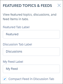
For drag-and-drop components, exposed attributes appear in the component’s properties panel.
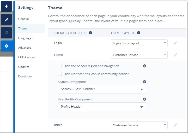
For theme layout components, exposed attributes appear when the theme layout is selected in the area.