Decorators
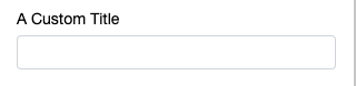
The label for the input, to be used instead of the default title case conversion of the property name.
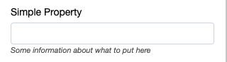
A subtitle for the input.
For information on the @units decorator, see Number Property.
Adds a header before the decorated property, indicating all properties below this decorator (until the next header) are intended to be a section on configurables.
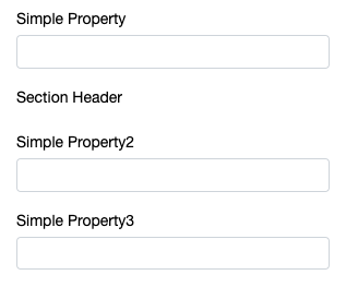
In the preceding example, simpleProperty2 and simpleProperty3 fall under the header “Section Header”.
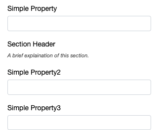
Additional text to describe a section, can be used to provide the end user with instructions.
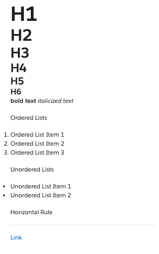
Basic Markdown rendered before the decorated property. Syntaxes are limited to the following examples.
The @optional decorator enables you to flag properties as either optional or required.
Personalization doesn’t prevent you from saving a campaign with empty or incomplete template properties that are flagged as required. For example, even if a simpleText: string property is tagged as required by using the @optional(false) decorator, a campaign developer can still save a campaign with the simpleText property field left empty or incomplete.
Hides the input from the user.
This decorator can also accept a function in order to hide configurables conditionally. The arguments for the decorator are this, and a function whose first argument is self, the instance of this class.
The function MUST return a boolean true or false. Returning a non-boolean truthy or falsy value (for example, 0, 1, ‘some string’) throws an error.
The inverse of the @hidden decorator, displays the field if true, hides the field if false.
For information on the @richText decorator, see String Property.
For information on the @options decorator, see Select Property.
Renders a static list of options as a button group.
For information on the @range decorator, see DateTime Property.
Displays the fields of a complex object horizontally.
Arrays of complex objects are rendered like a table. Include headersPerRow: true to show field titles on each row. Optionally render a line to visually divide each row by including dividerLine: true.