Set Component Styles and Properties in a Lightning Out 2.0 App
Tailor your Lightning Out 2.0 app to the specific branding requirements of an external app. Set Cascading Style Sheets (CSS) custom properties, including Salesforce Lightning Design System (SLDS) styling hooks, as style attributes directly in the context of the external app. You can also set or override values on other properties defined for your custom LWC component. This way, your embedded components can match the branding of any external app without changing individual component code.
Recall that a Lightning Out 2.0 app includes Lightning Out 2.0 web components that mirror your embedded LWC components but run in the context of the host page. If you need a refresher, review Understand Lightning Out 2.0 Architecture. This mirroring extends to most standard and custom attributes set on the Lightning Out 2.0 web component.
The style attribute has additional requirements. To set component styles in a Lightning Out 2.0 app, you must declare styles as SLDS styling hooks or other CSS custom properties using the -- prefix syntax. For example, --slds-g-sizing-border-1 and --custom-color are both valid styles, but background-color and font-size aren’t.
Lightning Out 2.0 supports the same syntax for style values as Lightning Web Components, including values defined in imported CSS modules, SLDS styling hooks with fallback values, and hard-coded values.
Lightning Out 2.0 supports both SLDS 1 and SLDS 2 styling hooks. However, the styling hooks must be compatible with your org themes and the custom LWC components that you embed. Always manually verify that your embedded LWC components have the desired look and feel.
Other supported standard attributes include:
autocapitalizeautocorrectdirenterkeyhintinputmodelangspellchecktitletranslate
Additionally, these standard aria attributes are supported.
aria-disabledaria-hiddenaria-labelaria-livearia-modalaria-pressedaria-valuemaxaria-valueminaria-valuenow
All custom attributes are supported unless the attribute name starts with an underscore (_).
Passing an unsupported attribute doesn’t trigger compilation or run-time errors, but that attribute’s value isn’t set on the LWC component.
To set component styles in a Lightning Out 2.0 app, make sure that a CSS stylesheet is defined for each of the embedded components. See Style Components with CSS Stylesheets. Always declare styles as SLDS styling hooks or other CSS custom properties using the -- syntax.
To share CSS rules among the components, you can use a common CSS module.
For example, here’s a CSS module file that declares style rules as CSS custom properties. Notice that it references an SLDS 2 global styling hook with a hard-coded fallback value.
The CSS file of the Lightning web component c-my-embedded-component imports the CSS module. The SLDS 1 card component styling hooks reference the properties defined in the CSS module.
Here’s the HTML file for c-my-embedded-component, which is a custom wrapper for the standard lightning-card component.
Here’s the JavaScript for c-my-embedded-component. The @api decorator is imported from lwc, so that the cardBody field is exposed as a public property. This custom property allows you to set the body text of the card from a parent component or the external host page.
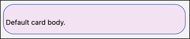
Here’s how c-my-embedded-component renders in an org that uses the Cosmos theme.
After you set up the LWC components and their properties, if you haven’t already, create your Lightning Out 2.0 app. To the app, add the components that you want to embed into an external host page and save your changes.
You can set component styles and other properties in the Lightning Out 2.0 App Manager.
- From the Lightning Out 2.0 App Manager in Setup, select Edit App from the actions dropdown next to the Lightning Out 2.0 app name. The Edit Lightning Out 2.0 App page opens.
- Open the App Components tab.
- Click
 in the Custom Properties cell for the custom component that you want to add properties to. Enter the properties and their values in JSON format. For example, to override values for
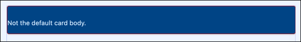
 c-my-embedded-component, enter{"style": "--slds-c-card-color-background: var(--secondary-color); --slds-c-card-text-color: var(--slds-g-color-palette-cloud-blue-90, #CFE9FE) ; --slds-c-card-color-border:#8E030F;", "card-body": "Not the default card body."}. - Save your changes.
Here’s how c-my-embedded-component renders on a host page with the custom property overrides specified.
Alternatively, directly edit the Lightning Out 2.0 app markup for that component on the host page. In the Lightning Out 2.0 web component for the embedded component, set a supported attribute with the override value.
For example, here’s the edited code for a Lightning Out 2.0 app that was generated with the Lightning Out 2.0 App Manager. c-my-embedded-component is referenced in the markup as <c-my-embedded-component>. All three properties declared in the CSS file of c-my-embedded-component are overwritten with new values. The card-body custom attribute is also set to Not the default card body.
In true implementations, the frontdoor-url attribute value on the lightning-out-application isn’t set until run time. See Set Up Authentication for Lightning Out 2.0 in Salesforce Help.
Alternatively, programmatically generate the Lightning Out 2.0 app markup by using Document Object Model (DOM) interface methods.
For example, here’s the JavaScript that generates the equivalent markup as the example in the Set Component Properties Declaratively section.
Lightning Out 2.0 currently supports only CSS custom properties and SLDS styling hooks as style overrides. Other CSS properties aren’t passed from the host page into the iframe of the component, even if the component’s CSS file declares those properties.
For example, here’s the CSS file of a component.
Here’s an attempt to override the embedded component’s styles on a host page.
The CSS custom property --custom-magenta-color is successfully passed to the component inside the iframe. The color property of the component’s h1 element references --custom-magenta-color. Therefore, when the component renders on the host page, the component’s h1 text is colored#8c23a8 instead of#b50be3.
However, the font-family and the font-size properties aren’t overridden because they aren’t CSS custom properties. When the component renders on the host page, the font-family of theh1 element is still courier, and its font-size is still 120%.
Here are other attributes and properties that you can’t pass from the host page to an embedded LWC component.
Blocked standard attributes:
accesskeyautofocusdraggableexportpartshiddeninertnoncepartslottabindex
Blocked aria attributes:
aria-activedescendantaria-controlsaria-describedbyaria-detailsaria-errormessagearia-flowtoaria-labelledbyaria-owns
See Also