Surface Components
The root component of a view containing layout components.
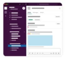
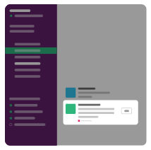
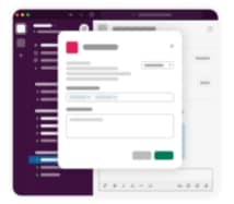
You can add components to these surfaces: the Home tab, messages, and modals.
The Home tab is a persistent, dynamic interface for apps.
Present each of your users with a unique Home tab just for them, always found in the same place.
The Home tab is a space you can fully customize in your app, complete with intricate layouts and deep interactivity. A single API endpoint handles building and updating the Home tab. See Home is where the tabs are.
Publish views to the app's home tab in Slack using Slack.BotClient. See Access a Slack Client.
Apex SDK for Slack is subject to Slack's block limit, which is 100 blocks in a the Home tab. If you are displaying Salesforce record data that exceeds 100 blocks, we recommend that you provide a button or link that directs a user back to Salesforce for a complete view.

Examples
This example creates a header and section for the Home tab.
This example creates some text, a header, and several buttons for the Home tab.
Keys
| Key | Type | Required | Description |
|---|---|---|---|
definition | String | Yes | The value must be home. |
components | Array | Yes | An array of layout components. |
Messages are one of the basic ingredients of Slack apps. Compose them, send them, retrieve them, update them, delete them.
Send messages to a channel using Slack.BotClient and Slack.UserClient. See Access a Slack Client.
Apex SDK for Slack is subject to Slack's block limit, which is 50 blocks in a message. If you are displaying Salesforce record data that exceeds 50 blocks, we recommend that you provide a button or link that directs a user back to Salesforce for a complete view.

Examples
This example creates a message with a header and a section containing some text.
This example creates a message with a header and a button that opens a URL.
Keys
| Key | Type | Required | Description |
|---|---|---|---|
definition | String | Yes | The value must be message. |
properties | Object | No | The component's properties. |
properties.text | String, Expression | No | When you use components in a message payload, text becomes a fallback message displayed in notifications. Use components to define everything else about the visible message. |
components | Array | No | An array of layout components to render as the message. |
Modals are focused spaces to request and collect data from users, or to temporarily display dynamic and interactive information.
Modals are the Slack app equivalent of alert boxes, pop-ups, or dialog boxes. They capture and maintain focus within Slack until the user submits or dismisses the modal. Compose a modal using visual and interactive components.
If you're not familiar with a modal's lifecycle in a Slack app, see Modals: focused spaces for user interaction.
Modals can handle these interaction payloads.
block_actions—Received when a user interacts with a componentview_submission—Received when a user submits a view in a modal.view_closed—Received when a user dismisses a modal. To receive these payloads, the modal view must have been created with thenotify_on_closeargument set totrue.
Payloads include a trigger_id that you must use to respond back with a modal. Slack has a 3-second expiration on the trigger_id.
But what if you're making an API call to fetch some data? A request could exceed this 3-second timeout. To satisfy the 3-second ack rule and work with modals, use the Slack.ActionHandler Apex class. Slack.ActionHandler has a number of methods to help you structure your handler. You can respond to Slack with a staging modal, which is a simple Loading... view. At this point, app code can take time to build up the actual modal view to show.
Apex SDK for Slack is subject to Slack's block limit, which is 100 blocks in a modal. If you are displaying Salesforce record data that exceeds 100 blocks, we recommend that you provide a button or link that directs a user back to Salesforce for a complete view.

Example
Keys
| Key | Type | Required | Description |
|---|---|---|---|
definition | String | Yes | The value must be modal. |
properties | Object | Yes | The component's properties |
properties.title | String, Plain Text, Expression | Yes | Title text for the modal |
properties.submitLabel | String, Plain Text, Expression | No | A label for the submit button |
properties.closeLabel | String, Plain Text, Expression | No | A label for the close button |
components | Array | No | An array of layout components to render inside the modal. |
events | Object | No | The events on the modal that trigger Actions to execute. |
events.onsubmit | Object | No | An object that defines the action to take when the onsubmit event fires and the properties to pass to the action. |
events.onsubmit.definition | String | No | The action that executes when a user clicks the submit button. |
events.onsubmit.properties | Object | No | The properties to pass to the action. |
events.oncancel | Object | No | An object that defines the action to take when the oncancel event fires and the properties to pass to the action. |
events.oncancel.definition | String | No | The action that executes when a user clicks the cancel button. |
events.oncancel.properties | Object | No | The properties to pass to the action. |