Composition Objects
Some components accept complex property values that must take a certain shape.
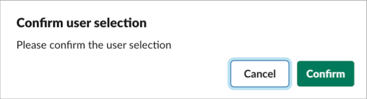
A dialog that provides a confirmation step. This dialog asks the user to confirm their action via confirm and deny buttons.
Example
| Key | Type | Required | Description |
|---|---|---|---|
confirm | Object | Yes | An object describing a dialog that provides a confirmation step. |
confirm.title | String, Expression, Plain Text | Yes | The title of the confirmation dialog. |
confirm.text | String, Expression, Plain Text | Yes | Explanatory text to display to the user in the confirmation dialog. |
confirm.confirm | String, Expression, Plain Text | Yes | The text of the confirm button. |
confirm.deny | String, Expression, Plain Text | Yes | The text of the cancel button. |
confirm.style | String, Expression | No | Defines the color scheme applied to the confirm button. The value danger displays the button with a red background on desktop, or red text on mobile. The value primary displays the button with a green background on desktop, or blue text on mobile. The default value is primary. |
Identifies the data provider for an external select component.
Example
| Key | Type | Required | Description |
|---|---|---|---|
datasource | String, Object, Expression | Yes | A valid data provider identifier string or object containing an identifier and properties to be passed into a data provider. |
datasource.definition | String, Object, Expression | Yes | A valid data provider identifier is required to be present within the datasource if the datasource takes the form of an Object. Use the format namespace__dataproviderName. |
datasource.properties | Object, Expression | No | Contains any parameters to be passed into the option data provider. |
Used in the conversations select component to filter which conversations are shown in the picker.
Example
| Key | Type | Required | Description |
|---|---|---|---|
filter | Object | Yes | Used in the conversations select component to filter which conversations are shown in the picker. |
filter.include | Array | Yes | List of conversation types to include. Possible values: public—public channels, private—private channels, im—direct messages, mpim—multi-party direct messages. |
filter.excludeExternalShared | Boolean, Expression | No | Exclude external shared channels from the conversation list. The default value is false. |
filter.excludeBotUsers | Boolean, Expression | No | Exclude bot users from the conversation list. The default value is false. |
Available in: Checkbox Group | Overflow | Radio Group | Select
An object that represents a single selectable item.
Example
| Key | Type | Required | Description |
|---|---|---|---|
options | Array, Expression | Yes | A list of options. |
options.identifier | String | Yes | A string used to identify the option. |
options.label | String, Expression, Plain Text, Mrkdwn | Yes | A label for the option on a checkbox group or radio group |
| String, Expression, Plain Text | Yes | A label for the option on overflow or select. | |
options.value | Boolean | No | The value of the option. The value key is only available in checkbox groups. |
options.description | String, Plain Text, Expression | No | The description of the option. |
options.url | String | No | A URL to load in the user’s browser when the option is selected. The url key is available only in overflow menus. |
Available in: Select
Provides a way to group options in a select component.
Example
| Key | Type | Required | Description |
|---|---|---|---|
optionGroups | Array, Expression | Yes | A list of option groups. |
optionGroups.label | String, Plain Text, Expression | Yes | A label for the group. |
optionGroups.options | Array of Options | Yes | Selectable items in the options group. |
Many properties accept a string, mrkdwn, or plain text.
For these properties, if the value is a string, the component renders plain text. If the value is an object it must be a Mrkdwn or Plain Text object.
Slack’s implementation of markdown is called mrkdwn.
For more details on formatting with mrkdwn, see Slack’s formatting documentation.
Examples
This example creates mrkdwn text with simple formatting and an emoji.
By default, control characters in markdown are encoded, including the <, >, and & characters. To use control characters in mrkdwn to tag users or denote links, set the disableEncoding property to true.
This example creates mrkdwn text with a link and an emoji. If disableEncoding is false (default), the angular brackets are rendered as they are.
This example renders the text http://salesforce.com with a link. The link is automatically parsed because verbatim is set to false. If verbatim is true (default), the text renders without a link.
This example creates mrkdwn text in a section and field component.
Keys
| Key | Type | Required | Description |
|---|---|---|---|
text | Object | Yes | A text object. |
type | String | Yes | The value must be mrkdwn. |
text | String | Yes | The text. |
verbatim | Boolean | No | When set to false, Slack detects and parses certain values like links in markdown. The default value is true. To turn on automatic parsing, set this key to false. For more information, see Slack’s text object documentation. |
disableEncoding | Boolean | No | By default (false), control characters are encoded within markdown. To turn off automatic encoding, set this key to true. |
Renders a plain text value with optional support for emojis.
Example
Keys
| Key | Type | Required | Description |
|---|---|---|---|
text | Object | Yes | A text object. |
type | String | No | The default value is plain_text. |
text | String | Yes | The text. |
emoji | Boolean | No | Slack doesn’t support emojis in plain text. To turn on emoji support, set this key to true. For more information, see Slack’s text object documentation. |