Layout Components
Groups element components together, such as a header or section.
Use layout components to position content in a surface. Most layout components can contain other components. The contained components must be elements.
Layout components must be rendered within a surface or an iteration.
Layout components have a visibility property, which defaults to true.
Use these layout components to build your views.
Available in: Modal | Message | Home tab
Use an actions component to group interactive elements together.
Examples
This example shows an action block with a select component.
This example shows an action block with a checkboxGroup, radioGroup, and a button component.
This example creates an action block with onchange events.
This example creates an action block with onchange and onclick events.
Keys
| Key | Type | Required | Description |
|---|---|---|---|
definition | String | Yes | The value must be actions. |
components | Array | Yes | A maximum of 25 components to render inside the actions component. |
name | String, Expression | No | The name to uniquely identify this component within the view. |
visibility | Boolean, Expression | No | Indicates whether the component is shown (true) or hidden (false). The default value is true. |
Available in: Modal | Message | Home tab
Displays message context, which can include images and text.

Example
This example shows a context component with some text and an image.
Keys
| Key | Type | Required | Description |
|---|---|---|---|
definition | String | Yes | The value must be context. |
components | Array | Yes | A maximum of 10 text and image components to render inside the context component. |
name | String, Expression | No | The name to uniquely identify this component within the view. |
visibility | Boolean, Expression | No | Indicates whether the component is shown (true) or hidden (false). The default value is true. |
Available in: Modal | Message | Home tab
A content divider, like an <hr>, to split up different components inside a message.
Examples
Here’s a simple divider.
This divider is added after the header in a message.
Keys
| Key | Type | Required | Description |
|---|---|---|---|
definition | string | Yes | The value must be divider. |
name | String, Expression | No | The name to uniquely identify this component within the view. |
visibility | Boolean, Expression | No | Indicates whether the component is shown (true) or hidden (false). The default value is true. |
Available in: Modal | Message | Home tab
A header with large, bold text.

Example
Keys
| Key | Type | Required | Description |
|---|---|---|---|
definition | String | Yes | The value must be header. |
properties | Object | Yes | The component’s properties. |
properties.text | String, Plain Text, Expression | Yes | The text for the header component. |
name | String, Expression | No | The name to uniquely identify this component within the view. |
visibility | Boolean, Expression | No | Indicates whether the component is shown (true) or hidden (false). The default value is true. |
Available in: Modal | Message | Home tab
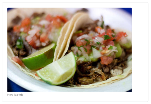
A simple image block, designed to make photos pop.
For a component that holds an image and text or other content, see inline image. Both image components use - definition: image. However, they’re available in different containing components, and the layout image has a title property.
Examples
This example creates a standalone image.
This example creates several images in a section and context component.
Keys
| Key | Type | Required | Description |
|---|---|---|---|
definition | String | Yes | The value must be image. |
properties | Object | Yes | The component’s properties. |
properties.url | String, Expression | Yes | The URL of the image to display. URLs must use a valid protocol scheme such as http:// or https://. |
properties.altText | String, Expression | Yes | A plain text description of the image. |
properties.title | String, Plain Text, Expression | No | The title for the image. This value can be provided only for a standalone image. |
name | String, Expression | No | The name to uniquely identify this component within the view. |
visibility | Boolean, Expression | No | Indicates whether the component is shown (true) or hidden (false). The default value is true. |
Available in: Modal | Message | Home tab
A layout component that can contain input elements in a components array.
Examples
This example creates an input block with a text input component.
This example creates an input block with a checkbox component.
This example creates input blocks with nested elements.
Keys
| Key | Type | Required | Description |
|---|---|---|---|
definition | String | Yes | The value must be input. |
properties | Object | Yes | The component’s properties. |
properties.label | String, Plain Text, Expression | Yes | The input label |
properties.hint | String, Expression | No | A hint that can be used to convey format or other input requirements for the input component rendered within the input. |
properties.required | Boolean, Expression | No | If true, the form can’t be submitted when a field in the input component is empty. The default value is false. |
properties.dispatchAction | Boolean, Expression | No | If true, an element within the input dispatches to an action bound to it. The default value is false. |
components | Array | Yes | A single component to render inside the input. The component can be a checkbox group, a conversations-select, date picker, radio group, select, text input, time picker, or users select. |
name | String, Expression | No | The name to uniquely identify this component within the view. |
visibility | Boolean, Expression | No | Indicates whether the component is shown (true) or hidden (false). The default value is true. |
When properties.required is false, Slack appends (optional) on the field label. (optional) isn’t currently localized when your Slack locale and Salesforce locale are different. To ensure labels are localized correctly, update your Slack locale to match your Salesforce locale.
Available in: Modal | Message | Home tab
Use a section to render plain text or mrkdwn and optionally a single component, like an image.
Examples
This example renders plain text.
This example renders markdown.
Use markdown to render a field value based on a view property.
A section can contain up to 10 text fields.
You can include a single component in a section.
This example contains a few sections with text and text fields.
Keys
| Key | Type | Required | Description |
|---|---|---|---|
definition | String | Yes | The value must be section. |
properties | Object | Yes | The component’s properties. |
properties.text | String, Expression, Plain Text, Mrkdwn | No | The text for the component. Required if the fields property is empty or absent. If the value is a string, the component renders plain text. To render mrkdwn, use the mrkdwn object. |
properties.fields | Array of items of type String, Plain Text, Mrkdwn, Expression | No | An array of text fields to render within the component. Required if the text property is absent. The maximum number of text fields is 10. |
components | Array | No | A single component to render inside the input. |
name | String, Expression | No | The name to uniquely identify this component within the view. |
visibility | Boolean, Expression | No | Indicates whether the component is shown (true) or hidden (false). The default value is true. |