Visualforce Developer Guide
 j
jNewer Version Available
Choosing an Effective Page Layout
In general, Visualforce added to page layouts works best if it’s read-only, at-a-glance information. Put features that require user interaction, like multi-field forms, on full screen pages by adding them as tabs in the main navigation, or as custom actions from the action bar.
Mobile Card Layout

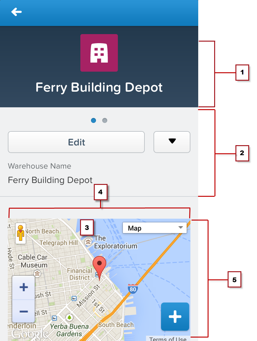
- The record header displays when an record is loaded, but can be scrolled up and off the screen by the user. When on screen, it’s 158 pixels high on all devices, and takes the full width of the screen. You can’t control the display of the record header.
- Mobile cards display above all of the related items on the record.
- Set the width to 100%; the element sizes automatically, minus some padding on either side. The content of mobile cards can’t be scrolled, so make sure it fits in the space you provide to it.
- Control the height of the mobile card by setting the height in pixels in the page layout editor. The mobile card area uses exactly that height, even if the mobile card’s content is shorter. In that case, the extra area is blank. If the card’s content is taller, the content is clipped. As a best practice, don’t create mobile cards taller than the smallest device screen you intend to support. Be sure to set the height of screen elements relevant to your environment.
- The record’s related items are displayed after all mobile cards.
While you can add multiple mobile cards, it quickly becomes a user experience challenge to scroll past them to the related lists. It’s a best practice to add only one or two. If you need a full screen to display your page, consider moving it to a custom action on the object instead.
1<apex:page standardController="Warehouse__c"
2    docType="html-5.0" showHeader="false" standardStylesheets="false">
Visualforce on a Page Layout
- The record header displays when an record is loaded, but can be scrolled up and off the screen by the user. When on screen, it’s 158 pixels high on all devices, and takes the full width of the screen. You can’t control the display of the record header.
- Record controls and details, automatically generated by the Salesforce app.
- A Visualforce page added to the object’s page layout.
- Set the width to 100%; the element sizes automatically, minus some padding on either side.
- Control the height of the Visualforce page’s area by setting the height of the item in pixels in the page layout editor. The Visualforce element uses exactly that height, even if the content is shorter. In that case, the extra area is blank. If the page’s content is taller, the content is clipped. As a best practice, don’t set inline Visualforce pages to be taller than the smallest device screen you intend to support.
As is the case with multiple cards, although you can add multiple inline Visualforce pages to a page layout, it quickly becomes a user experience challenge to scroll past them to see the rest of the page. It’s a best practice to never add more than two Visualforce page elements in a row; separate Visualforce elements with a regular page element, such as a field. If you need a full screen to display your page, consider moving it to a custom action on the object instead.
1<apex:page standardController="Warehouse__c"
2    docType="html-5.0" showHeader="false" standardStylesheets="false">
Full Screen Layout
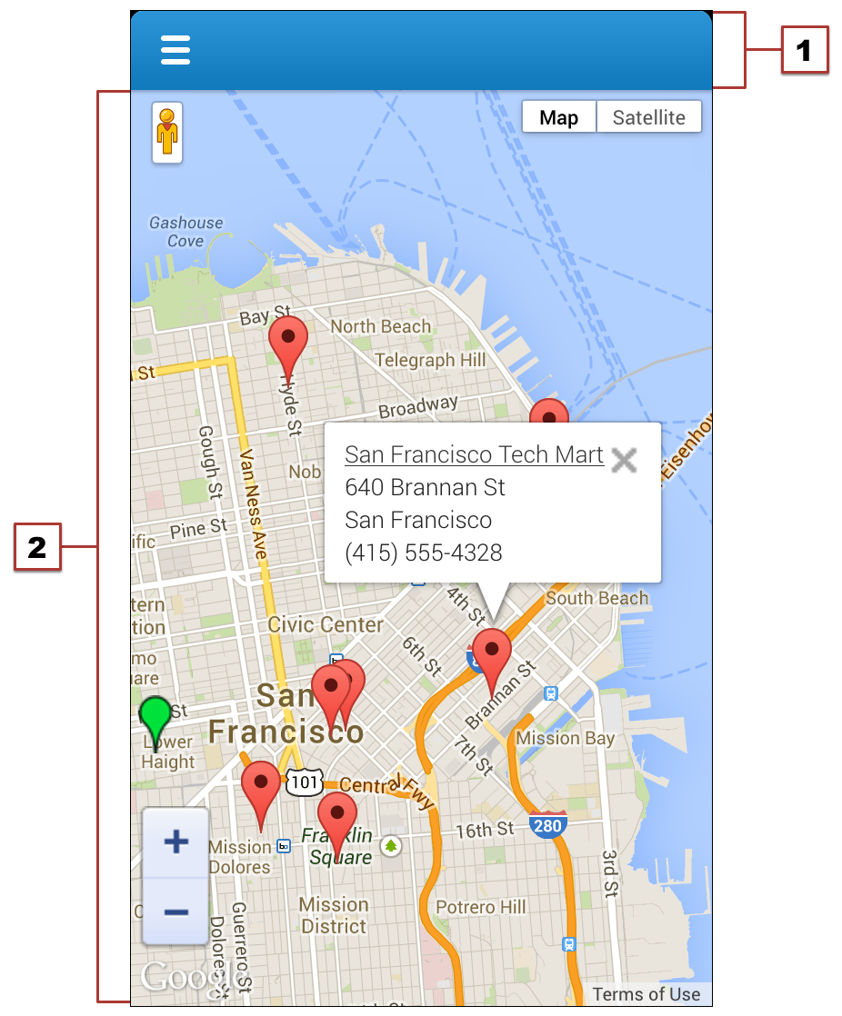
- The Salesforce header, which provides access to the main navigation menu, is pixels high. The contents of the header can’t be changed.
- The rest of the device screen is dedicated to your Visualforce page.
When displayed in the Salesforce app, the standard Salesforce header and sidebar are automatically removed, like Visualforce pages used as mobile cards or added to page layouts. However, Visualforce pages used as custom actions in the action bar are shared with the full Salesforce site, and pages added to the navigation may or may not be shared. Pages shared with the full Salesforce site shouldn’t have the standard Salesforce header and sidebar explicitly removed unless removing the header and sidebar is the standard practice for all Visualforce on your site.