Lightning Components Developer Guide
 j
jNewer Version Available
Working with Lightning Design System Variants
If you pass in a variant that’s not supported, the default variant is used instead. This example creates a button with the base variant.
1<lightning:button variant="base" label="Base" onclick="{! c.handleClick }"/>The following reference describes how variants in base components correspond to variants in Lightning Design System. Base components that don’t have any visual styling, such as lightning:formattedDateTime, are not listed here. For more information on any of these components, see the Component Library.
Accordion
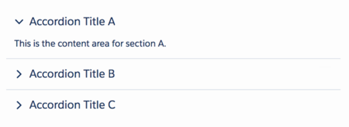
A lightning:accordion component is a collection of vertically stacked sections with content areas. The sections are defined with lightning:accordionSection components. By default, only one section is expanded at a time. The allowMultipleSectionsOpen attribute enables you to expand more than one section. This component does not support the variant attribute. lightning:accordion uses the styling from Accordion in the Lightning Design System.
Avatar
A lightning:avatar component is an image that represents an object, such as an account or user. You can create avatars in different sizes and two variants. lightning:avatar uses the styling from Avatar in the Lightning Design System.

| Base Component Variant | Lightning Design System Class Name | Description |
|---|---|---|
| square (default) | slds-avatar | An avatar with a rounded square shape |
| circle | slds-avatar_circle | An avatar with a circular shape |
Badge
A lightning:badge component is a label containing a small amount of information. This component does not support the variant attribute. lightning:badge uses the styling from Badges in the Lightning Design System.
Breadcrumb
A lightning:breadcrumb component displays the path of a page relative to a parent page. Breadcrumbs are nested in a lightning:breadcrumbs component. This component does not support the variant attribute. lightning:breadcrumb uses the styling from Breadcrumbs in the Lightning Design System.

Button
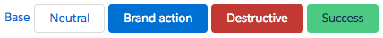
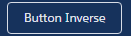
A lightning:button component is a button that executes an action in a client-side controller. Buttons can be one of three types: button (default), reset, and submit. Buttons support icons to the left or right of the text label. lightning:button uses the styling from Buttons in the Lightning Design System.
| Base Component Variant | Lightning Design System Class Name | Description |
|---|---|---|
| neutral (default) | slds-button_neutral | A button with gray border and white background |
| base | slds-button | A button without a border, which appears like a text link |
| brand | slds-button_brand | A blue button with white text |
| destructive | slds-button_desctructive | A red button with white text |
| inverse | slds-button_inverse | A button for dark backgrounds |
| success | slds-button_success | A green button |
Button Group
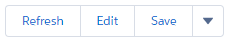
A lightning:buttonGroup component is a group of buttons that can be displayed together to create a navigational bar. You can nest lightning:button and lightning:buttonMenu components in the group. Although the button group itself doesn’t support the variant attribute, variants are supported for buttons and the button menu components. For example, you can nest <lightning:button variant="inverse" label="Refresh" /> in a button group. If including lightning:buttonMenu, place it after the buttons and pass in the slds-button_last class to adjust the border. lightning:buttonGroup uses the styling from Button Groups in the Lightning Design System.
Button Icon
A lightning:buttonIcon component is an icon-only button that executes an action in a client-side controller. You can create button icons in different sizes. Only Lightning Design System utility icons are supported. lightning:buttonIcon uses the styling from Button Icons in the Lightning Design System.


| Base Component Variant | Lightning Design System Class Name | Description |
|---|---|---|
| border (default) | slds-button_icon-border | A button that contains an icon with gray border |
| bare | slds-button_icon | A button that looks like a plain icon |
| brand | slds-button_icon-brand | A button that uses the Salesforce blue background color |
| container | slds-button_icon-container | A 32px by 32px button that looks like a plain icon |
| border-filled | slds-button_icon-border-filled | A button that contains an icon with gray border and white background |
| bare-inverse | slds-button_icon-inverse | A button that contains a white icon without borders for a dark background |
| border-inverse | slds-button_icon-border-inverse | A button that contains a white icon for a dark background |
Button Icon (Stateful)
A lightning:buttonIconStateful component is an icon-only button that retains state. You can press the button to toggle between states. You can create button icons in different sizes. Only Lightning Design System utility icons are supported. The selected attribute appends the slds-is-selected class when it’s set to true. lightning:buttonIconStateful uses the styling from Button Icons in the Lightning Design System.

| Base Component Variant | Lightning Design System Class Name | Description |
|---|---|---|
| border (default) | slds-button_icon-border | A button that contains an icon with gray border |
| border-filled | slds-button_icon-border-filled | A button that contains an icon with a white background |
| border-inverse | slds-button_icon-border-inverse | A button that contains a white icon for a dark background |
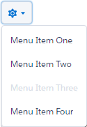
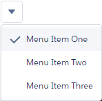
Button Menu
A lightning:buttonMenu component is a dropdown menu with a list of menu items, represented by lightning:menuItem components. Menu items can be checked or unchecked, or execute an action in a client-side controller. You can create button menus with icons in different sizes and position the dropdown menu in different locations relative to the button. The variants change the appearance of the button, and are similar to the variants on button icons.
lightning:buttonMenu supports the lightning:menuDivider component for creating horizontal lines between menu items. The menu divider has a compact variant for reducing the space above and below the line. The lightning:menuSubheader component enables you to create subheadings in the list of menu items. It has no variants.
lightning:buttonMenu uses the styling from Menus in the Lightning Design System.

| Base Component Variant | Lightning Design System Class Name | Description |
|---|---|---|
| border (default) | slds-button_icon-border | A button that contains an icon with gray border |
| bare | slds-button_icon | A button that looks like a plain icon |
| container | slds-button_icon-container | A 32px by 32px button that looks like a plain icon |
| border-filled | slds-button_icon-border-filled | A button that contains an icon with gray border and white background |
| bare-inverse | slds-button_icon-inverse | A button that contains a white icon without borders for a dark background |
| border-inverse | slds-button_icon-border-inverse | A button that contains a white icon for a dark background |
Button (Stateful)
A lightning:buttonStateful component is a button that toggles between states. Stateful buttons can show a different label and icon based on their states. Only Lightning Design System utility icons are supported. lightning:buttonStateful uses the styling from Buttons in the Lightning Design System.

| Base Component Variant | Lightning Design System Class Name | Description |
|---|---|---|
| neutral (default) | slds-button_neutral | A button with gray border and white background |
| brand | slds-button_brand | A blue button with white text |
| destructive | slds-button_destructive | A red button with white text |
| inverse | slds-button_inverse | A button for dark backgrounds |
| success | slds-button_success | A green button |
| text | slds-button | A button that contains an icon with gray border and white background |
Card
A lightning:card component is used to apply a stylized container around a grouping of information in an article HTML tag. The information could be a single item or a group of items such as a related list. lightning:card uses the styling from Cards in the Lightning Design System.
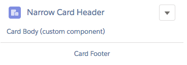
| Base Component Variant | Lightning Design System Class Name | Description |
|---|---|---|
| base (default) | slds-card | A group of related information that takes the width of the container |
| narrow | slds-card_narrow | A group of related information that has narrow width |
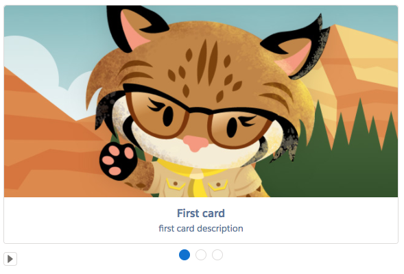
Carousel
A lightning:carousel component is a collection of images that are displayed horizontally one at a time. Specify the images using lightning:carouselImage child components. The carousel doesn’t support the variant attribute, and it uses the slds-carousel class on the outer element. lightning:carousel uses the styling from Carousel in the Lightning Design System.
Checkbox Group
A lightning:checkboxGroup component is a group of checkboxes that enables selection of single or multiple options. This component is different from lightning:input of type="checkbox" as the latter is not suitable for grouping a set of checkboxes together. Although the checkbox group doesn’t support the variant attribute, the slds-form-element class is appended to the fieldset element that encloses the checkbox group. lightning:checkboxGroup uses the styling from Checkbox in the Lightning Design System.

Combobox
A lightning:combobox component is an input element that enables single selection from a list of options. The result of the selection is displayed as the value of the input. In a multi-select combobox, each selected option is displayed in a pill below the input element. lightning:combobox uses the styling from Combobox in the Lightning Design System.
| Base Component Variant | Lightning Design System Class Name | Description |
|---|---|---|
| standard (default) |
slds-input slds-form-element slds-form-element__control slds-combobox |
A combobox that enables single or multiple selection |
| label-hidden | N/A | An input element with a hidden label |
Data Table and Tree Grid
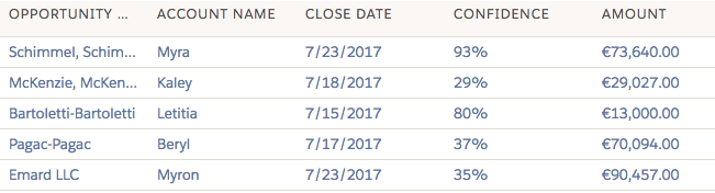
A lightning:datatable component is a table that displays columns of data, formatted according to type. It enables resizing of columns, header-level actions, row-level actions, selecting of rows, sorting of columns, text wrapping and clipping, row numbering, and cell content alignment. Although the data table doesn’t support the variant attribute, the slds-table and slds-table_bordered classes are appended to the table element. Component attributes and column properties set in the client-side controller enable you to customize tables. lightning:datatable uses the styling from Data Tables in the Lightning Design System.
Similar in appearance to lightning:datatable, lightning:treeGrid is a hierarchical view of data presented in a table. It uses the styling from Trees in the Lightning Design System.
Dual Listbox
A lightning:dualListbox component provides two list boxes, where you can move one or more options to the second list box and reorder the selected options. lightning:dualListbox uses the styling from Dueling Picklist in the Lightning Design System.
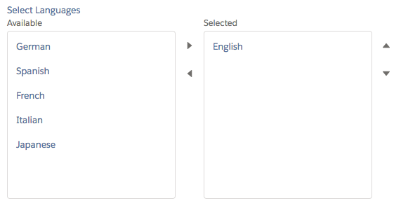
| Base Component Variant | Lightning Design System Class Name | Description |
|---|---|---|
| standard (default) |
slds-dueling-list |
A dual listbox with a visible label |
| label-hidden | N/A | A dual listbox with a hidden label |
Dynamic Icon
A lightning:dynamicIcon component represents various animated icons. The type attribute determines the animated icon to display and corresponds to the dynamic icons in the Lightning Design System. lightning:dynamicIcon uses the styling from Dynamic Icons in the Lightning Design System.

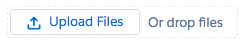
File Uploader
A lightning:fileUpload component enables file uploads to a record. The file uploader includes drag-and-drop functionality and filtering by file types. Although it doesn’t support the variant attribute, the slds-file-selector class is appended to the component. lightning:fileUpload uses the styling from FileSelector in the Lightning Design System.
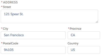
Form Layout
A form layout represents a set of interactive controls to submit user input, which can include compound fields such as fields for addresses, names, or geolocation. These components use the styling from Form Layout in the Lightning Design System.
lightning:inputAddress displays an address compound field.
lightning:inputName displays a name compound field.

lightning:inputField displays an editable field with a label, help text, and value that correspond to a record field on a Salesforce object. The field’s data type determines the component that’s used for the input field. The lightning:inputField component must be nested in a lightning:recordEditForm component.
lightning:outputField displays a read-only field with a label, help text, and value of a record field on a Salesforce object. The component has a label-hidden variant to hide the label. lightning:outputField is used in lightning:recordViewForm and lightning:recordEditForm components.
The lightning:recordForm component eases record form creation. It accepts a mode attribute to specify variants of the form. The component creates an edit form that can create or update records, a view form with the option to edit fields, and a read-only form. The layout of the form is set with other attributes. The lightning:recordForm component uses lightning:recordEditForm and lightning:recordViewForm to create the forms.
The edit mode form with a single column layout: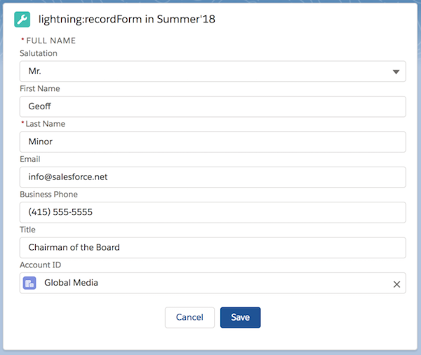
The view mode form with two column layout: 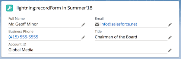
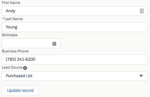
The read-only mode form with two column layout: 
Help Text (Tooltip)
A lightning:helptext component displays an icon with a popover containing a small amount of text describing an element on screen. The iconVariant attribute changes the appearance of the help text icon and supports the same variants as the lightning:icon component. You can also change the default icon using the iconName attribute to specify a different utility icon. The slds-popover and slds-popover_tooltip classes are applied to the tooltip. lightning:helptext uses the styling from Tooltips in the Lightning Design System.
| iconVariant Values | Lightning Design System Class Name | Description |
|---|---|---|
| inverse | slds-icon | An icon with a white fill |
| error | slds-icon-text-error | An icon with a red fill |
| warning | slds-icon-text-warning | An icon with a yellow fill |
Icon
A lightning:icon component is a visual element that provides context and enhances usability. Although all Lightning Design System icons are supported, only utility icons support variants. You can create icons in different sizes. You can also use a custom svg sprite and specify a path to the resource instead of using Lightning Design System icons. lightning:icon uses the styling from Icons in the Lightning Design System.
| Base Component Variant | Lightning Design System Class Name | Description |
|---|---|---|
| inverse | slds-icon | An icon with a white fill |
| error | slds-icon-text-error | An icon with a red fill |
| warning | slds-icon-text-warning | An icon with a yellow fill |
Input
A lightning:input component is an interactive control, such as an input field or checkbox, which accepts user input. lightning:input uses the styling from Input in the Lightning Design System.

| Base Component Variant | Lightning Design System Class Name | Description |
|---|---|---|
| standard (default) |
slds-input slds-form-element slds-form-element__control |
An input element, which can be an input field, checkbox, toggle, radio button, or other types. The class appended to the element depends on the input type. |
| label-hidden | N/A | An input element with a hidden label |
Layout
A lightning:layout component is a flexible grid system for arranging containers within a page or another container. The lightning:layoutItem component is used to specify the items inside the layout. The component does not support the variant attribute. Customization of the layout is controlled by horizontalAlign, verticalAlign, pullToBoundary, and multipleRows attributes of lightning:layout. The attributes of lightning:layoutItem enable you to configure the size of the layout item, and change how the layout is configured on different device sizes.
lightning:layout uses the styling from Grid in the Lightning Design System. For more information, see Lightning Design System Considerations.
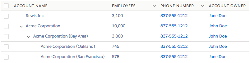
List View
A lightning:listView component represents a list view of records that you own or have read or write access to, and records shared with you. Inline edit, row level actions, and the action bar are supported in Lightning Experience, the Salesforce app, and communities only. On a desktop, this component renders a full list view. On all other form factors, such as a tablet or mobile devices, the component renders a mobile-friendly alternative.
Map
A lightning:map component securely displays a map of one or more locations. The component does not support the variant attribute. It supports attributes that enable you to add a title for a list of locations and a footer. lightning:map uses the styling from Map in the Lightning Design System.
Messaging
Messaging components communicate relevant information, such as for engagement or feedback. These components use styling from Messaging in the Lightning Design System. lightning:overlayLibrary display messages via modals and popovers. A modal blocks everything else on the page until it’s dismissed, while popovers display contextual information on a reference element and don’t interrupt like modals.

lightning:notificationsLibrary display messages via notices and toasts. Notices interrupt the user's workflow and block everything else on the page, while toasts are less intrusive than notices and are suitable for providing feedback following an action.

Pill
A lightning:pill component is a text label that’s wrapped by a rounded border and displayed with a remove button. Pills can contain an icon or avatar next to the text label. This component does not support the variant attribute, but its content and other attributes determine the styling applied to them. For example, a pill with hasError="true" displays as a pill with a red border and error icon. lightning:pill uses the styling from Pills in the Lightning Design System.

Additionally, you can display pills in a container using the lightning:pillContainer component.

Progress Bar
A lightning:progressBar component displays a horizontal progress bar from left to right to indicate the progress of an operation. It uses the styling from Progress Bar in the Lightning Design System.

| Base Component Variant | Lightning Design System Class Name | Description |
|---|---|---|
| base (default) | slds-progress-bar | A basic progress bar |
| circular | slds-progress-bar_circular | A progress bar with rounded ends |
Progress Indicator and Path
A lightning:progressIndicator component displays the steps in a process and indicates what has been completed. The nested lightning:progressStep component defines the label and value to display for each step. The type attribute determines if progress indicators or a path is displayed. When using type="base", the variant attribute is available. lightning:progressIndicator uses the styling from Progress Indicator and Path in the Lightning Design System.
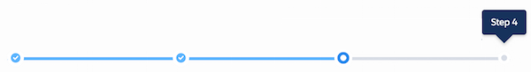
The variant attribute is not available when type="path".

| Base Component Variant | Lightning Design System Class Name | Description |
|---|---|---|
| base (default) | slds-progress | For type="base" only. Indicates steps in a process. |
| shaded | slds-progress_shade | For type="base" only. Adds a shaded background to the current step. |
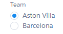
Radio Group
A lightning:radioGroup component is a group of radio buttons that enables selection of a single option. The type attribute determines if a group of typical radio buttons or rectangular buttons is displayed. lightning:radioGroup uses the styling from Radio Group in the Lightning Design System.

| Base Component Variant | Lightning Design System Class Name | Description |
|---|---|---|
| standard (default) |
slds-radio slds-radio_button-group |
A group of radio buttons or rectangular buttons |
| label-hidden | N/A | A group of radio buttons or rectangular buttons with a label that’s hidden |
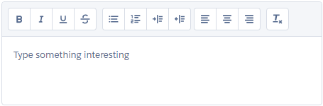
Rich Text Editor
A lightning:inputRichText component is a rich text editor with a customizable toolbar. The toolbar displays at the top of the editor but you can change its position to below the editor using the bottom-toolbar variant. To add an image button to the toolbar, nest the lightning:insertImageButton component inside lightning:inputRichText. The button opens a file browser to upload an image to insert in the text editor. lightning:inputRichText uses the styling from Rich Text Editor in the Lightning Design System.
| Base Component Variant | Lightning Design System Class Name | Description |
|---|---|---|
| bottom-toolbar | slds-rich-text-editor__toolbar-bottom | A rich text editor with a toolbar placed below the editor |
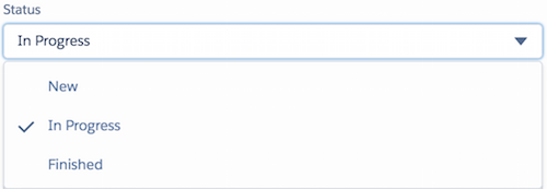
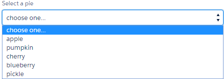
Select
A lightning:select component is a dropdown list that enables you to select a single option. lightning:select uses the styling from Select in the Lightning Design System.
| Base Component Variant | Lightning Design System Class Name | Description |
|---|---|---|
| standard (default) | slds-select | A select input element that supports single selection of values |
| label-hidden | N/A | A select input element with a hidden label |
Slider
A lightning:slider component is a slider for specifying a value between two specified numbers. The type attribute determines if a horizontal (default) or vertical slider is displayed. lightning:slider uses the styling from Slider in the Lightning Design System.
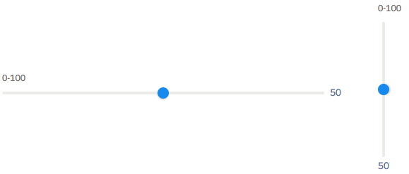
| Base Component Variant | Lightning Design System Class Name | Description |
|---|---|---|
| standard (default) | slds-slider-label | A slider with an optional visible label. |
| label-hidden | N/A | A slider with a hidden label |
Spinner
A lightning:spinner component is a spinner that indicates data is loading. You can create spinners in different sizes. lightning:spinner uses the styling from Spinners in the Lightning Design System.

| Base Component Variant | Lightning Design System Class Name | Description |
|---|---|---|
| base (default) | slds-spinner | A gray spinner |
| brand | slds-spinner_brand | A blue spinner |
| inverse | slds-spinner_inverse | A white spinner for a dark background |
Tabs
A lightning:tabset component is a list of tabs with corresponding content areas, represented by lightning:tab components. lightning:tabset uses the styling from Tabs in the Lightning Design System.
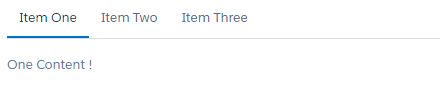
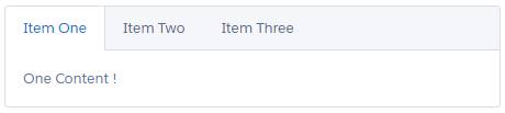
| Base Component Variant | Lightning Design System Class Name | Description |
|---|---|---|
| default | slds-tabs_default | A list of tabs and content areas without borders |
| scoped | slds-tabs_scoped | A list of tabs and content areas with borders |
| vertical | slds-vertical-tabs | A list of tabs that are displayed vertically to the left of the content areas |
Textarea
A lightning:textarea component is an input field for multi-line text input. It uses the styling from Textarea in the Lightning Design System.
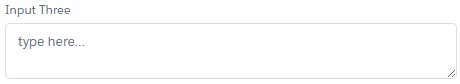
| Base Component Variant | Lightning Design System Class Name | Description |
|---|---|---|
| standard (default) | slds-form-element | A textarea element with a text label |
| label-hidden | N/A | A textarea element with a hidden label |
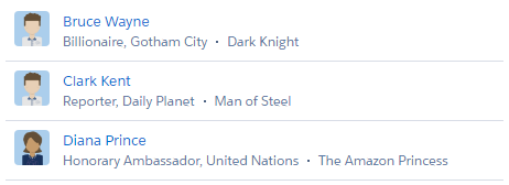
Tile
A lightning:tile component is a group of related information associated with a record. This component does not support variants, but you can pass in the slds-tile_board class to create a board. Similarly, use a definition list in the tile body to create a tile with an icon or use an unordered list to create a list of tiles with avatars. lightning:tile uses the styling from Tiles in the Lightning Design System.

Tree
A lightning:tree component is a visualization of a structure hierarchy. A tree item, also known as a branch, can be expanded or collapsed. Although this component does not support the variant attribute, it uses the styling from Trees in the Lightning Design System.

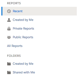
Vertical Navigation
A lightning:verticalNavigation component is a list of links that are one level deep, with support for icons and overflow sections that collapse and expand. Although this component does not support the variant attribute, you can use the compact and shaded attributes to achieve compact spacing and styling for a shaded background. The component supports subcomponents that enable you to add icons, badges, and overflow content.
lightning:verticalNavigation uses the styling from Vertical Navigation in the Lightning Design System.