Lightning Communities Developer Guide
 j
jNewer Version Available
Configure a Custom Theme Layout Component
1. Add an Interface to Your Theme Layout Component
A theme layout component must implement the forceCommunity:themeLayout interface to appear in Community Builder in the area.
Explicitly declare {!v.body} in your code to ensure that your theme layout includes the content layout. Add {!v.body} wherever you want the page’s contents to appear within the theme layout.
Add attributes declared as Aura.Component[] to include regions in the theme layout, which contain the page’s components. You can add components to the regions in your markup or leave regions open for users to drag-and-drop components into. Attributes declared as Aura.Component[] and included in your markup are rendered as open regions in the theme layout that users can add components to. For example:
- search, which contains the Search Publisher component
- profileMenu, which contains the Profile Header component
- navBar, which contains the Navigation Menu component
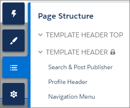
Add the regions to your markup to define where to display them in the theme layout’s body.
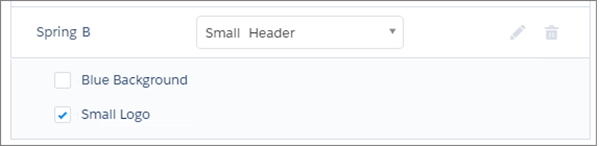
2. Add a Design Resource to Include Theme Properties
You can expose theme layout properties in Community Builder by adding a design resource to your bundle.
First, implement the properties in the component.
Define the theme properties in the design resource to expose the properties in the UI. This example adds a label for the Small Header theme layout along with two checkboxes.
3. Add a CSS Resource to Avoid Overlapping Issues
Add a CSS resource to your bundle to style the theme layout as needed, ideally using standard design tokens.
- Apply CSS
styles.
- Wrap the elements in your custom theme layout in a div
tag.