Experience Cloud Developer Guide
 j
jNewer Version Available
Configure a Custom Theme Layout Component
1. Add an Interface to Your Theme Layout Component
A theme layout component must implement the forceCommunity:themeLayout interface to appear in Experience Builder in the area.
Explicitly declare {!v.body} in your code to ensure that your theme layout includes the content layout. Add {!v.body} wherever you want the page’s contents to appear within the theme layout.
Add attributes declared as Aura.Component[] to include regions in the theme layout, which contain the page’s components. You can add components to the regions in your markup or leave regions open for users to drag-and-drop components into. Attributes declared as Aura.Component[] and included in your markup are rendered as open regions in the theme layout that users can add components to. For example:
1<aura:component implements="forceCommunity:themeLayout">
2<aura:attribute name="myRegion" type="Aura.Component[]"/>
3
4{!v.body}
5
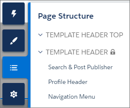
6</aura:component>In Customer Service, the Template Header consists of these locked regions.
- search, which contains the Search Publisher component
- profileMenu, which contains the Profile Header component
- navBar, which contains the Navigation Menu component
1<aura:attribute name="navBar" type="Aura.Component[]" required="false" />Add the regions to your markup to define where to display them in the theme layout’s body.
1<aura:component implements="forceCommunity:themeLayout" access="global" description="Sample Custom Theme Layout">
2    <aura:attribute name="search" type="Aura.Component[]" required="false"/>
3    <aura:attribute name="profileMenu" type="Aura.Component[]" required="false"/>
4    <aura:attribute name="navBar" type="Aura.Component[]" required="false"/>
5    <aura:attribute name="newHeader" type="Aura.Component[]" required="false"/>
6    <div>
7        <div class="searchRegion">
8            {!v.search}
9        </div>
10        <div class="profileMenuRegion">
11            {!v.profileMenu}
12        </div>
13        <div class="navigation">
14            {!v.navBar}
15        </div>
16        <div class="newHeader">
17            {!v.newHeader}
18        </div>
19        <div class="mainContentArea">
20            {!v.body}
21        </div>
22    </div>
23</aura:component>
2. Add a Design Resource to Include Theme Properties
You can expose theme layout properties in Experience Builder by adding a design resource to your bundle.
First, implement the properties in the component.
1<aura:component implements="forceCommunity:themeLayout" access="global" description="Small Header">
2    <aura:attribute name="blueBackground" type="Boolean" default="false"/>
3    <aura:attribute name="smallLogo" type="Boolean" default="false" />
4    ...
Define the theme properties in the design resource to expose the properties in the UI. This example adds a label for the Small Header theme layout along with two checkboxes.
1<design:component label="Small Header">
2    <design:attribute name="blueBackground" label="Blue Background"/>
3    <design:attribute name="smallLogo" label="Small Logo"/>
4</design:component>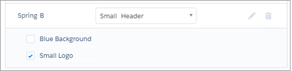
3. Add a CSS Resource to Avoid Overlapping Issues
Add a CSS resource to your bundle to style the theme layout as needed, ideally using standard design tokens.
To avoid overlapping issues with positioned elements, such as dialog boxes or hovers:
- Apply CSS styles.
1.THIS { 2 position: relative; 3 z-index: 1; 4} - Wrap the elements in your custom theme layout in a div tag.
1<div class="mainContentArea">
2    {!v.body}
3</div>