Lightning Communities Developer Guide
 j
jNewer Version Available
Tips and Considerations for Configuring Components for Community Builder
Keep these guidelines in mind when creating components and component bundles for Community Builder.
Components
- Give the component a friendly name using the label attribute in the design file element, such as <design:component label="foo">.
- Design your components to fill 100% of the width, including margins, of the region that they display in.
- Make sure that the component provides an appropriate placeholder behavior in declarative tools if it requires interaction.
- Never let a component display a blank box. Think of how other sites work. For example, Facebook displays an outline of the feed before the feed items come back from the server, which improves the user’s perception of UI responsiveness.
- If the component depends on a fired event, give it a default state that displays before the event fires.
- Style components using standard design tokens to make them consistent with the Salesforce Design System.
- Keep in mind that Lightning Locker is enforced for all Lightning components created in Summer ’17 (API version 40.0) and later.
Attributes
- Use the design file to control which attributes are exposed to Community Builder.
- Make your attributes easy to use and understandable to an administrator. Don’t expose SOQL queries, JSON objects, or Apex class names.
- Give required attributes default values to avoid a poor user experience. When a component that has required attributes with no default values is added to Community Builder, it appears invalid.
- Use basic supported types (string, integer, boolean) for exposed attributes.
- Specify a min and max for integer attributes in the <design:attribute> element to control the range of accepted values.
- Be aware that string attributes can provide a data source with a set of predefined values, allowing the attribute to expose its configuration as a picklist.
- Give attributes a label with a friendly display name.
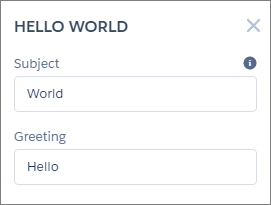
- Include a description to explain the expected data and provide guidelines, such as the
data format or expected range of values. Description text appears as a tooltip in the
property panel.
- To delete a design attribute for a component that implements the forceCommunity:availableForAllPageTypes interface, first remove the interface from the component before deleting the design attribute. Then reimplement the interface. If the component is referenced in a Lightning page, you must remove the component from the page before you can change it.