Lightning Aura Components Developer Guide
 j
jNewer Version Available
Create Custom Content Layout Components for Communities
When you create a custom content layout component in the Developer Console, it appears in
Experience Builder in
the New Page and the Change Layout dialog boxes.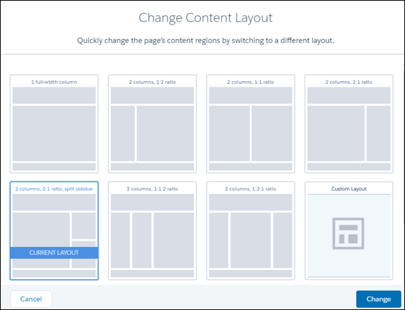
1. Add a New Interface to Your Content Layout Component
To appear in the New Page and the Change Layout dialog boxes in Experience Builder, a content layout component must implement the forceCommunity:layout interface.
1<aura:component implements="forceCommunity:layout" description=”Custom Content Layout” access="global">
2    <aura:attribute name="column1" type="Aura.Component[]" required="false"></aura:attribute>
3    <aura:attribute name="column2" type="Aura.Component[]" required="false"></aura:attribute>
4
5    <div class="container">
6        <div class="contentPanel">
7            <div class="left">
8                {!v.column1}
9            </div>
10            <div class="right">
11                {!v.column2}
12            </div>
13        </div>
14    </div>
15</aura:component>2. Add a CSS Resource to Your Component Bundle
Next, add a CSS resource to style the content layout as needed.
Here’s the sample CSS for our simple two-column content layout.
1.THIS .contentPanel:before,
2.THIS .contentPanel:after {
3    content: " ";
4    display: table;
5}
6.THIS .contentPanel:after {
7    clear: both;
8}
9.THIS .left {
10    float: left;
11    width: 50%;
12}
13.THIS .right {
14    float: right;
15    width: 50%;
16}
CSS resources must be named componentName.css.
3. Optional: Add an SVG Resource to Your Component Bundle
You can include an SVG resource in your component bundle to define a custom icon for the content layout component when it appears in the Experience Builder.
The recommended image size for a content layout component in Experience Builder is 170px by 170px. However, if the image has different dimensions, Experience Builder scales the image to fit.
SVG resources must be named componentName.svg.