LWR Sites for Experience Cloud
 j
jNewer Version Available
How Branding Works in LWR Sites
What Are --dxp Styling Hooks?
Styling hooks use CSS custom properties, which are variables within your CSS that cascade to all descendents within the scope of a selector. --dxp styling hooks are a reduced set of custom properties that map to the lower-level component styling hooks, so you can set a single hook that affects many individual components at once.
These hooks are used in the base components that come with LWR templates, and can also be used in your custom Lightning web components, which means that you can brand your entire site much more quickly.
What Are the Theme Panel Properties?
The Theme panel in Experience Builder provides several branding properties that let you
declaratively control the color, image, text, and site spacing of your site.
In the Colors tab, you can create color palettes that differ from the main site colors, and
apply them to specific sections of the page. And in the Images tab, you can select images
from a Salesforce CMS workspace to create a logo or a browser icon (favicon).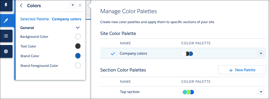
From the Text tab, you can select from dynamic font styles, headings, and decorations for
all types of text, including links and buttons. And in the Site Spacing tab, you can adjust
your site’s maximum content width, section padding, and section column and component spacing
for desktop and mobile views.
How Do --dxp Styling Hooks and Theme Panel Properties Combine?
Each property in the Theme panel in Experience Builder maps to one or more --dxp styling hooks. So if you update a property in the Theme panel, the system automatically updates any Lightning web components that use the hooks associated with that property.

1.my-custom-button-component {
2  background-color: var(--dxp-g-brand);
3  color: var(--dxp-g-brand-contrast);
4}
Now, whenever a user updates the Brand Color property in the Theme panel, the system instantly updates the background color of the button component.