LWR Sites for Experience Cloud
 j
jNewer Version Available
Site Spacing --dxp Styling Hooks
Site spacing allows you to customize the global spacing settings for your site. These
styling hooks combine to provide a consistent spacing experience across each page.
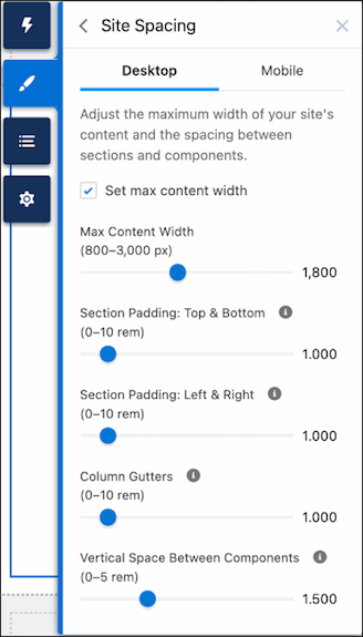
The Site Spacing tab of the Theme panel lets you set the following properties for desktop and
mobile devices.
- Max Content Width
- The maximum width of the inner content for theme regions and page regions.
- Section Padding: Top & Bottom
- The space between the top and bottom of a section’s inner content and the top and bottom of the section container, respectively.
- Section Padding: Left & Right
- The space between the left and right edges of a section’s inner content and the left and right edges of the section container, respectively.
- Column Gutters
- The space between columns for section components with multiple columns. In mobile form factor, this setting controls the vertical space between stacked columns.
- Vertical Space Between Components
- The amount of vertical spacing between components in the same region.
Site spacing properties aren’t limited to what’s exposed through the Theme panel. Along with the declarative properties displayed there, there are dozens of additional component-level site spacing hooks, which you can use to fine-tune spacing in different parts of your page.
For example, let’s say you want your header region to span edge-to-edge instead of being confined to the max-content width set in the Theme panel. To achieve this outcome, you would override the max-width and padding directly for the section in question. Using the --dxp branding hooks enables you to edit the look and feel of any component without violating that component’s style encapsulation.