LWR Sites for Experience Cloud
 j
jNewer Version Available
How --dxp Styling Hooks Map to Theme Panel Properties

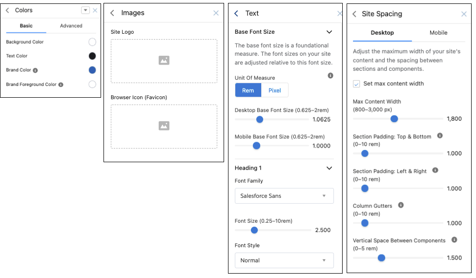
Colors
| These Theme panel properties... | ...map to these --dxp styling hooks |
|---|---|
| Background Color |
--dxp-g-root --dxp-g-root-1 --dxp-g-root-2 --dxp-g-root-3 |
| Text Color |
--dxp-g-root-contrast --dxp-g-root-contrast-1 --dxp-g-root-contrast-2 --dxp-g-root-contrast-3 |
| Brand Color |
--dxp-g-brand --dxp-g-brand-1 --dxp-g-brand-2 --dxp-g-brand-3 |
| Brand Foreground Color |
--dxp-g-brand-contrast --dxp-g-brand-contrast-1 --dxp-g-brand-contrast-2 --dxp-g-brand-contrast-3 |
Images
| These Theme panel properties... | ...map to these --dxp styling hooks |
|---|---|
| Site Logo |
--dxp-s-site-logo-path --dxp-s-site-logo-url |
Text
The Base Font Size property, which maps to the --dxp-s-html-font-size styling hook, defines the font size for the <html> element of your site. Changing the base font proportionally adjusts all font sizes in your site.
1--dxp-s-level-style- text-heading-extra-large for Heading 1
- text-heading-large for Heading 2
- text-heading-medium for Heading 3
- text-heading-small for Heading 4
- body for Paragraph 1
- body-small for Paragraph 2
- button for Button Text
1--dxp-s-text-heading-extra-large-font-family| These Theme panel properties... | ...map to these --dxp styling hooks |
|---|---|
| Base | |
| Font Size | --dxp-s-html-font-size |
| Headings, Body, and Button | |
| Font Family | --dxp-s-level-font-family |
| Font Size | --dxp-s-level-font-size |
| Font Style | --dxp-s-level-font-style |
| Font Weight | --dxp-s-level-font-weight |
| Text Decoration |
--dxp-s-level-text-decoration Doesn’t apply to Button Text. |
| Text Transform | --dxp-s-level-text-transform |
| Line Height | --dxp-s-level-line-height |
| Character Spacing | --dxp-s-level-letter-spacing |
| Link Text | |
| Text Decoration | --dxp-s-link-text-decoration |
| Focus Text Decoration | --dxp-s-link-text-decoration-focus |
| Hover Text Decoration | --dxp-s-link-text-decoration-hover |
Site Spacing
| These Theme panel properties... | ...map to these --dxp styling hooks |
|---|---|
| Desktop Site Spacing | |
| Max Content Width |
--dxp-s-section-columns-max-width --dxp-s-header-content-max-width --dxp-s-footer-content-max-width |
| Section Padding: Top & Bottom |
--dxp-s-section-content-spacing-block-start --dxp-s-section-content-spacing-block-end |
| Section Padding: Left & Right |
--dxp-s-section-content-spacing-inline-start --dxp-s-section-content-spacing-inline-end |
| Column Gutters | --dxp-s-column-spacer-size |
| Vertical Space Between Components | --dxp-s-component-wrapper-spacer-size |
| Mobile Site Spacing | |
| Max Content Width |
--dxp-s-section-columns-max-width-mobile --dxp-s-header-content-max-width-mobile --dxp-s-footer-content-max-width-mobile |
| Section Padding: Top & Bottom |
--dxp-s-section-content-spacing-block-start-mobile --dxp-s-section-content-spacing-block-end-mobile |
| Section Padding: Left & Right |
--dxp-s-section-content-spacing-inline-start-mobile --dxp-s-section-content-spacing-inline-end-mobile |
| Column Gutters | --dxp-s-column-spacer-size-mobile |
| Vertical Space Between Components | --dxp-s-component-wrapper-spacer-size-mobile |