LWR Sites for Experience Cloud
 j
jNewer Version Available
Make a Custom LWR Component Screen-Size Responsive
- Declare an integer, string, or both properties as screen-size responsive.
- Define media queries by using CSS variables for each screen size.
- Specify the property values for each view mode using Experience Builder.
- Republish the site.
In the component’s configuration file, <component>.js-meta.xml, declare an integer, string, or both properties as screen-size responsive by using the screenResponsive attribute with a value of true, and the exposedTo attribute with a value of css.
For example, for the maximum height of a custom LWR Button component
1<targetConfig targets="lightningCommunity_Default">
2    <property name="test" type="String" default="Button"/>
3    <property name="url" type="String"/>
4    <property name="maxHeight" type="Integer" min="0" max="20" default="0" screenResponsive="true" exposedTo="css"/>
5...
For the alignment of a child component of a custom LWR Banner component, for example
1<targetConfig targets="lightningCommunity_Default">
2    <property type="Color" name="borderColor" default="" />
3    <property name="url" type="String"/>
4    <property type="String" name="bannerAlignment" default="center"
5 screenResponsive="true" exposedTo="css"/>In the component’s .css file, use the CSS variable --dxp-c-screensize-property to define a media query, where
screensize can be l (for desktop), m (for tablet), or s (for mobile).
property is the property name in kebab case.
1/* Desktop */
2div {
3    max-height: calc(var(--dxp-c-l-max-height)*1px);
4}
5
6/* Tablet */
7@media only screen and (max-width: 64em) {
8    div {
9        max-height: calc(var(--dxp-c-m-max-height)*1px);
10    }
11}
12/* Mobile */
13@media only screen and (max-width: 47.9375em) {
14    div {
15        max-height: calc(var(--dxp-c-s-max-height)*1px);
16    }
17}
For the alignment (property bannerAlignment) of a custom LWR Banner component, for example
1/* Desktop */
2div {
3justify-content: var(--dxp-c-l-banner-alignment, center);
4}
5
6/* Tablet */
7@media only screen and (max-width: 64em){
8    div {
9        justify-content: var(--dxp-c-m-banner-alignment);
10    }
11}
12
13/* Mobile */
14@media only screen and (max-width: 47.9375em) {
15    div {
16        justify-content: var(--dxp-c-s-banner-alignment);
17    }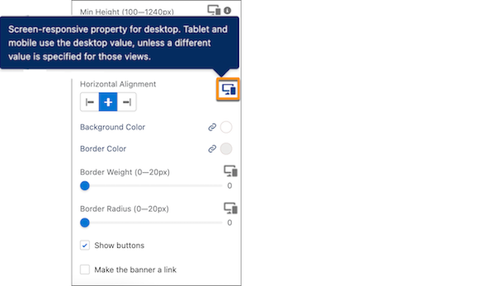
18}After a component property is declared screen-size responsive, its values are specified for each view mode using Experience Builder. In the component’s property editor, an icon indicates those properties. By default, responsive property values set for the larger screen sizes are inherited by the smaller screen sizes. To set a different responsive property value for a smaller screen size, switch between the different view modes and set the corresponding property value there.
After a property’s values are specified for different screen sizes using Experience Builder, republish the site. By republishing, the CSS custom variables are added in the host class of the generated component.
1<dxp_base-button data-component-id="button-0b67" slot="column"
2                 style="--dxp-c-l-max-height:100; --dxp-c-m-max-height:80; --dxp-c-s-max-height:60;">
3...
In this example, using Experience Builder, the component maximum height property is assigned a value of 100 pixels for desktop, 80 pixels for tablet and 60 pixels for mobile.