


LWR Sites for Experience Cloud
 j
jMake a Custom Lightning Web Component Screen-Size Responsive
To make your custom Lightning web component screen responsive, follow these general steps.
1. Declare a Property as Screen-Size Responsive
In the component’s configuration file, componentName.js-meta.xml, declare an integer, string, or both properties as screen-size responsive by using the screenResponsive attribute with a value of true, and the exposedTo attribute with a value of css.
For example, here’s the code for the maximum height of a custom button component.
1<targetConfig targets="lightningCommunity_Default">
2    <property name="test" type="String" default="Button"/>
3    <property name="url" type="String"/>
4    <property name="maxHeight" type="Integer" min="0" max="20" default="0" screenResponsive="true" exposedTo="css"/></targetConfig>
Here’s the code for the alignment of a child component of a custom banner component.
1<targetConfig targets="lightningCommunity_Default">
2    <property type="Color" name="borderColor" default="" />
3    <property name="url" type="String"/>
4    <property type="String" name="bannerAlignment" default="center" screenResponsive="true" exposedTo="css"/>
5</targetConfig>
2. Use CSS Variables to Define Media Queries
In the component’s .css file, use the CSS variable --dxp-c-screensize-property to define a media query, where
screensize can be l (for desktop), m (for tablet), or s (for mobile).
property is the property name in kebab case.
1/* Desktop */
2div {
3    max-height: calc(var(--dxp-c-l-max-height)*1px);
4}
5
6/* Tablet */
7@media only screen and (max-width: 64em) {
8    div {
9        max-height: calc(var(--dxp-c-m-max-height)*1px);
10    }
11}
12/* Mobile */
13@media only screen and (max-width: 47.9375em) {
14    div {
15        max-height: calc(var(--dxp-c-s-max-height)*1px);
16    }
17}Here’s the code for the alignment (property bannerAlignment) of a custom banner component.
1/* Desktop */
2div {
3justify-content: var(--dxp-c-l-banner-alignment, center);
4}
5
6/* Tablet */
7@media only screen and (max-width: 64em){
8    div {
9        justify-content: var(--dxp-c-m-banner-alignment);
10    }
11}
12
13/* Mobile */
14@media only screen and (max-width: 47.9375em) {
15    div {
16        justify-content: var(--dxp-c-s-banner-alignment);
17    }
18}3. Specify the Property Values for Each Screen Size
After you declare a component property as screen responsive, specify the values for each screen size in Experience Builder. In the component’s property panel, an icon indicates screen-responsive properties.
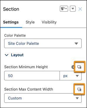
By default, smaller screen sizes inherit the property values that you specify for larger screen sizes. To set a property value for a particular screen size, use the dropdown menu in the navigation bar to switch between view modes.
4. Publish the Site
After you specify a property’s values for different screen sizes, publish the site. When you publish, the CSS custom variables are added in the host class of the generated component.
1<dxp_base-button data-component-id="button-0b67" slot="column"
2                 style="--dxp-c-l-max-height:100; --dxp-c-m-max-height:80; --dxp-c-s-max-height:60;">
3...
In this example, the component maximum height property is assigned a value of 100 pixels for desktop, 80 pixels for tablet, and 60 pixels for mobile.