Lightning Aura Components Developer Guide
 j
jNewer Version Available
Standard Design Tokens for Experience Builder Sites
Use a subset of the standard design tokens to make your components compatible with the
Theme panel in Experience Builder. The Theme panel enables administrators to quickly style an
entire site using these properties. Each property in the Theme panel maps to one or more standard
design tokens. When an administrator updates a property in the Theme panel, the system
automatically updates any Lightning components that use the tokens associated with that branding
property.
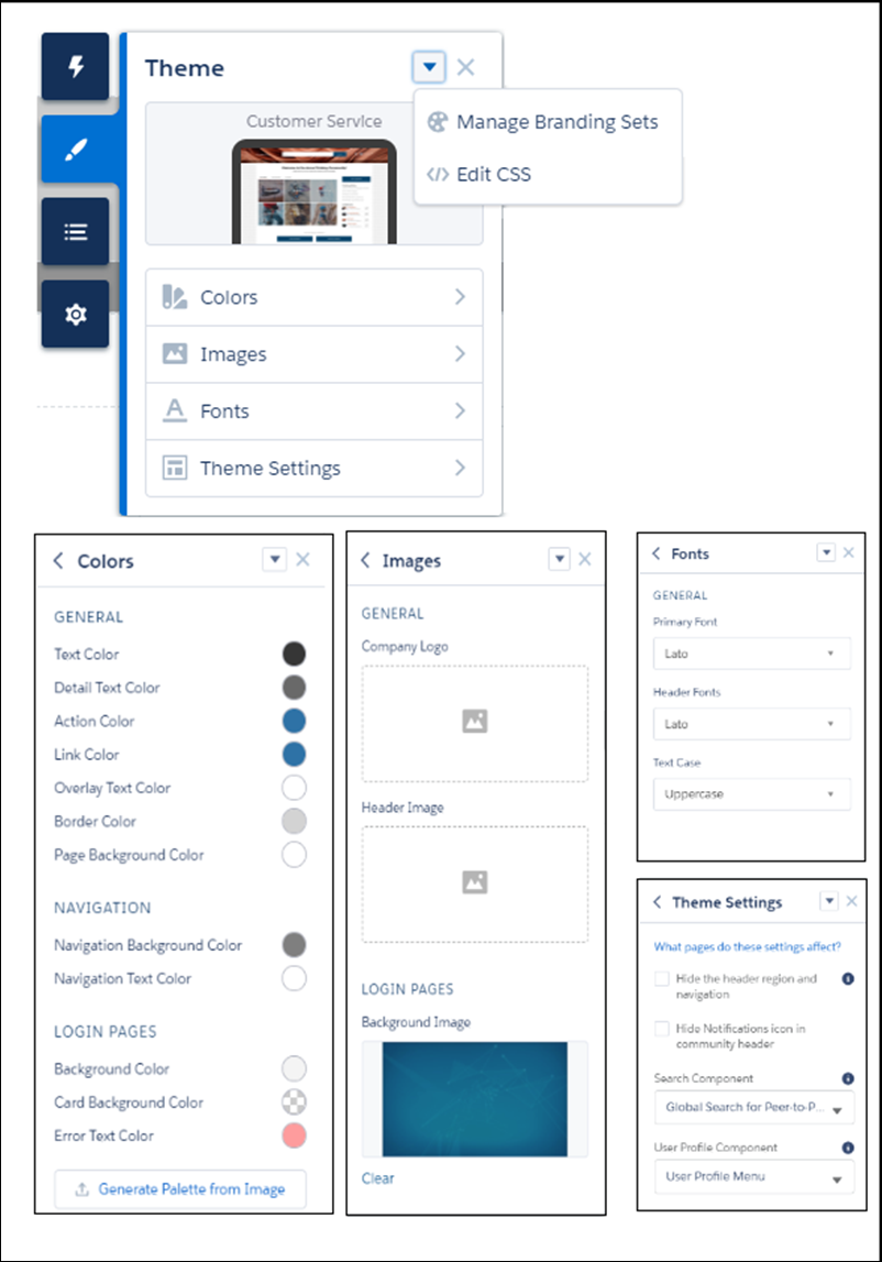
Available Tokens for Experience Builder Sites
For Experience Builder sites, these standard tokens are available when extending from forceCommunity:base.
| These Branding panel properties... | ...map to these standard design tokens |
|---|---|
| Text Color | colorTextDefault |
| Detail Text Color |
|
| Action Color |
|
| Link Color | colorTextLink |
| Overlay Text Color |
|
| Border Color |
|
| Company Logo | brandLogoImage |
| Header Image | headerImageUrl |
| Login Pages Background Image | LoginBackgroundImage |
| Primary Font | fontFamily |
| Text Case | textTransform |
In addition, the following standard tokens are available for derived theme properties in the template. You can indirectly access derived properties when you update the properties in the Theme panel. For example, if you change the Action Color property in the Theme panel, the system automatically recalculates the Action Color Darker value based on the new value.
| These derived branding properties... | ...map to these standard design tokens |
|---|---|
| Action Color Darker (Derived from Action Color) |
|
| Hover Color (Derived from Action Color) |
|
| Link Color Darker (Derived from Link Color) |
|
For a complete list of the design tokens available in the SLDS, see Design Tokens on the Lightning Design System site.