Lightning Aura Components Developer Guide
 j
jNewer Version Available
Create a Custom Lightning Page Template Component
Custom Lightning page template components are supported for record pages, app pages, and Home pages. Each page type has a different interface that the template component must implement.
- lightning:appHomeTemplate
- lightning:homeTemplate
- lightning:recordHomeTemplate
The following steps show you how to build the template component structure for an app page, followed by adding a design resource to configure the template regions and components. After completing these steps, you can create a Lightning page in the Lightning App Builder using the Lightning page template that you configured.
1. Build the Template Component Structure
A custom template is an Aura component bundle that should include at least a .cmp resource and a design resource. The .cmp resource must implement a template interface, and declare an attribute of type Aura.Component[] for each template region. The Aura.Component[] type defines the attribute as a collection of components.
Here’s an example of a two-column app page template .cmp resource that uses the lightning:layout component and the Salesforce Lightning Design System (SLDS) for styling.
1<aura:component implements="lightning:appHomeTemplate" description="Main column
2 and right sidebar. On a phone, the regions are of equal width">
3    <aura:attribute name="left" type="Aura.Component[]" />
4    <aura:attribute name="right" type="Aura.Component[]" />
5
6    <div>
7        <lightning:layout>
8            <lightning:layoutItem flexibility="grow"
9                                  class="slds-m-right_small">
10                {!v.left}
11            </lightning:layoutItem>
12            <lightning:layoutItem size="{! $Browser.isDesktop ? '4' : '6' }"
13                                  class="slds-m-left_small">
14                {!v.right}
15            </lightning:layoutItem>
16        </lightning:layout>
17    </div>
18
19</aura:component>
The description attribute on the aura:component tag is optional, but recommended. If you define a description, it displays as the template description beneath the template image in the Lightning App Builder new page wizard.
2. Configure Template Regions and Components in the Design Resource
The design resource controls what kind of page can be built on the template. The design resource specifies:
- What regions a page that uses the template must have.
- What kinds of components can be put into the page’s regions.
- How much space the component takes on the page based on the type of device that it renders on.
- What device form factors the component supports.
Regions inherit the interface assignments that you set for the overall page, as set in the .cmp resource.
Specify regions and components using these tags:
- flexipage:template
- This tag has no attributes and acts as a wrapper for the flexipage:region tag. Text literals are not allowed.
- flexipage:region
- This tag defines a region on the template and has these attributes. Text literals are
not allowed.
Attribute Description name The name of an attribute in the .cmp resource marked type Aura.Component[]. Flags the attribute as a region. label The label of your region. This label appears in the template switching wizard in the Lightning App Builder when users map region content to a new template. defaultWidth Specifies the default width of the region. This attribute is required for all regions. Valid values are: Small, Medium, Large, and Xlarge. - flexipage:formfactor
- Use this tag to specify how much space the component takes on the page based on the
type of device that it renders on. Add this tag as a child of the flexipage:region tag. Use multiple flexipage:formfactor tags per flexipage:region to define flexible behavior across form factors.
Attribute Description type The type of form factor or device the template renders on, such as a desktop or tablet. Valid values are: Medium (tablet), and Large (desktop). Because the only reasonable width value for a Small form factor (phone) is Small, you don’t have to specify a Small type. Salesforce takes care of that association automatically. width The available size of the area that the component in this region has to render in. Valid values are: Small, Medium, Large, and Xlarge. For example, in this code snippet, the region has a large width to render in when the template is rendered on a large form factor. The region has a small width to render in when the template is rendered on a medium form factor.1<flexipage:region name="right" label="Right Region" defaultWidth="Large"> 2 <flexipage:formfactor type="Large" width="Large" /> 3 <flexipage:formfactor type="Medium" width="Small" /> 4</flexipage:region>
1<design:component label="Two Region Custom App Page Template">
2    <flexipage:template >
3        <!-- The default width for the "left" region is "MEDIUM". In tablets,
4        the width is "SMALL" -->
5            <flexipage:region name="left" label="Left Region" defaultWidth="MEDIUM">
6                <flexipage:formfactor type="MEDIUM" width="SMALL" />
7            </flexipage:region>
8            <flexipage:region name="right" label="Right Region" defaultWidth="SMALL" />
9       </flexipage:template>
10</design:component>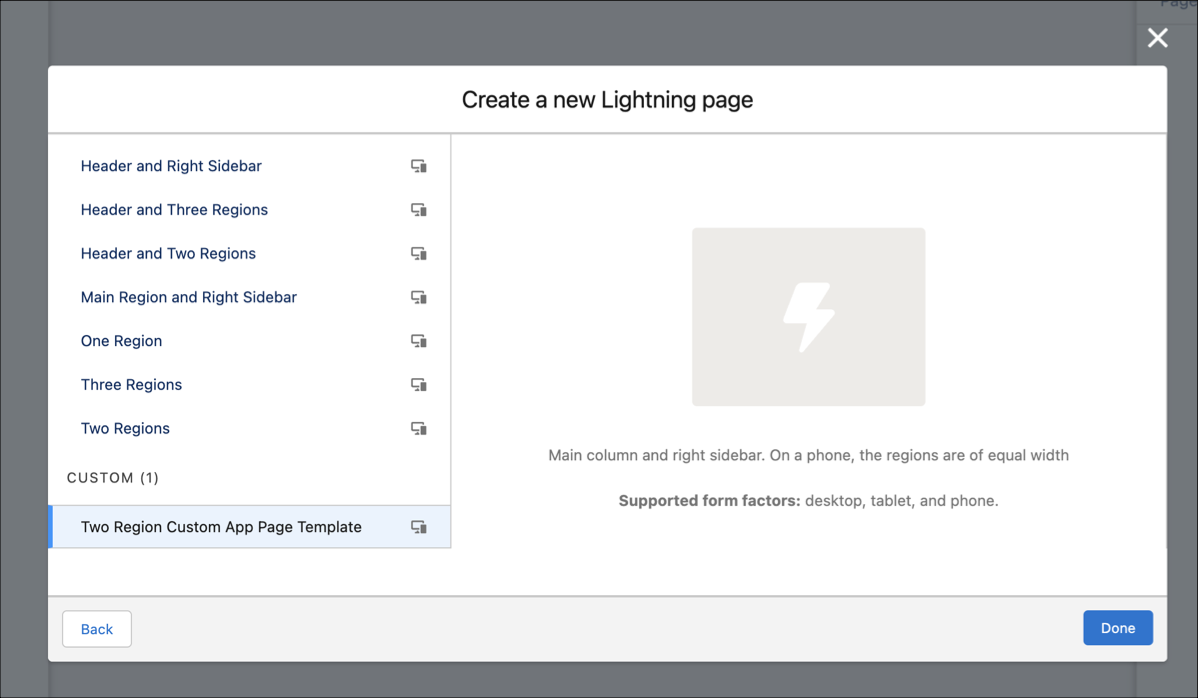
Specify supported devices for an app or record page template component with the <design:suppportedFormFactors> tag set. When you create a custom template component for an app page, you must assign it both the Large (desktop) and Small (phone) form factors.
1<design:component label="Two Region Custom App Page Template">
2    <flexipage:template >
3        <!-- The default width for the "left" region is "MEDIUM". In tablets,
4        the width is "SMALL" -->
5            <flexipage:region name="left" label="Left Region" defaultWidth="MEDIUM">
6                <flexipage:formfactor type="MEDIUM" width="SMALL" />
7            </flexipage:region>
8            <flexipage:region name="right" label="Right Region" defaultWidth="SMALL" />
9       </flexipage:template>
10       <design:supportedFormFactors>
11        <design:supportedFormFactor type="Small"/>
12        <design:supportedFormFactor type="Large"/>
13    </design:supportedFormFactors>
14</design:component>
3. (Optional) Add a Template Image
If you added a description to your .cmp resource, both it and the template image display when a user selects your template in the Lightning App Builder new page wizard.
You can use an SVG resource to define the custom template image.
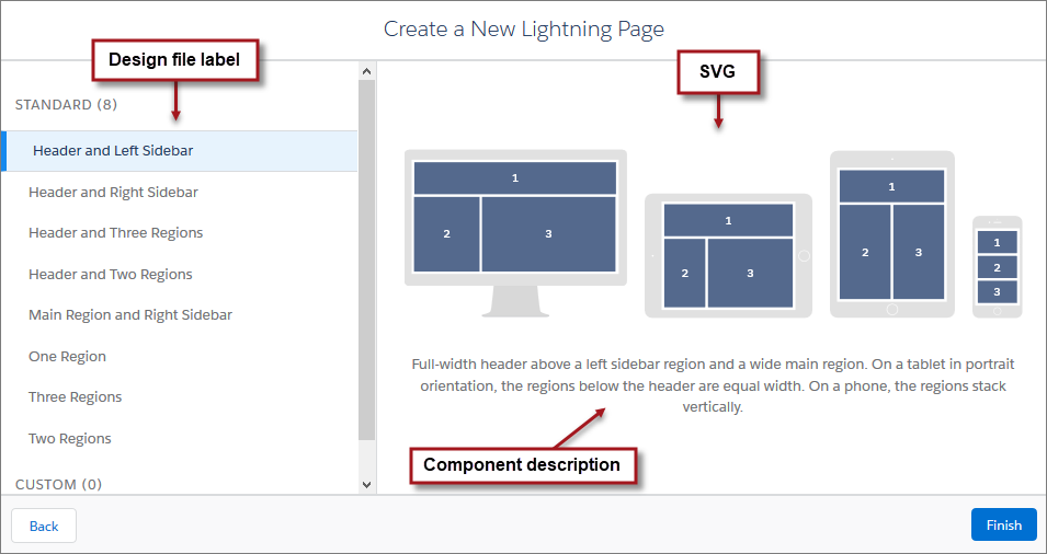
We recommend that your SVG resource is no larger than 150 KB, and no more than 160 px high and 560 px wide.