Standard Design Tokens for Experience Builder Sites
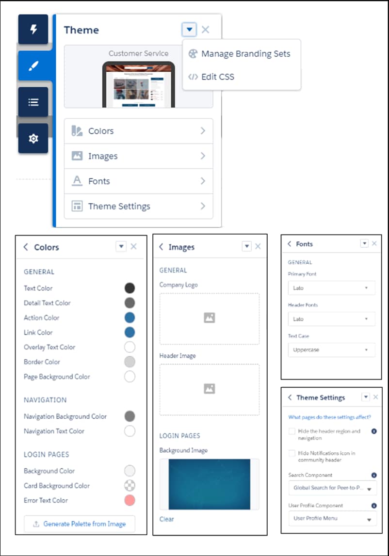
Use a subset of the standard design tokens to make your components compatible with the Theme panel in Experience Builder. The Theme panel enables administrators to quickly style an entire site using these properties. Each property in the Theme panel maps to one or more standard design tokens. When an administrator updates a property in the Theme panel, the system automatically updates any Lightning components that use the tokens associated with that branding property.
Salesforce recommends that you use Styling Hooks instead of design tokens if possible. While existing design tokens still work, styling hooks are the future of customization for Lightning web components and Aura components. See Replace Design Tokens with Styling Hooks.
Important
Available Tokens for Experience Builder Sites
For Experience Builder sites, these standard tokens are available when extending from forceCommunity:base.
The standard token values evolve along with SLDS. Available tokens and their values can change without notice.
Important
Design tokens are not available for navigation branding properties. To add branding to navigation properties, override the navigation bar within the custom components. See CSS Overrides Migration for the Navigation Menu.
Important
These Branding panel properties…
…map to these standard design tokens
Text Color
colorTextDefault
Detail Text Color
colorTextActionLabel, colorTextLabel, colorTextPlaceholder, or colorTextWeak
Action Color
colorBackgroundButtonBrand, colorBorderBrand, colorBorderButtonBrand, colorBrand, colorTextBrand, colorTextTabLabelSelected, or colorTextActionLabelActive
Link Color
colorTextLink
Overlay Text Color
colorTextButtonBrand, colorTextButtonBrandHover, or colorTextInverse
Border Color
colorBorder, colorBorderButtonDefault, colorBorderInput, or colorBorderSeparatorAlt
Company Logo
brandLogoImage
Header Image
headerImageUrl
Login Pages Background Image
LoginBackgroundImage
Primary Font
fontFamily
Text Case
textTransform
As of Summer ’18 colorBackgroundHighlight is no longer mapped to Action Color.
Note
In addition, the following standard tokens are available for derived theme properties in the template. You can indirectly access derived properties when you update the properties in the Theme panel. For example, if you change the Action Color property in the Theme panel, the system automatically recalculates the Action Color Darker value based on the new value.
These derived branding properties…
…map to these standard design tokens
Action Color Darker (Derived from Action Color)
colorBackgroundButtonBrandActive or colorBackgroundButtonBrandHover
Hover Color (Derived from Action Color)
colorBackgroundButtonDefaultHover, colorBackgroundRowHover, colorBackgroundRowSelected, or colorBackgroundShade
Link Color Darker (Derived from Link Color)
colorTextLinkActive or colorTextLinkHover
For a complete list of the design tokens available in the SLDS, see Design Tokens on the Lightning Design System site.


 j
j