Override Component Branding in LWR Sites with Custom CSS
Occasionally, styling hooks are insufficient to style a component exactly the way you want. In this situation, you can use CSS selectors to target and style preapproved “parts” within a component.
Use custom CSS sparingly and avoid targeting DOM elements without a part attribute. Doing so is brittle because changes to the component’s internal DOM structure is likely to break hard-coded CSS selectors. Additionally, Salesforce Customer Support can’t help resolve any issues with custom CSS.
Warning
Target Component Instances
Every component has a data-component-id attribute with a unique value per component instance. Using this value, you can easily target the component instance and override styling hooks or add new CSS altogether.
To determine the exact attribute value of a component, inspect the DOM of your app—for example, with Chrome DevTools.
Let’s say a section on the page has the HTML markup <community_layout-section data-component-id="section-adfb">. This code sample uses the value to override the component’s default styling.
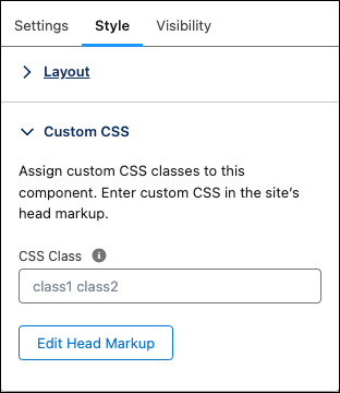
You can also specify a custom CSS class on a component’s property panel to target that component.
Target Parts Within a Component
Most components are made up of many DOM elements, which means that you can style a specific element or part within a component. Component parts are exposed by DXP with the following format:


 j
j