


 j
jVisualforce Charting Limitations and Considerations
Building a Complex Chart with Visualforce Charting
Previous Versions
Use Visualforce charting to assemble a variety of chart components into a complex chart that represents multiple sets of related data. The end result can be quite sophisticated and attention getting.
The examples later in this topic use the following controller, which is a modest expansion of the controller in A Simple Charting Example. It includes more data, and methods that can be called by remote JavaScript invocation:
1public class ChartController {
2    // Return a list of data points for a chart
3    public List<Data> getData() {
4        return ChartController.getChartData();
5    }
6
7    // Make the chart data available via JavaScript remoting
8    @RemoteAction
9    public static List<Data> getRemoteData() {
10        return ChartController.getChartData();
11    }
12
13    // The actual chart data; needs to be static to be
14    // called by a @RemoteAction method
15    public static List<Data> getChartData() {
16        List<Data> data = new List<Data>();
17        data.add(new Data('Jan', 30, 90, 55));
18        data.add(new Data('Feb', 44, 15, 65));
19        data.add(new Data('Mar', 25, 32, 75));
20        data.add(new Data('Apr', 74, 28, 85));
21        data.add(new Data('May', 65, 51, 95));
22        data.add(new Data('Jun', 33, 45, 99));
23        data.add(new Data('Jul', 92, 82, 30));
24        data.add(new Data('Aug', 87, 73, 45));
25        data.add(new Data('Sep', 34, 65, 55));
26        data.add(new Data('Oct', 78, 66, 56));
27        data.add(new Data('Nov', 80, 67, 53));
28        data.add(new Data('Dec', 17, 70, 70));
29        return data;
30    }
31
32    // Wrapper class
33    public class Data {
34        public String name { get; set; }
35        public Integer data1 { get; set; }
36        public Integer data2 { get; set; }
37        public Integer data3 { get; set; }
38        public Data(String name, Integer data1, Integer data2, Integer data3) {
39            this.name = name;
40            this.data1 = data1;
41            this.data2 = data2;
42            this.data3 = data3;
43        }
44    }
45}
The @RemoteAction method isn’t used in the chart examples in this topic, but it illustrates how you can re-use your data generation method for both server-side and JavaScript remoting methods.
Note
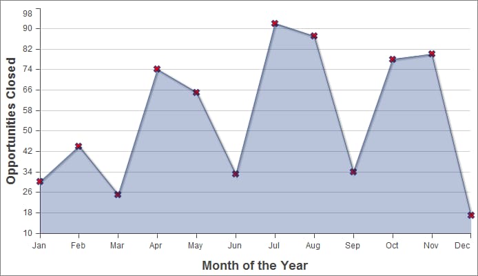
Here is a simple line chart that graphs one of the three data series in the data set, “Opportunities Closed-Won,” over a calendar year:
1<apex:page controller="ChartController">
2    <apex:chart height="400" width="700" data="{!data}">
3    	  <apex:axis type="Numeric" position="left" fields="data1"
4            title="Opportunities Closed" grid="true"/>
5    	  <apex:axis type="Category" position="bottom" fields="name"
6            title="Month of the Year">
7    	</apex:axis>
8    	<apex:lineSeries axis="left" fill="true" xField="name" yField="data1"
9          markerType="cross" markerSize="4" markerFill="#FF0000"/>
10   </apex:chart>
11</apex:page>
Things to note about this example:
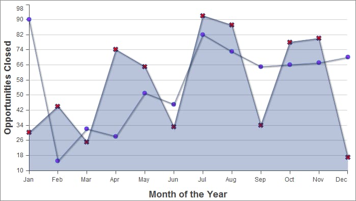
<apex:lineSeries> component, is bound to a specific axis.Adding a second data series with the same unit of measure is simple. Here, the “Opportunities Closed-Lost” data set is added as a second line series:
1<apex:page controller="ChartController">
2    <apex:chart height="400" width="700" data="{!data}">
3    	  <apex:axis type="Numeric" position="left" fields="data1,data2"
4            title="Opportunities Closed" grid="true"/>
5    	  <apex:axis type="Category" position="bottom" fields="name"
6            title="Month of the Year">
7    	  </apex:axis>
8    	  <apex:lineSeries axis="left" fill="true" xField="name" yField="data1"
9        	  markerType="cross" markerSize="4" markerFill="#FF0000"/>
10    	  <apex:lineSeries axis="left" xField="name" yField="data2"
11            markerType="circle" markerSize="4" markerFill="#8E35EF"/>
12    </apex:chart>
13</apex:page>
The important thing to note is how both data1 and data2 fields are bound to the vertical <apex:axis> by the fields attribute of that component. This allows the charting engine to determine appropriate scale and tick marks for the axis.
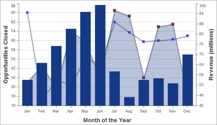
To add another data series, but charted against a different set of units, you need to add a second vertical axis. The following example shows a data series, “Revenue by Month,” added as a bar chart:
1<apex:page controller="ChartController">
2    <apex:chart height="400" width="700" data="{!data}">
3    	  <apex:axis type="Numeric" position="left" fields="data1,data2"
4            title="Opportunities Closed" grid="true"/>
5        <apex:axis type="Numeric" position="right" fields="data3"
6            title="Revenue (millions)"/>
7    	  <apex:axis type="Category" position="bottom" fields="name"
8            title="Month of the Year"/>
9    	  <apex:lineSeries axis="left" fill="true" xField="name" yField="data1"
10        	  markerType="cross" markerSize="4" markerFill="#FF0000"/>
11    	  <apex:lineSeries axis="left" xField="name" yField="data2"
12            markerType="circle" markerSize="4" markerFill="#8E35EF"/>
13        <apex:barSeries orientation="vertical" axis="right"
14            xField="name" yField="data3"/>
15    </apex:chart>
16</apex:page>
Notice the following:
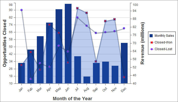
You can improve the comprehensibility of the chart by adding a chart legend, series labels, and by making sure that chart labels are readable:
1<apex:page controller="ChartController">
2    <apex:chart height="400" width="700" data="{!data}">
3        <apex:legend position="right"/>
4        <apex:axis type="Numeric" position="left" fields="data1"
5            title="Opportunities Closed" grid="true"/>
6        <apex:axis type="Numeric" position="right" fields="data3"
7            title="Revenue (millions)"/>
8        <apex:axis type="Category" position="bottom" fields="name"
9            title="Month of the Year">
10            <apex:chartLabel rotate="315"/>
11        </apex:axis>
12        <apex:barSeries title="Monthly Sales" orientation="vertical" axis="right"
13            xField="name" yField="data3">
14            <apex:chartTips height="20" width="120"/>
15        </apex:barSeries>
16        <apex:lineSeries title="Closed-Won" axis="left" xField="name" yField="data1"
17            fill="true" markerType="cross" markerSize="4" markerFill="#FF0000"/>
18        <apex:lineSeries title="Closed-Lost" axis="left" xField="name" yField="data2"
19            markerType="circle" markerSize="4" markerFill="#8E35EF"/>
20    </apex:chart>
21</apex:page>
Note the following about the additions:
<apex:barSeries> component is before the two <apex:lineSeries> components.<apex:legend> component can be in any of four positions: left, right, top, or bottom. The legend is placed within the boundary of the chart; in this example the legend has compressed the horizontal width of the chart itself.title attribute.<apex:chartLabel> component is enclosed in the <apex:axis> component it affects.<apex:chartTips> component enables rollover tool tips that provide additional information about each data point in the series that encloses it.See Also
j