Elements
Visual components like text or for user input, such as a button or checkbox.
Elements represent the smallest pieces of a view. Elements must be rendered within layout components.
When working with events from the App Home page, put your elements in an actions block.
Available in: Section | Actions
An interactive button. The button can be a trigger for anything from opening a simple link to starting a complex workflow.

Examples
Render a button within an actions block.
Keys
| Key | Type | Required | Description |
|---|---|---|---|
definition | String | Yes | The value must be button. |
properties | Object | Yes | The component’s properties. |
properties.label | String, Plain Text, Expression | No | The button label. |
properties.name | String, Expression | Yes | The name applied to the button element. The name is used to retrieve the value on submission. |
properties.value | String, Expression | No | The value to send along with the interaction payload. |
properties.style | String. Possible values, primary, danger, null | No | The button style. The default value is null. |
properties.url | String, Expression | No | A URL that’s opened on button click. URLs must use a valid protocol scheme such as http:// or https://. |
properties.confirm | Confirm | No | A confirmation dialog to display after a button click. |
events | Object | No | Events that trigger an action. |
events.onclick | Object | No | Fires when a user clicks the button. |
events.onclick.definition | String | No | The identifier of the action that executes when the event fires. |
events.onclick.properties | Object | No | Properties to pass to the action. |
Available in: Section | Actions | Input
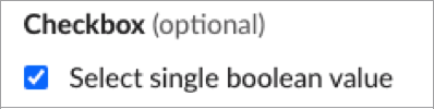
A checkbox that allows a user to specify a single boolean value.
Examples
This example shows a checkbox that defaults to selected.
This example shows checkboxes that render as selected or unselected, a checkbox with a label, and a required checkbox.
Keys
| Key | Type | Required | Description |
|---|---|---|---|
definition | String | Yes | The value must be checkbox. |
properties | Object | Yes | The component’s properties. |
properties.name | String, Expression | Yes | The name applied to the checkbox input. The name is used to retrieve the value on submission. |
properties.value | Boolean, Expression | No | The initial value applied to the checkbox input. Defaults to false. |
properties.label | String, Expression | No | The label for the checkbox input. |
properties.description | String, Expression | No | The description for the checkbox input. |
properties.confirm | Confirm, Expression | No | A confirmation dialog to display after a checkbox is selected. |
events | Object | No | Events that trigger an action. |
events.onchange | Object | No | Fires when a checkbox is ticked or unticked. |
events.onchange.definition | String | No | The identifier of the action that executes when the event fires. |
events.onchange.properties | Object | No | Properties to pass to the action. |
Available in: Section | Actions | Input
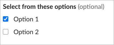
A checkbox group that allows a user to choose multiple items from a list of possible options.
Example
On an initial render, Option 1 is selected and Option 2 isn’t selected by default.
Keys
| Key | Type | Required | Description |
|---|---|---|---|
definition | String | Yes | The value must be checkboxGroup. |
properties | Object | Yes | The component’s properties. |
properties.name | String, Expression | Yes | The name applied to the checkbox inputs. The name is used to retrieve the values on submission. |
properties.options | Options | Yes | A list of checkbox items. |
properties.confirm | Confirm, Expression | No | A confirmation dialog to display after a checkbox is selected. |
events | Object | No | Events that trigger an action. |
events.onchange | Object | No | Fires when a checkbox is ticked or unticked. |
events.onchange.definition | String | No | The identifier of the action that executes when the event fires. |
events.onchange.properties | Object | No | Properties to pass to the action. |
Available in: Section | Actions | Input
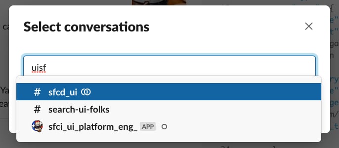
This multi-select menu populates its options with a list of public and private channels, DMs, and multi-party DMs that are visible to the current user in the active workspace.
Example
This example selects a single conversation.
This example allows multiple selections.
This example filters to include only public and private channels.
This example filters to include direct messages and exclude bots.
This example shows a comprehensive usage of the conversationsSelect component.
Keys
| Key | Type | Required | Description |
|---|---|---|---|
definition | String | Yes | The value must be conversationsSelect. |
properties | Object | Yes | The component’s properties. |
properties.name | String, Expression | Yes | The name applied to the conversations select component. The name is used to retrieve the value on submission. |
properties.placeholder | String, Expression, Plain Text | No | A placeholder value to display when nothing is selected. |
properties.multiselect | Boolean, Expression | No | Indicates whether the component supports multiple selections. The default value is false. |
properties.maxSelection | Number, Expression | No | If multiselect is true, you can optionally specify maxSelection. The maximum number of conversations that can be selected. The minimum value is 1. |
properties.defaultCurrent | Boolean, Expression | No | Pre-populates the select with the conversation the user was viewing when they opened the modal. The default value is false. |
properties.filter | Filter, Expression | No | Filter the list of available conversations. |
properties.confirm | Confirm, Expression | No | A confirmation dialog to display after a conversation is selected. |
events | Object | No | Events that trigger an action. |
properties.value | String, Array, Expression | No | Indicates the conversation, or conversations if multiselect is true, selected on an initial render. Must match the ID of a conversation in Slack. If the value is an array, it’s an array of strings. If defaultCurrent is also supplied, value takes precedence. |
events.onchange | Object | No | Fires when a conversation is selected, or the multi-select menu is confirmed. |
events.onchange.definition | String | No | The identifier of the action that executes when the event fires. |
events.onchange.properties | Object | No | Properties to pass to the action. |
Available in: Section | Actions | Input
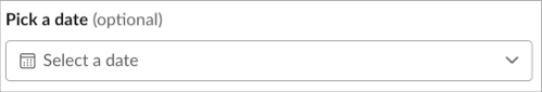
An element that lets users select a date from a calendar.
The date picker doesn’t currently support multiple time zones, which can lead to issues when editing and submitting values. For example, if the field value is stored as 11:00 pm PST on 3/9/2022, the date picker displays the date incorrectly as 3/9/2022 for users in EST. The date picker does not display the time zone or convert the date to the local time zone.
Examples
This example shows a date picker that displays a confirmation dialog after a date is selected.
This example shows various ways to use a date picker.
Keys
| Key | Type | Required | Description |
|---|---|---|---|
definition | String | Yes | The value must be datepicker. |
properties | Object | Yes | The component’s properties. |
properties.value | String, Expression | No | The initial date that’s selected when the date picker is loaded in the format YYYY-MM-DD. |
properties.placeholder | String, Plain Text, Expression | No | Text used as a placeholder when the value is empty. |
properties.name | String, Expression | Yes | A name applied to the date picker. The name is used to retrieve the values on submission. |
properties.confirm | Confirm, Expression | No | A confirmation dialog to display after a date is selected. |
events | Object | No | Events that trigger an action. |
events.onchange | Object | No | Fires when a date is chosen and the date picker closes. |
events.onchange.definition | String | No | The identifier of the action that executes when the event fires. |
events.onchange.properties | Object | No | Properties to pass to the action. |
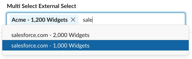
This component is a lookup that fetches options from a data source when a user enters text into the field. Use List<Slack.Option> or List<Slack.OptionGroup> to create your data source and return it as a Slack.OptionDataResponse object.
Available in: Section | Actions | Input
Example
This example displays a list of accounts by name in an external select component.
Return data to the External Select component using Slack.OptionDataResponse.
This example is from view_opportunity_by_account.view in the sample app.
To allow multiple selections, set the multiselect property to true.
Pre-selecting renders the select component with a selected value. To pre-select a value, use one of these methods.
- Bind an expression directly into the
valueproperty. This expression must point to a dataProvider that provides preselected values (see Implement a Data Provider). - Add an array of pre-selected options in the
valueproperty, or a singleSlack.OptionDataResponseobject.
Pre-selected Option Expression Example
Pre-selected Option Inline Array Example
Keys
| Key | Type | Required | Description |
|---|---|---|---|
definition | String | Yes | The value must be externalSelect. |
properties | Object | Yes | The component’s properties. |
properties.name | String, Expression | Yes | The name applied to the external select items. The name is used to retrieve the value on submission. |
properties.placeholder | String, Expression, Plain Text | No | A placeholder value for the externalSelect menu to display when nothing is selected. The default placeholder value is “Select option(s)”. |
properties.value | Object, Array of objects, Expression | No | Provide a single option object or array of options to set as pre-selected. |
properties.value.text | String, Plain Text, Mrkdwn | Yes | A label for the selected item. |
properties.value.value | String, Plain Text | No | The value of the selected item. |
properties.multiselect | Boolean, Expression | No | Indicates whether the external select component supports multiple selections. The default value is false. |
properties.maxSelection | Number, Expression | No | If multiselect is true, you can optionally specify maxSelection. The maximum number of options that can be selected. The minimum value is 1. |
properties.minQueryLength | Number, Expression | No | The minimum number of characters that a user must enter into the external select input before results are queried and updated in available selections. The minimum value is 1. |
properties.confirm | Confirm, Expression | No | A confirmation dialog to display after a radio button is selected. |
properties.datasource | String, Object, Expression | Yes | A valid data provider identifier string or object containing an identifier and properties to be passed into a data provider. |
properties.datasource.definition | String, Object, Expression | Yes | A valid data provider identifier is required to be present within the datasource if the datasource takes the form of an Object. |
properties.datasource.properties | Object, Expression | No | Contains any parameters to be passed into the option data provider. |
Available in: Section | Context
Display an image alongside additional content, such as text.
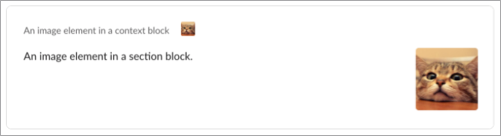
For a component that holds only an image, see image. Both image components use - definition: image. However, they’re available in different containing components, and the layout image has a title property.
Example
This example is an image within a context component.
Keys
| Key | Type | Required | Description |
|---|---|---|---|
definition | String | Yes | The value must be image. |
properties | Object | Yes | The component’s properties. |
properties.url | String, Expression | Yes | The URL of the image to display. URLs must use a valid protocol scheme such as http:// or https://. |
properties.altText | String, Expression | Yes | A plain text description of the image. |
Available in: Section | Actions
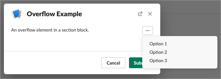
An overflow menu in a section or actions component.
Examples
This example creates an overflow menu with 3 options.
This example creates an overflow menu in an actions block.
Keys
| Key | Type | Required | Description |
|---|---|---|---|
definition | String | Yes | The value must be overflow. |
properties | Object | Yes | The component’s properties. |
properties.name | String, Expression | Yes | A name applied to the overflow element, used to retrieve the value when a menu option is selected. |
properties.options | Options | Yes | A list of options to display in the overflow menu. A minimum of 2 options is required and a maximum of 5 options is allowed. |
properties.confirm | Confirm, Expression | No | A confirmation dialog to display after a checkbox is selected. |
events | Object | No | Events that trigger an action. |
events.onclick | Object | No | Fires when an item from the overflow menu is clicked. |
events.onclick.definition | String | No | The identifier of the action that executes when the event fires. |
events.onclick.properties | Object | No | Properties to pass to the action. |
Available in: Section | Actions | Input
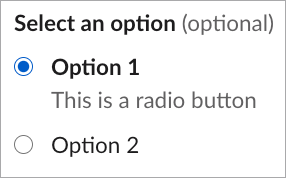
A radio button group that allows a user to choose one item from a list of possible options.
Example
On an initial render, Option 1 is selected.
Keys
| Key | Type | Required | Description |
|---|---|---|---|
definition | String | Yes | The value must be radioGroup. |
properties | Object | Yes | The component’s properties. |
properties.name | String, Expression | Yes | The name applied to the radio button inputs. The name is used to retrieve the values on submission. |
properties.value | String, Expression | No | Optionally indicates the value to select on an initial render. Must match the identifier of one of the items passed in to the options field. |
properties.options | Options | Yes | A list of radio button items. |
properties.confirm | Confirm, Expression | No | A confirmation dialog to display after a radio button is selected. |
events | Object | No | Events that trigger an action. |
events.onchange | Object | No | Fires when the selected radio in a group of radio buttons is changed. |
events.onchange.definition | String | No | The identifier of the action that executes when the event fires. |
events.onchange.properties | Object | No | Properties to pass to the action. |
Available in: Section | Actions | Input
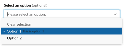
A select menu, like a standard HTML <select> tag, creates a dropdown menu with a list of options for a user to choose. The select menu also includes type-ahead functionality, where a user can type a part or all of an option string to filter the list.
This example shows a select menu in a modal, with option values specified by options. The optional value parameter provides the input string entered into the select component that’s used to perform the lookup. The value you provide preselects an option from the options identifier or from your data provider.
Alternatively, you can pass an expression to value and use a data provider that returns List<Slack.Option> or List<Slack.OptionGroup>.
Pass in the accountId property to the Apex class.
This example is from view_opportunity_by_account.view in the sample app.
Place the select component in an actions block when using it from the App Home page.
On initial render, Option 1 is selected.
Keys
| Key | Type | Required | Description |
|---|---|---|---|
definition | String | Yes | The value must be select. |
properties | Object | Yes | The component’s properties. |
properties.name | String, Expression | Yes | The name applied to the select items. The name is used to retrieve the value on submission. |
properties.placeholder | String, Expression, Plain Text | No | A placeholder value for the select menu to display when nothing is selected. Use a descriptive placeholder like “Select a status” to convey the field’s purpose. If you don’t include a placeholder, screen readers override the label and announce “Pick an option”. |
properties.value | String, Array of strings, Expression | No | Optionally indicates the value, or values if multiselect, selected on an initial render. Must match the identifier of one of the options passed to options or optionsGroup. |
properties.options | Options | No | Provide a value for options or optionGroups, but not both. A list of selectable items. If more than 100 options are provided, the options items are automatically split into optionGroups of 100 options each. |
properties.optionGroups | Option Groups | No | Provide a value for options or optionGroups, but not both. A list of select groups. Each group accepts a label and an array of options. Maximum of 100 options per group. |
properties.multiselect | Boolean, Expression | No | Indicates whether the select component supports multiple selections. The default value is false. |
properties.maxSelection | Number, Expression | No | If multiselect is true, you can optionally specify maxSelection. The maximum number of options that can be selected. The minimum value is 1. |
properties.valueDelimiter | String, Expression | No | If multiselect is true and value resolves to a String that represents a delimited list, specify valueDelimiter with the appropriate list delimiter. For example, a value of option_1;option2 is delimited by ;. |
properties.confirm | Confirm, Expression | No | A confirmation dialog to display after an option is selected. |
events | Object | No | The events on the select component that trigger actions to execute. |
events.onchange | Object | No | An object that defines the action to take when the onchange event fires and the properties to pass to the action. |
events.onchange.definition | String | No | The action that executes when a user selects an option. |
events.onchange.properties | Object | No | The properties to pass to the action. |
Available in: Context
Use this component to render text in a context component only.
Keys
| Key | Type | Required | Description |
|---|---|---|---|
definition | String | Yes | The value must be text. |
properties | Object | Yes | The component’s properties. |
properties.text | String, Expression, Plain Text, Mrkdwn | Yes | The text for the component. |
Available in: Input
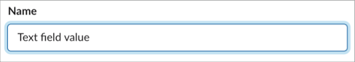
A text input, similar to the HTML <input> tag, creates a field where a user can enter freeform data. It can appear as a single-line field or a larger textarea using the multiline flag.
Text input fields don’t currently support the onchange event. You can trigger an interaction payload only by pressing the submit button on your modal.
Example
Keys
| Key | Type | Required | Description |
|---|---|---|---|
definition | String | Yes | The value must be textInput. |
properties | Object | Yes | The component’s properties. |
properties.name | String Expression | No | An identifier used to retrieve the value on submission. |
properties.placeholder | String, Expression, Plain Text | No | A placeholder value for the select menu to display when nothing is selected. |
properties.value | String, Expression | No | The initial value for the input field. |
properties.minLength | Integer, Expression | No | The minimum number of characters allowed on form submission. |
properties.maxLength | Integer, Expression | No | The maximum number of characters allowed on form submission. |
properties.multiline | Boolean, Expression | No | If true, the input field supports multiple lines. The default value is false. |
Available in: Section | Actions | Input
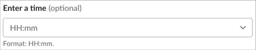
Select a time of day to a 15-minute increment.
The time picker renders as a select element. Slack’s time picker element is in beta and isn’t used by Apex SDK for Slack.
The time picker doesn’t currently support multiple time zones, which can lead to issues when editing and submitting values. For example, if the field value is stored as 11:00 pm PST on 3/9/2022, the time picker displays the time incorrectly as 11:00 pm for users in EST. The time picker does not display the time zone or convert the date to the local time zone.
Example
Keys
| Key | Type | Required | Description |
|---|---|---|---|
definition | String | Yes | The value must be timepicker. |
properties | Object | Yes | The component’s properties. |
properties.value | String, Expression | No | The initial time that’s selected when the time picker is loaded. The format is HH:mm where HH is 24-hour format of an hour (00 to 23) and mm is minutes with leading zeros (00 to 59). The time zone is local to the Slack user client. |
properties.placeholder | String, Plain Text, Expression | No | Text used as a placeholder when the value is empty. |
properties.name | String, Expression | Yes | A name applied to the time picker. The name is used to retrieve the value on submission. |
properties.confirm | Confirm, Expression | No | A confirmation dialog to display after a time is selected. |
events | Object | No | Events that trigger an action. |
events.onchange | Object | No | Fires when a time is chosen in the time picker. |
events.onchange.definition | String | No | The identifier of the action that executes when the event fires. |
events.onchange.properties | Object | No | Properties to pass to the action. |
Available in: Section | Actions | Input
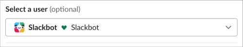
This multi-select menu populates its options with a list of Slack users visible to the current user in the active workspace.
Example
This example allows a single selection.
This example allows multiple selections.
This example shows a comprehensive usage of the usersSelect component.
Keys
| Key | Type | Required | Description |
|---|---|---|---|
definition | String | Yes | The value must be usersSelect. |
properties | Object | Yes | The component’s properties. |
properties.name | String, Expression | No | An identifier used to retrieve the value on submission. |
properties.placeholder | String, Expression, Plain Text | No | A placeholder value to display when nothing is selected. |
properties.value | String, Array, Expression | No | Indicates the user, or users if multiselect, selected on an initial render. Must match the ID of a user in Slack. If the value is an array, it’s an array of strings. |
properties.confirm | Confirm, Expression | No | A confirmation dialog to display after a radio button is selected. |
properties.multiselect | Boolean, Expression | No | Indicates whether the select component supports multiple selections. The default value is false. |
properties.maxSelection | Number, Expression | No | If multiselect is true, you can optionally specify maxSelection. The maximum number of options that can be selected. The minimum value is 1. |
events | Object | No | Events that trigger an action. |
events.onchange | Object | No | Fires when a user is selected, or the multi-select menu is confirmed. |
events.onchange.definition | String | No | The identifier of the action that executes when the event fires. |
events.onchange.properties | Object | No | Properties to pass to the action. |