Lightning Components Developer Guide
 j
jNewer Version Available
Create Custom Theme Layout Components for Communities
A theme layout is the top-level layout for the template pages (1) in your community. It includes the common header and footer (2), and often includes navigation, search, and the user profile menu. The theme layout applies to all the pages in your community, except the login pages.
In contrast, the content layout (3) defines the content regions of your
pages, such as a two-column layout.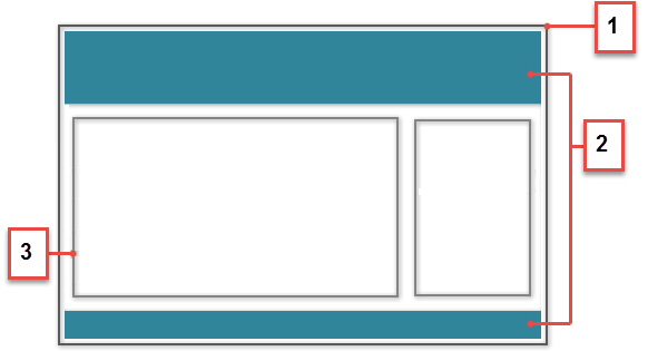
1. Add a New Interface to Your Theme Layout Component
A theme layout must implement the forceCommunity:themeLayout to appear in Community Builder in the area.
You must explicitly declare {!v.body} in your code to ensure that your theme layout includes the content layout. Add {!v.body} wherever you want the page's contents to appear within the theme layout.
You can add components to the regions in your markup, or leave regions open for users to drag-and-drop components into. Any attributes declared as Aura.Component[] and included in your markup are rendered as open regions in the theme layout that users can add components to.
- search, which contains the Search Publisher component
- profileMenu, which contains the Profile Header component
- navBar, which contains the Navigation Menu component
1<aura:attribute name="navBar" type="Aura.Component[]" required="false" />1<aura:component implements="forceCommunity:themeLayout" access="global" description="Sample Custom Theme Layout">
2 <aura:attribute name="search" type="Aura.Component[]" required="false"/>
3 <aura:attribute name="profileMenu" type="Aura.Component[]" required="false"/>
4 <aura:attribute name="navBar" type="Aura.Component[]" required="false"/>
5 <aura:attribute name="newHeader" type="Aura.Component[]" required="false"/>
6 <div>
7 <div class="searchRegion">
8 {!v.search}
9 </div>
10 <div class="profileMenuRegion">
11 {!v.profileMenu}
12 </div>
13 <div class="navigation">
14 {!v.navBar}
15 </div>
16 <div class="newHeader">
17 {!v.newHeader}
18 </div>
19 <div class="mainContentArea">
20 {!v.body}
21 </div>
22 </div>
23</aura:component>2. Add a CSS Resource to Avoid Overlapping Issues
Next, add a CSS resource to your bundle to style the theme layout as needed.
- Apply CSS styles as
follows:
1.THIS { 2 position: relative; 3 z-index: 1; 4} - Wrap the elements in your custom theme layout in a div
tag.
1<div class="mainContentArea">
2    {!v.body}
3</div>
CSS resources must be named componentName.css.