Lightning Aura Components Developer Guide
 j
jNewer Version Available
Create Custom Theme Layout Components for Experience Builder
A theme layout component is the top-level layout (1) for the template
pages in your site. Theme layout components are organized and applied to your pages through
theme layouts. A theme layout component includes the common header and footer (2), and often
includes navigation, search, and the user profile menu. In contrast, the content layout (3)
defines the content regions of your pages. The next image shows a two-column content
layout.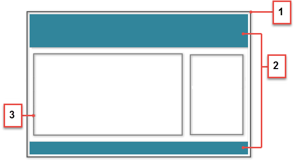
A theme layout type categorizes the pages in your Experience Builder site that share the same theme layout.
When you create a custom theme layout component in the Developer Console, it appears in Experience Builder in the area. Here you can assign it to new or existing theme layout types. Then you apply the theme layout type—and thereby the theme layout—in the page’s properties.
1. Add an Interface to Your Theme Layout Component
A theme layout component must implement the forceCommunity:themeLayout interface to appear in Experience Builder in the area.
Explicitly declare {!v.body} in your code to ensure that your theme layout includes the content layout. Add {!v.body} wherever you want the page’s contents to appear within the theme layout.
You can add components to the regions in your markup or leave regions open for users to drag-and-drop components into. Attributes declared as Aura.Component[] and included in your markup are rendered as open regions in the theme layout that users can add components to.
- search, which contains the Search Publisher component
- profileMenu, which contains the User Profile Menu component
- navBar, which contains the Navigation Menu component
1<aura:attribute name="navBar" type="Aura.Component[]" required="false" />1<aura:component implements="forceCommunity:themeLayout" access="global" description="Sample Custom Theme Layout">
2 <aura:attribute name="search" type="Aura.Component[]" required="false"/>
3 <aura:attribute name="profileMenu" type="Aura.Component[]" required="false"/>
4 <aura:attribute name="navBar" type="Aura.Component[]" required="false"/>
5 <aura:attribute name="newHeader" type="Aura.Component[]" required="false"/>
6 <div>
7 <div class="searchRegion">
8 {!v.search}
9 </div>
10 <div class="profileMenuRegion">
11 {!v.profileMenu}
12 </div>
13 <div class="navigation">
14 {!v.navBar}
15 </div>
16 <div class="newHeader">
17 {!v.newHeader}
18 </div>
19 <div class="mainContentArea">
20 {!v.body}
21 </div>
22 </div>
23</aura:component>2. Add a Design Resource to Include Theme Properties
You can expose theme layout properties in Experience Builder by adding a design resource to your bundle.
This example adds two checkboxes to a theme layout called Small Header.
1<design:component label="Small Header">
2    <design:attribute name="blueBackground" label="Blue Background"/>
3    <design:attribute name="smallLogo" label="Small Logo"/>
4</design:component>
The design resource only exposes the properties. You must implement the properties in the component.
1<aura:component implements="forceCommunity:themeLayout" access="global" description="Small Header">
2    <aura:attribute name="blueBackground" type="Boolean" default="false"/>
3    <aura:attribute name="smallLogo" type="Boolean" default="false" />
4    ...
Design resources must be named componentName.design.
3. Add a CSS Resource to Avoid Overlapping Issues
Add a CSS resource to your bundle to style the theme layout as needed.
- Apply CSS
styles.
1.THIS { 2 position: relative; 3 z-index: 1; 4} - Wrap the elements in your custom theme layout in a div
tag.
1<div class="mainContentArea">
2    {!v.body}
3</div>
CSS resources must be named componentName.css.