ISVforce Guide
 j
jNewer Version Available
Filters in the Marketplace Analytics Dashboard
Global Filters
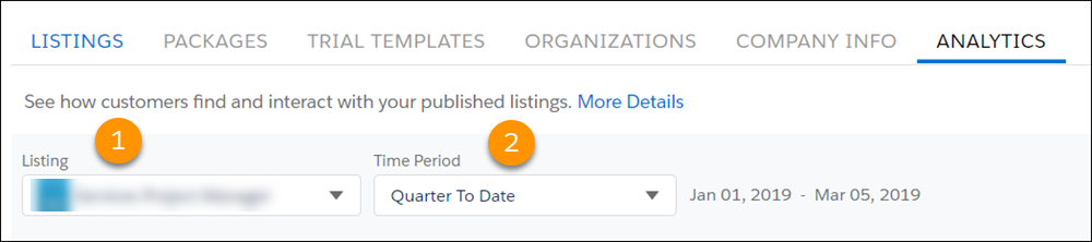
| Global Filter | Description |
|---|---|
| Listing (1) | Select an AppExchange listing to view. You can view only your company’s published listings in the dashboard. |
| Time Period (2) | Select the time period that you want to explore. You can select one of the fixed time periods, such as the last quarter, or you can define a custom period. The time period’s start and end dates appear next to the filter. |
Local Filters

| Local Filter | Description | Visualization |
|---|---|---|
| Source (3) | Select the traffic sources to show in the visualization. Traffic sources help you understand where an activity on your AppExchange listing originated, such as an AppExchange search or a Facebook ad. |
|
| Activity (4) | Select the activity metrics to show in the visualization. An activity metric tells you how often an event or interaction occurred on your AppExchange listing. |
|
| View By (5) | Adjust the time scale of the visualization, such as days, weeks, months, or
quarters. In the x-axis of a visualization, weeks are formatted as Wn, where n is a week number. For example, W1 represents the first week of the year. Likewise, quarters are formatted as Qn, where n is a quarter number. For example, Q4 represents the fourth quarter of the year. For both weeks and quarters, the year starts on January 1. |
|
| Lead Type | Select the types of lead events to show in the visualization, such as lead events from demo views. |
|