


Experience Cloud Developer Guide
 j
jNote: This release is in preview. Features described here don’t become generally available until the latest general availability date that Salesforce announces for this release. Before then, and where features are noted as beta, pilot, or developer preview, we can’t guarantee general availability within any particular time frame or at all. Make your purchase decisions only on the basis of generally available products and features.
Configure a Custom Theme Layout Component
1. Add an Interface to Your Theme Layout Component
A theme layout component must implement the forceCommunity:themeLayout interface to appear in Experience Builder in the area.
Explicitly declare {!v.body} in your code to ensure that your theme layout includes the content layout. Add {!v.body} wherever you want the page’s contents to appear within the theme layout.
Add attributes declared as Aura.Component[] to include regions in the theme layout, which contain the page’s components. You can add components to the regions in your markup or leave regions open for users to drag-and-drop components into. Attributes declared as Aura.Component[] and included in your markup are rendered as open regions in the theme layout that users can add components to. For example:
1<aura:component implements="forceCommunity:themeLayout">
2<aura:attribute name="myRegion" type="Aura.Component[]"/>
3
4{!v.body}
5
6</aura:component>
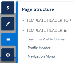
In Customer Service, the Template Header consists of these locked regions.
- search, which contains the Search Publisher component
- profileMenu, which contains the Profile Header component
- navBar, which contains the Navigation Menu component
1<aura:attribute name="navBar" type="Aura.Component[]" required="false" />Add the regions to your markup to define where to display them in the theme layout’s body.
1<aura:component implements="forceCommunity:themeLayout" access="global" description="Sample Custom Theme Layout">
2    <aura:attribute name="search" type="Aura.Component[]" required="false"/>
3    <aura:attribute name="profileMenu" type="Aura.Component[]" required="false"/>
4    <aura:attribute name="navBar" type="Aura.Component[]" required="false"/>
5    <aura:attribute name="newHeader" type="Aura.Component[]" required="false"/>
6    <div>
7        <div class="searchRegion">
8            {!v.search}
9        </div>
10        <div class="profileMenuRegion">
11            {!v.profileMenu}
12        </div>
13        <div class="navigation">
14            {!v.navBar}
15        </div>
16        <div class="newHeader">
17            {!v.newHeader}
18        </div>
19        <div class="mainContentArea">
20            {!v.body}
21        </div>
22    </div>
23</aura:component>
2. Add a Design Resource to Include Theme Properties
You can expose theme layout properties in Experience Builder by adding a design resource to your bundle.
First, implement the properties in the component.
1<aura:component implements="forceCommunity:themeLayout" access="global" description="Small Header">
2    <aura:attribute name="blueBackground" type="Boolean" default="false"/>
3    <aura:attribute name="smallLogo" type="Boolean" default="false" />
4    ...
Define the theme properties in the design resource to expose the properties in the UI. This example adds a label for the Small Header theme layout along with two checkboxes.
1<design:component label="Small Header">
2    <design:attribute name="blueBackground" label="Blue Background"/>
3    <design:attribute name="smallLogo" label="Small Logo"/>
4</design:component>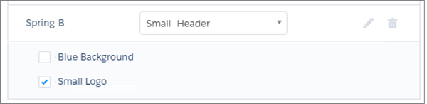
3. Add a CSS Resource to Avoid Overlapping Issues
Add a CSS resource to your bundle to style the theme layout as needed, ideally using standard design tokens.
To avoid overlapping issues with positioned elements, such as dialog boxes or hovers:
- Apply CSS styles.
1.THIS { 2 position: relative; 3 z-index: 1; 4} - Wrap the elements in your custom theme layout in a div tag.
1<div class="mainContentArea">
2    {!v.body}
3</div>