


Visualforce 開発者ガイド
 j
jVisualforce Charting を使用した複雑なグラフの作成
Visualforce Charting を使用して、さまざまなグラフコンポーネントから、関連データの複数のセットを表す複雑なグラフを作成します。最終的に、非常に洗練された注目を集めるグラフを作成できます。
グラフコントローラ
このトピックの後半の例では、次のコントローラを使用します。このコントローラは、「単純なグラフ作成の例」のコントローラを少し拡張したものです。リモート JavaScript 呼び出しでコールできる、より多くのデータおよびメソッドが含まれます。
1swfobject.registerObject("clippy.codeblock-0", "9");
2
3
4
5
6
7
8
9
10
11
12
13
14
15
16
17public class ChartController {
18    // Return a list of data points for a chart
19    public List<Data> getData() {
20        return ChartController.getChartData();
21    }
22
23    // Make the chart data available via JavaScript remoting
24    @RemoteAction
25    public static List<Data> getRemoteData() {
26        return ChartController.getChartData();
27    }
28
29    // The actual chart data; needs to be static to be
30    // called by a @RemoteAction method
31    public static List<Data> getChartData() {
32        List<Data> data = new List<Data>();
33        data.add(new Data('Jan', 30, 90, 55));
34        data.add(new Data('Feb', 44, 15, 65));
35        data.add(new Data('Mar', 25, 32, 75));
36        data.add(new Data('Apr', 74, 28, 85));
37        data.add(new Data('May', 65, 51, 95));
38        data.add(new Data('Jun', 33, 45, 99));
39        data.add(new Data('Jul', 92, 82, 30));
40        data.add(new Data('Aug', 87, 73, 45));
41        data.add(new Data('Sep', 34, 65, 55));
42        data.add(new Data('Oct', 78, 66, 56));
43        data.add(new Data('Nov', 80, 67, 53));
44        data.add(new Data('Dec', 17, 70, 70));
45        return data;
46    }
47
48    // Wrapper class
49    public class Data {
50        public String name { get; set; }
51        public Integer data1 { get; set; }
52        public Integer data2 { get; set; }
53        public Integer data3 { get; set; }
54        public Data(String name, Integer data1, Integer data2, Integer data3) {
55            this.name = name;
56            this.data1 = data1;
57            this.data2 = data2;
58            this.data3 = data3;
59        }
60    }
61}単純な折れ線グラフの作成
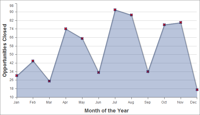
次は、1 暦年で「成立した商談」というデータセットの 3 つのデータ系列の 1 つをグラフ化した単純な折れ線グラフです。
1swfobject.registerObject("clippy.codeblock-1", "9");
2
3
4
5
6
7
8
9
10
11
12
13
14
15
16
17<apex:page controller="ChartController">
18    <apex:chart height="400" width="700" data="{!data}">
19    	  <apex:axis type="Numeric" position="left" fields="data1"
20            title="Opportunities Closed" grid="true"/>
21    	  <apex:axis type="Category" position="bottom" fields="name"
22            title="Month of the Year">
23    	</apex:axis>
24    	<apex:lineSeries axis="left" fill="true" xField="name" yField="data1"
25          markerType="cross" markerSize="4" markerFill="#FF0000"/>
26   </apex:chart>
27</apex:page>
この例では、次の点を確認してください。
- 折れ線グラフおよび棒グラフでは、グラフの X 軸と Y 軸を定義する必要がある。
- 縦軸はグラフの左側に定義され、その月に成立した商談の金額を示す。
- 横軸はグラフの下部に定義され、暦年の月を表す。
- 実際の折れ線グラフ、<apex:lineSeries> コンポーネントは特定の軸にバインドされる。
- グラフの各線の差別化に使用できるいくつかのマーカー属性がある。
2 番目のデータ系列の追加
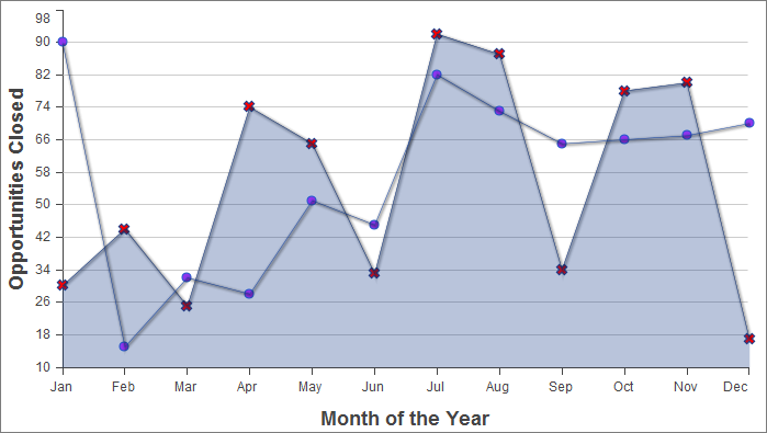
同じ測定単位を使用する 2 番目のデータ系列は簡単に追加できます。ここでは、「不成立の商談」データセットを 2 番目の折れ線系列として追加します。
1swfobject.registerObject("clippy.codeblock-2", "9");
2
3
4
5
6
7
8
9
10
11
12
13
14
15
16
17<apex:page controller="ChartController">
18    <apex:chart height="400" width="700" data="{!data}">
19    	  <apex:axis type="Numeric" position="left" fields="data1,data2"
20            title="Opportunities Closed" grid="true"/>
21    	  <apex:axis type="Category" position="bottom" fields="name"
22            title="Month of the Year">
23    	  </apex:axis>
24    	  <apex:lineSeries axis="left" fill="true" xField="name" yField="data1"
25        	  markerType="cross" markerSize="4" markerFill="#FF0000"/>
26    	  <apex:lineSeries axis="left" xField="name" yField="data2"
27            markerType="circle" markerSize="4" markerFill="#8E35EF"/>
28    </apex:chart>
29</apex:page>重要なのは、data1 項目および data2 項目の両方がそのコンポーネントの項目属性によって縦の <apex:axis> にバインドされている方法を確認することです。これにより、グラフ作成エンジンが軸の適切な目盛りと刻みのマークを特定できます。
2 番目の軸を使用した棒グラフの系列を追加
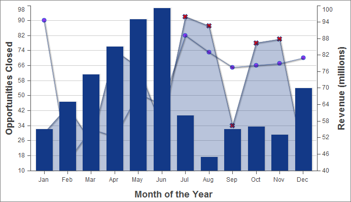
他の単位でグラフを作成するもう 1 つのデータ系列を追加するには、2 番目の縦軸を追加する必要があります。次に、データ系列「月別収益」が棒グラフとして追加された例を示します。
1swfobject.registerObject("clippy.codeblock-3", "9");
2
3
4
5
6
7
8
9
10
11
12
13
14
15
16
17<apex:page controller="ChartController">
18    <apex:chart height="400" width="700" data="{!data}">
19    	  <apex:axis type="Numeric" position="left" fields="data1,data2"
20            title="Opportunities Closed" grid="true"/>
21        <apex:axis type="Numeric" position="right" fields="data3"
22            title="Revenue (millions)"/>
23    	  <apex:axis type="Category" position="bottom" fields="name"
24            title="Month of the Year"/>
25    	  <apex:lineSeries axis="left" fill="true" xField="name" yField="data1"
26        	  markerType="cross" markerSize="4" markerFill="#FF0000"/>
27    	  <apex:lineSeries axis="left" xField="name" yField="data2"
28            markerType="circle" markerSize="4" markerFill="#8E35EF"/>
29        <apex:barSeries orientation="vertical" axis="right"
30            xField="name" yField="data3"/>
31    </apex:chart>
32</apex:page>
次の点を確認してください。
- 新しい測定単位を使用するデータ系統を追加するには、グラフの右側に 2 番目の縦軸を追加する必要がある。
- グラフの各境界に 1 つ、最大 4 つの異なる軸を設定できる。
- 棒グラフは縦方向に設定され、右の軸にバインドされている。横棒グラフは上軸または下軸にバインドされている。
凡例、ラベル、およびグラフのヒントの追加
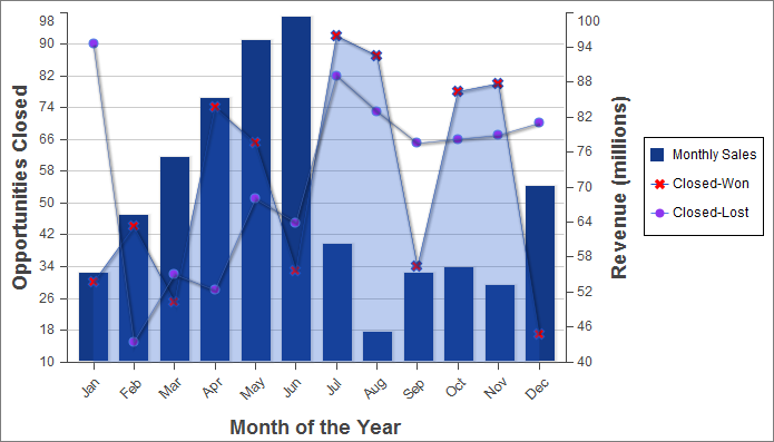
グラフの凡例、系列ラベルを追加したり、グラフのラベルを確実に読むことができるようにすることで、グラフを分かりやすくすることができます。
1swfobject.registerObject("clippy.codeblock-4", "9");
2
3
4
5
6
7
8
9
10
11
12
13
14
15
16
17<apex:page controller="ChartController">
18    <apex:chart height="400" width="700" data="{!data}">
19        <apex:legend position="right"/>
20        <apex:axis type="Numeric" position="left" fields="data1"
21            title="Opportunities Closed" grid="true"/>
22        <apex:axis type="Numeric" position="right" fields="data3"
23            title="Revenue (millions)"/>
24        <apex:axis type="Category" position="bottom" fields="name"
25            title="Month of the Year">
26            <apex:chartLabel rotate="315"/>
27        </apex:axis>
28        <apex:barSeries title="Monthly Sales" orientation="vertical" axis="right"
29            xField="name" yField="data3">
30            <apex:chartTips height="20" width="120"/>
31        </apex:barSeries>
32        <apex:lineSeries title="Closed-Won" axis="left" xField="name" yField="data1"
33            fill="true" markerType="cross" markerSize="4" markerFill="#FF0000"/>
34        <apex:lineSeries title="Closed-Lost" axis="left" xField="name" yField="data2"
35            markerType="circle" markerSize="4" markerFill="#8E35EF"/>
36    </apex:chart>
37</apex:page>
これらの追加については、次の点を確認してください。
- データ系列コンポーネントの順序が、グラフを描画する際のグラフ要素のレイヤを決定する。前の例では、棒グラフは前面に配置されていました。この例では、2 つの <apex:lineSeries> コンポーネントの前に <apex:barSeries> コンポーネントがあるため、棒グラフが背面に配置されています。
- <apex:legend> コンポーネントは、左、右、上、または下の 4 つのどの位置にも配置できる。凡例はグラフの境界線内に配置されます。この例では、凡例によってグラフ自体の横幅が圧縮されています。
- データ系列のコンポーネント title 属性を使用して凡例タイトルを追加する。
- グラフの下軸のラベルを回転させるために、<apex:chartLabel> コンポーネントはこのコンポーネントが影響する <apex:axis> コンポーネントで囲まれている。
- <apex:chartTips> コンポーネントにより、このコンポーネントを囲む系列の各データポイントの詳細を示すロールオーバーツールのヒントを有効にできる。