Visualforce 開発者ガイド
 j
jLightning Experience スタイルシートで既存の Visualforce ページをスタイル設定
Lightning Experience または Salesforce アプリケーションで Visualforce ページが表示されるとき、ページのスタイルが Lightning Experience UI と一致するように設定する場合は、<apex:page> タグで lightningStylesheets="true" に設定します。ページが Salesforce Classic で表示される場合、Lightning Experience のスタイル設定は適用されません。
1<apex:page lightningStylesheets="true">lightningStylesheets="true" の場合、CSS 範囲指定クラス slds-vf-scope は自動的に Visualforce ページの <body> 要素に適用されます。範囲指定クラスが適用されるのは、コンテンツが Lightning Experience UI に一致するようにするためです。applyBodyTag または applyHtmlTag を false に設定した場合、範囲指定クラス slds-vf-scope を手動で追加する必要があります。
lightningStylesheets 属性を使用しない標準の Visualforce ページは次のようになります。ページには、Classic UI のスタイル設定が使用されます。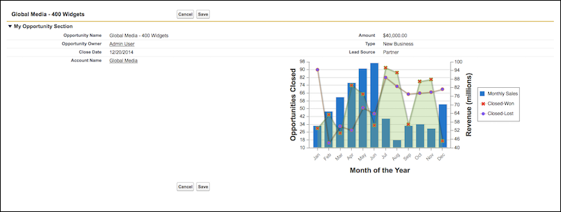
lightningStylesheets 属性が true に設定された同一の Visualforce ページは次のようになります。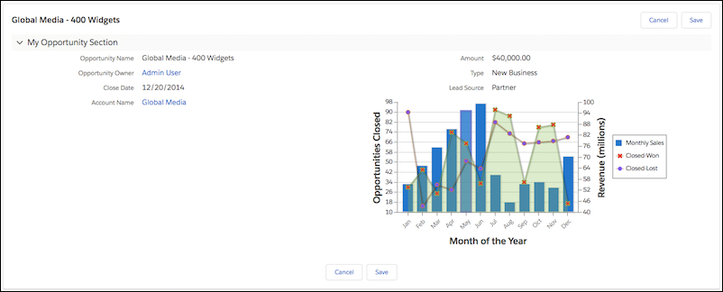
lightningStylesheets 属性を使用して、よく使用される Visualforce コンポーネントのスタイルを設定できます。ただし、一部のコンポーネントのスタイルは Lightning Experience と若干異なります。たとえば、<apex:inputFile>、および一部の <apex:inputField> 要素では、代わりにブラウザのデフォルトのスタイル設定が使用されます。<apex:form>、<apex:outputText>、<apex:param> など、スタイル設定を必要としない、よく使用される Visualforce コンポーネントは引き続きサポートされます。
Visualforce コンポーネントライブラリに含まれないカスタム SLDS コンポーネントを含めるには、<apex:slds/> タグを使用し、コードと lightningStylesheets 属性を含めます。
lightningStylesheets="true" を使用すると、ほとんどの Visualforce ボタンが neutral バリエーションとして表示されます。ニュートラルスタイルのボタンになるのは、ブランド設定する必要があるボタンを確実に判断するためのセレクタフックがないためです。組織のブランド設定に基づいてスタイル設定したボタンを作成するには、.slds-vf-button_brand スタイル属性を <apex:commandButton> に追加します。
1<apex:commandButton styleClass="slds-vf-button_brand" value="Refresh the Page">lightningStylesheets 属性をサポートしている、またはスタイル設定を必要としない Visualforce コンポーネントを次に示します。
- analytics:reportChart
- apex:actionFunction
- apex:actionPoller
- apex:actionRegion
- apex:actionStatus
- apex:actionSupport
- apex:areaSeries
- apex:attribute
- apex:axis
- apex:barSeries
- apex:canvasApp
- apex:chart
- apex:chartLabel
- apex:chartTips
- apex:column
- apex:commandButton
- apex:commandLink
- apex:component
- apex:componentBody
- apex:composition
- apex:dataList
- apex:dataTable
- apex:define
- apex:detail
- apex:dynamicComponent
- apex:enhancedList
- apex:facet
- apex:flash
- apex:form
- apex:gaugeSeries
- apex:iframe
- apex:image
- apex:include
- apex:includeLightning
- apex:includeScript
- apex:inlineEditSupport
- apex:input
- apex:inputCheckbox
- apex:inputField
- apex:inputFile
- apex:inputHidden
- apex:inputSecret
- apex:inputText
- apex:inputTextArea
- apex:insert
- apex:legend
- apex:lineSeries
- apex:listViews
- apex:map
- apex:mapMarker
- apex:message
- apex:messages
- apex:outputField
- apex:outputLabel
- apex:outputLink
- apex:outputPanel
- apex:outputText
- apex:page
- apex:pageBlock
- apex:pageBlockButtons
- apex:pageBlockSection
- apex:pageBlockSectionItem
- apex:pageBlockTable
- apex:pageMessage
- apex:pageMessages
- apex:panelBar
- apex:panelBarItem
- apex:panelGrid
- apex:panelGroup
- apex:param
- apex:pieSeries
- apex:radarSeries
- apex:relatedList
- apex:remoteObjectField
- apex:remoteObjectModel
- apex:remoteObjects
- apex:repeat
- apex:scatterSeries
- apex:scontrol
- apex:sectionHeader
- apex:selectCheckboxes
- apex:selectList
- apex:selectOption
- apex:selectOptions
- apex:selectRadio
- apex:stylesheet
- apex:tab
- apex:tabPanel
- apex:toolbar
- apex:toolbarGroup
- apex:variable
- chatter:feed
- chatter:feedWithFollowers
- chatter:follow
- chatter:newsFeed
- flow:interview
- site:googleAnalyticsTracking
- site:previewAsAdmin
- topics:widget