


HXL Components
The Components page is an interactive catalog of available HXL components. Inspect a component’s configuration and see how it renders across each channel. To facilitate UI development, copy and paste the JSON in your widget bundle’s .json composition file.
Browse the Components
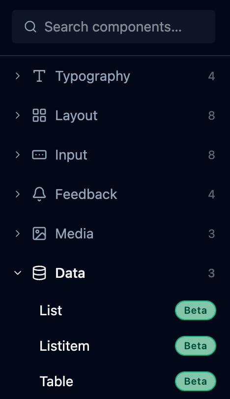
The left sidebar lists all available components, grouped by category. Expand or collapse each category to show or hide its components. Each category shows a component count. A search box at the top of the sidebar filters components by name.
Every component displays a release status badge next to its name.
- Beta components are available and stable for evaluation.
- Developer (Dev) Preview components are for early access, and their APIs can still change. If you use dev preview components, we recommend that you use them in a sandbox org.
Inspect and Preview a Component
To load a component in the workspace, select the component from the sidebar.
- The editor panel shows the component’s configuration as declarative JSON. When you edit the component’s configuration, the preview refreshes automatically.
- The preview panel shows a live rendering of the component. Use the preview toggle at the top of the preview pane to see how the same component definition renders natively in Agentforce, Slackbot, and more.
For the full property reference for each component, see the HXL Components Reference.
Review Common Component Patterns
Each component page includes examples that show common composition patterns. Explore the available variants and sizes to understand how they render on a surface. To speed up development and ensure consistency, reuse the patterns in your widget bundles.
Beta Feature
 j
j