


 j
jVisualforce Charting Limitations and Considerations
Building a Complex Chart with Visualforce Charting
Chart Colors
Chart Layout and Annotation
Bar Charts
Other Linear Series Charts
Pie Charts
Gauge Charts
Radar Charts
Previous Versions
Gauge charts show a single measurement against a defined axis or scale. Although it charts a single number, you can vary the axis and chart colors to communicate what that number means.
Use the minimum and maximum attributes of the <apex:axis> tag to define the range of values. Use the colorSet attribute of the <apex:gaugeSeries> tag to indicate whether the current value is good or bad. Here’s a chart that indicates the metric is well within an acceptable range:
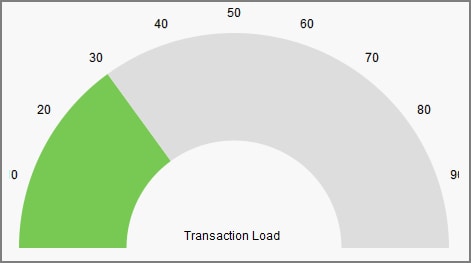
1<apex:chart height="250" width="450" animate="true" data="{!data}">
2    <apex:axis type="Gauge" position="gauge" title="Transaction Load"
3        minimum="0" maximum="100" steps="10"/>
4    <apex:gaugeSeries dataField="data1" donut="50" colorSet="#78c953,#ddd"/>
5</apex:chart>
Gauge charts don’t support legends or labels.
Note
See Also
j