


Force.com Platform Fundamentals
 j
jNewer Version Available
Try It Out: Group Fields into a New Section
Let's start modifying our page layout by first defining a new section for salary information. On a page layout, a section is simply an area where we can group similar fields under an appropriate heading. This makes it easy for our users to quickly identify and enter the information for a record, especially if our object has a large number of fields:
- In the palette, select the Fields category.
- Drag the Section user interface element from the palette to just above the System Information section on the page layout.
When you drag a new section on to the page layout, the Section Properties popup window appears.
- In the Section Name text box, enter Compensation.
The Section Name field controls the text that's displayed as the heading for the section.
- In the Display Section Header On area, select both Detail Page and Edit Page.
Displaying the header on both the detail and edit pages helps users understand the context of the information, regardless of whether they are editing the position or just viewing it.
- In the Layout drop-down list, choose 2-Column.
This option allows us to choose whether we want the fields in our section to be arranged in two columns or one. The default is two columns and is the most common choice. However, if our section is going to contain text area fields, the one-column layout gives them more space on the page for display.
- In the Tab-key Order drop-down list, choose Left-Right.
This setting controls the direction that a user's cursor will move when using the Tab key to navigate from field to field.
- Click OK.
We have a new section for Compensation just above the System Information section! Let's add the Min Pay and Max Pay fields:
- While pressing CTRL, click both the Min Pay and Max Pay fields in the Information section, and drag them to the new Compensation section as shown.
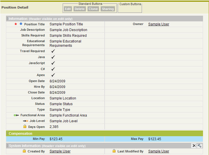
Pressing CTRL allows you to select multiple individual user interface elements with your mouse. Alternatively, pressing the SHIFT key allows you to select a group of elements.
Now that we've gone through the process for building one section, let's build two more. As we do this, you might have to scroll up and down to view the entire layout, depending on the size of your screen. Rest assured that if you have to scroll, the palette will move with you, making it easy to add user interface elements even at the very bottom of the page layout.
- Create a new one-column Description section below the Compensation section, and drag Job Description, Responsibilities, Skills Required, and Educational Requirements into it.
- Create a new two-column Required Languages section below the Description section, and drag Apex, C#, Java, and JavaScript into it.
As you work, you may notice that the fields you add to the page layout are grayed-out in the palette, but the Section user interface element is never grayed-out. This is because fields can only appear one time on each page layout, but the Section user interface element can be reused to create as many sections as you want.
While we're shuffling fields around, let's reorganize the Information section so it's more readable.
- Arrange the first column of the Information section as follows:
- Position Name
- Status
- Type
- Functional Area
- Job Level
- Travel Required
- Created By
- Arrange the second column of the Information section as follows:
- Owner
- Location
- Open Date
- Hire By
- Close Date
- Days Open
- Last Modified By
That's much better—our fields are organized and it's easy to locate all the information we need.
The Information section still looks a little dense, though. Fortunately, the page layout editor provides a way to add blank spaces that separate the fields within the section to improve its readability even further.