Lightning Components Developer's Guide
 j
jNewer Version Available
Step 2: Create A Component for User Input
- Click .
- Enter form for the Name field in the New Lightning Bundle popup window. This creates a new component, form.cmp.
-
In the source code editor, enter this code.
1<aura:component implements="force:appHostable">
2  <ltng:require styles="/resource/slds090/assets/styles/salesforce-lightning-design-system.min.css"/>
3  <aura:attribute name="expenses" type="Expense__c[]"/>
4  <aura:attribute name="newExpense" type="Expense__c"
5         default="{ 'sobjectType': 'Expense__c',
6                         'Name': '',
7                         'Amount__c': 0,
8                         'Client__c': '',
9                         'Date__c': '',
10                         'Reimbursed__c': false
11                       }"/>
12  <!-- If you registered a namespace, replace the previous aura:attribute tags with the following -->
13  <!-- <aura:attribute name="expenses" type="myNamespace.Expense__c[]"/>
14  <aura:attribute name="newExpense" type="myNamespace__Expense__c"
15               default="{ 'sobjectType': 'myNamespace__Expense__c',
16                          'Name': '',
17                          'myNamespace__Amount__c': 0,
18                          'myNamespace__Client__c': '',
19                          'myNamespace__Date__c': '',
20                          'myNamespace__Reimbursed__c': false
21                         }"/> -->
22  <!-- Attributes for Expense Counters -->
23  <aura:attribute name="total" type="Double" default="0.00" />
24  <aura:attribute name="exp" type="Double" default="0" />
25
26  <!-- Input Form using components -->
27  <div class="container">
28    <form class="slds-form--stacked">
29      <div class="slds-form-element slds-is-required">
30        <div class="slds-form-element__control">
31
32       <!-- If you registered a namespace,
33            the attributes include your namespace.
34            For example, value="{!v.newExpense.myNamespace__Amount__c}" -->
35
36          <ui:inputText aura:id="expname" label="Expense Name"
37                        class="slds-input"
38                        labelClass="slds-form-element__label"
39                        value="{!v.newExpense.Name}"
40                        required="true"/>
41         </div>
42       </div>
43       <div class="slds-form-element slds-is-required">
44         <div class="slds-form-element__control">
45           <ui:inputNumber aura:id="amount" label="Amount"
46                           class="slds-input"
47                           labelClass="slds-form-element__label"
48                           value="{!v.newExpense.Amount__c}"
49                           placeholder="20.80" required="true"/>
50          </div>
51        </div>
52        <div class="slds-form-element">
53          <div class="slds-form-element__control">
54            <ui:inputText aura:id="client" label="Client"
55                          class="slds-input"
56                          labelClass="slds-form-element__label"
57                          value="{!v.newExpense.Client__c}"
58                          placeholder="ABC Co."/>
59           </div>
60         </div>
61         <div class="slds-form-element">
62           <div class="slds-form-element__control">
63             <ui:inputDateTime aura:id="expdate" label="Expense Date"
64                               class="slds-input"
65                               labelClass="slds-form-element__label"
66                               value="{!v.newExpense.Date__c}"
67                               displayDatePicker="true"/>
68            </div>
69          </div>
70          <div class="slds-form-element">
71            <ui:inputCheckbox aura:id="reimbursed" label="Reimbursed?"
72                              class="slds-checkbox"
73                              labelClass="slds-form-element__label"
74                              value="{!v.newExpense.Reimbursed__c}"/>
75            <ui:button label="Submit"
76                       class="slds-button slds-button--neutral"
77                       labelClass="label"
78                       press="{!c.createExpense}"/>
79           </div>
80    </form>
81  </div><!-- ./container-->
82
83  <!-- Expense Counters -->
84  <div class="container slds-p-top--medium">
85        <div class="row">
86            <div class="slds-tile ">
87                <!-- Make the counter red if total amount is more than 100 -->
88                <div class="{!v.total >= 100
89                     ? 'slds-notify slds-notify--toast slds-theme--error slds-theme--alert-texture'
90                     : 'slds-notify slds-notify--toast slds-theme--alert-texture'}">
91                    <p class="slds-tile__title slds-truncate">Total Expenses</p>
92                    $<ui:outputNumber class="slds-truncate" value="{!v.total}" format=".00"/>
93                </div>
94            </div>
95            <div class="slds-tile ">
96                <div class="slds-notify slds-notify--toast slds-theme--alert-texture">
97                      <p class="slds-tile__title slds-truncate">No. of Expenses</p>
98                      <ui:outputNumber class="slds-truncate" value="{!v.exp}"/>
99                  </div>
100            </div>
101        </div>
102    </div>
103          <!-- Display expense records -->
104          <div class="container slds-p-top--medium">
105              <div id="list" class="row">
106                 <aura:iteration items="{!v.expenses}" var="expense">
107
108                     <!-- If you’re using a namespace,
109                          use the format
110                          {!expense.myNamespace__myField__c} instead. -->
111
112                     <p>{!expense.Name}, {!expense.Client__c},
113                        {!expense.Amount__c}, {!expense.Date__c},
114                        {!expense.Reimbursed__c}</p>
115                </aura:iteration>
116              </div>
117          </div>
118</aura:component>
Components provide a rich set of attributes and browser event support. Attributes are typed fields that are set on a specific instance of a component, and can be referenced using an expression syntax. All aura:attribute tags have name and type values. For more information, see Supported aura:attribute Types.
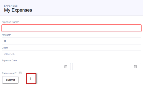
The attributes and expressions here will become clearer as you build the app. {!v.exp} evaluates the number of expenses records and {!v.total} evaluates the total amount. {!c.createExpense} represents the client-side controller action that runs when the Submit button (1) is clicked, which creates a new expense. The press event in ui:button enables you to wire up the action when the button is pressed.
 The expression {!v.expenses} wires up the component to the expenses object. var="expense" denotes the name of the variable to use for each item inside the iteration. {!expense.Client__c} represents data binding to the client field in the expense object.
 -
Click STYLE in the sidebar to create
a new resource named form.css. Enter these CSS
rule sets.
1.THIS .uiInputDateTime .datePicker-openIcon { 2 position: absolute; 3 left: 45%; 4 top: 45%; 5} 6 7.THIS .uiInputDateTime .timePicker-openIcon { 8 position: absolute; 9 left: 95%; 10 top: 70%; 11} 12 13.THIS .uiInputDefaultError li { 14 list-style: none; 15} -
Add the component to the app. In expenseTracker.app, add the new component to the markup.
This step adds <c:form /> to the markup. If you’re using a namespace, you can use <myNamespace:form /> instead. If you haven’t set a namespace prefix for your organization, use the default namespace c when referencing components that you’ve created.
1<aura:application> 2 <ltng:require styles="/resource/slds090/assets/styles/salesforce-lightning-design-system.min.css"/> 3 4 <div class="slds"> 5 <div class="slds-page-header"> 6 <div class="slds-grid"> 7 <div class="slds-col slds-has-flexi-truncate"> 8 <p class="slds-text-heading--label">Expenses</p> 9 <div class="slds-grid"> 10 <div class="slds-grid slds-type-focus slds-no-space"> 11 <h1 class="slds-text-heading--medium slds-truncate" title="My Expenses">My Expenses</h1> 12 </div> 13 </div> 14 </div> 15 </div> 16 </div> 17 18 <div class="slds-col--padded slds-p-top--large"> 19 <c:form /> 20 </div> 21 </div> 22 </aura:application> -
Save your changes and click Update Preview in the sidebar to preview your app. Alternatively, reload your browser.
Good job! You created a component that provides an input form and view of your expenses. Next, you’ll create the logic to display your expenses.