


Customize Colors with the Service Chat SDK
Customize the colors by defining the branding token colors used throughout the interface.
The legacy chat product is scheduled for retirement on February 14, 2026, and is in maintenance mode until then. During this phase, you can continue to use chat, but we no longer recommend that you implement new chat channels. To avoid service interruptions to your customers, migrate to Messaging for In-App and Web before that date. Messaging offers many of the chat features that you love plus asynchronous conversations that can be picked back up at any time. Learn about chat retirement in Help.
Important
To customize colors, create an SCAppearanceConfiguration instance, specify values for each token you want to change, and store the instance in the appearanceConfiguration property of the ServiceCloud sharedInstance.
In Swift:
1// Create appearance configuration instance
2let appearance = SCAppearanceConfiguration()
3
4// Customize color tokens
5appearance.setColor(COLOR_VALUE, forName: TOKEN_NAME)
6
7// Add other customizations here...
8
9// Save configuration instance
10ServiceCloud.shared().appearanceConfiguration = appearance
In Objective-C:
1// Create appearance configuration instance
2SCAppearanceConfiguration *appearance = [SCAppearanceConfiguration new];
3
4// Customize color tokens
5[appearance setColor:COLOR_VALUE forName:TOKEN_NAME];
6
7// Add other customizations here...
8
9// Save configuration instance
10[SCServiceCloud sharedInstance].appearanceConfiguration = appearance;
To support dark mode in iOS 13 and later, specify adaptive colors for each branding token. The following branding tokens are available for customization.
| Token Name / Swift Value / Objective-C Value | Default | Dark Mode Default | Description / Sample Uses |
|---|---|---|---|
Navigation Bar BackgroundnavbarBackgroundSCSAppearanceColorTokenNavbarBackground | #FAFAFA  | #1A2129  | Background color for the navigation bar. |
Navigation Bar InvertednavbarInvertedSCSAppearanceColorTokenNavbarInverted | #010101  | #C6CBCF  | Navigation bar text and icon color. |
Brand PrimarybrandPrimarySCSAppearanceColorTokenBrandPrimary | #007F7F  | #00B4B4  | |
Brand SecondarybrandSecondarySCSAppearanceColorTokenBrandSecondary | #2872CC  | #0070D2  | Used throughout the UI for button colors. Chat: Agent text bubbles. |
Primary Brand InvertedbrandPrimaryInvertedSCSAppearanceColorTokenBrandPrimaryInverted | #FBFBFB  | #FBFBFB | |
Secondary Brand InvertedbrandSecondaryInvertedSCSAppearanceColorTokenBrandSecondaryInverted | #FCFCFC  | #F7F7F7  | Text on areas where a brand color is used for the background. |
Contrast PrimarycontrastPrimarySCSAppearanceColorTokenContrastPrimary | #000000  | #E2E4E6  | Primary body text color. |
Contrast SecondarycontrastSecondarySCSAppearanceColorTokenContrastSecondary | #6D6D6D  | #898D92  | |
Contrast TertiarycontrastTertiarySCSAppearanceColorTokenContrastTertiary | #BABABA  | #A0A6AD  | |
Contrast QuaternarycontrastQuaternarySCSAppearanceColorTokenContrastQuaternary | #F1F1F1  | #09121B  | Chat: Background color. |
Contrast InvertedcontrastInvertedSCSAppearanceColorTokenContrastInverted | #FFFFFF  | #323232  | Page background, navigation bar, table cell background. |
Feedback PrimaryfeedbackPrimarySCSAppearanceColorTokenFeedbackPrimary | #E74C3C  | #E0A7A9 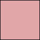 | Text color for error messages. |
Feedback SecondaryfeedbackSecondarySCSAppearanceColorTokenFeedbackSecondary | #2ECC71  | #9ACDB7  | |
Feedback TertiaryfeedbackTertiarySCSAppearanceColorTokenFeedbackTertiary | #F5A623  | #FADBAE 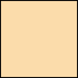 | |
OverlayoverlaySCSAppearanceColorTokenOverlay | Contrast Primary (at 40% alpha) | #323232 |
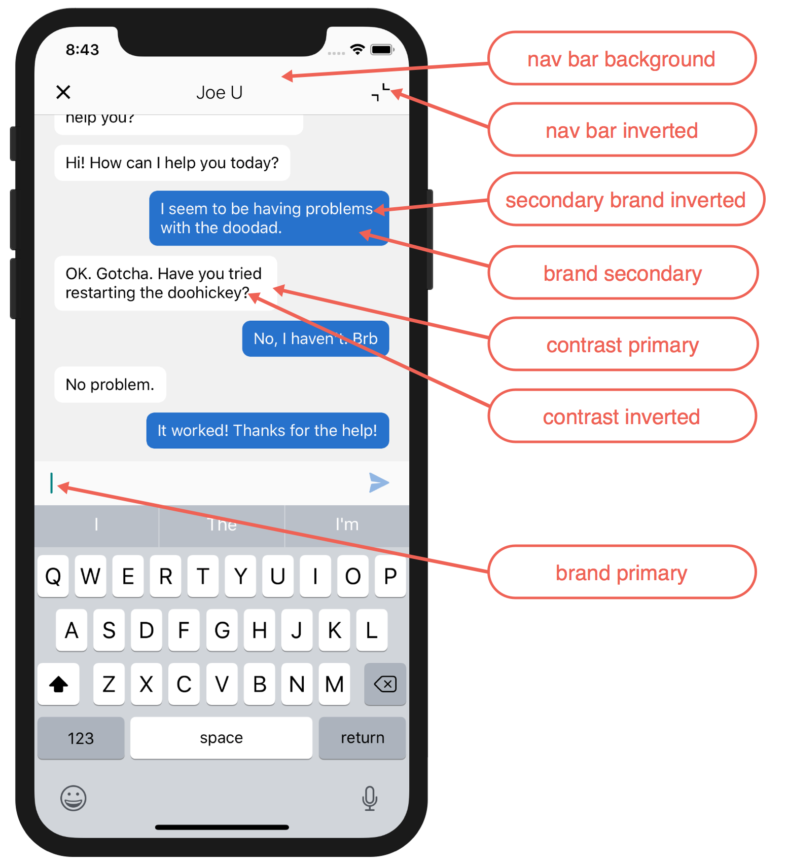
These screenshots illustrate how the branding tokens affect the UI.
Chat UI Branding:
Example
The following code sample changes three of the branding tokens.
In Swift:
1// Create appearance configuration instance
2let appearance = SCAppearanceConfiguration()
3
4// Customize color tokens
5appearance.setColor(
6       UIColor(red: 80/255, green: 227/255, blue: 194/255, alpha: 1.0),
7       forName: .brandPrimary)
8appearance.setColor(
9       UIColor(red: 74/255, green: 144/255, blue: 226/255, alpha: 1.0),
10       forName: .brandSecondary)
11appearance.setColor(
12       UIColor(red: 252/255, green: 252/255, blue: 252/255, alpha: 1.0),
13       forName: .brandSecondaryInverted)
14
15// Save configuration instance
16ServiceCloud.shared().appearanceConfiguration = appearance
In Objective-C:
1// Create appearance configuration instance
2SCAppearanceConfiguration *appearance = [SCAppearanceConfiguration new];
3
4// Customize color tokens
5[appearance setColor:[UIColor colorWithRed: 80/255
6                                     green: 227/255
7                                      blue: 194/255
8                                     alpha: 1.0]
9             forName:SCSAppearanceColorTokenBrandPrimary];
10[appearance setColor:[UIColor colorWithRed: 74/255
11                                     green: 144/255
12                                      blue: 226/255
13                                     alpha: 1.0]
14             forName:SCSAppearanceColorTokenBrandSecondary];
15[appearance setColor:[UIColor colorWithRed: 252/255
16                                     green: 252/255
17                                      blue: 252/255
18                                     alpha: 1.0]
19             forName:SCSAppearanceColorTokenBrandSecondaryInverted];
20
21// Save configuration instance
22[SCServiceCloud sharedInstance].appearanceConfiguration = appearance;
For an example of how to specify adaptive colors that work with the dark mode feature that was introduced in iOS 13, see Handling Dark Mode for iOS 13 with the Service SDK.
 j
j