Change Chart Colors for Dimension Values
You can customize the colors of dimension values in a stacked bar, stacked column, or stacked waterfall chart. If you specify one measure and two groups, you can also customize the color for donut, funnel, treemap, stacked pyramid, line, and timeline charts.
The customizations described in this topic can now be configured using the CRM Analytics UI. It is no longer necessary to edit by modifying the XMD file. For the UI instructions, see Change the Labels and Colors of Dataset Dimension Values and View and Configure Dataset Columns
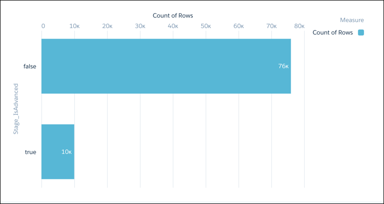
This example shows a bar chart with default colors.
Custom colors are specified in the chartColor section of the XMD file. If you have a large XMD file, you can do a text search to find the appropriate chartColor section.
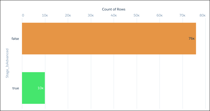
For example, the bold text in this XMD snippet shows how to change the colors for the true and false values of the Stage_IsAdvanced dimension. The XMD snippet is located in the dimension section of the XMD file.
1"conditionalFormatting":{
2            "chartColor":{
3               "parameters":{
4                  "values":[
5                     {
6                        "formatValue":"#E8963B",
7                        "value":"false"
8                     },
9                     {
10                        "formatValue":"#3AE867",
11                        "value":"true"
12                     }
13                  ]
14               },
15               "referenceField":"Stage_IsAdvanced",
16               "type":"categories"
17            }
Here’s how the color customization appears in the chart.
See Also


 j
j