Update Lightning Base Components Styling
Lightning base components implement Salesforce Lightning Design System (SLDS) component blueprints and styling. The base components are available as Aura components and Lightning web components (LWC). Only the LWC versions of the base components work in LWR.
For SSR environments, base components can render in native shadow DOM or light DOM. Be aware that native shadow blocks global styles from being applied to individual components, which means that your existing styling rules sometimes don’t work as expected anymore. For a list of base components that support SSR, see Use Supported Lightning Base Components.
To achieve your styling goals in native shadow, use SLDS styling hooks that are assigned to specific parts of the component with the ::part CSS pseudo function.
Here’s an example of how you can modify your existing styling rules. Let’s say you use SLDS styling hooks to customize the text colors on your buttons.
In this example, the values aren’t applied to lightning-button. The lightning-button component’s internals become untargetable because of the native shadow boundary.
The previous example renders the following result:
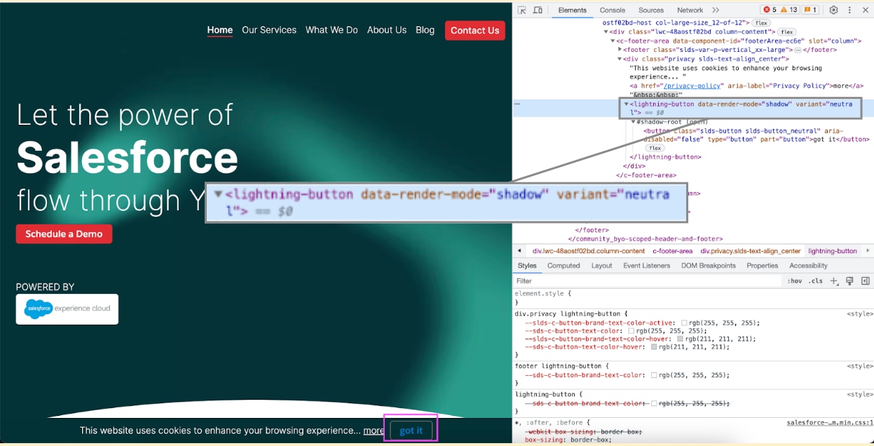
In the footer, the got it button text renders in blue instead of white.
To fix this styling issue, apply ::part(button) with the same rules:
Using ::part(button) results in the correct styles getting applied to the button.

See Also
- Lightning Design System: Styling Hooks on SLDS Components
- Lightning Design System: Styling Hooks