Determine if you can customize the styles on a base component with styling hooks to meet your requirements.
If you can’t find a base component for your use case, find the closest SLDS blueprint to help you build your own custom component.
When you create a component from a blueprint, the blueprint markup becomes part of your component’s code. If SLDS updates the related blueprint, your component code isn’t updated automatically. To match the latest blueprint, you must manually update your component. Salesforce automatically updates the base components when SLDS updates the associated blueprint.
Important
To build a component from an SLDS blueprint, search the SLDS blueprints catalog to find the closest design for your component. The blueprints are included only on the SLDS 1 site, and they are the same for SLDS 1 and SLDS 2. Only the values of CSS properties are changed in SLDS 2.
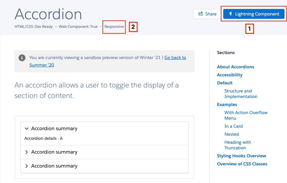
On the SLDS 1 site, an SLDS blueprint is implemented as a base component if it has a Lightning Component button (1) in the top-right of the page. Each blueprint provides details for its device support (2)—adaptive, responsive, or desktop-only. An adaptive blueprint has markup for non-desktop breakpoints, while a responsive blueprint scales elegantly across screen sizes.
Although base components implement SLDS styling, not all base components are supported for mobile screens. The Targets panel in the base component documentation lists the containers that support a component.
For example, the Data Table SLDS blueprint is adaptive, but the lightning-datatable base component is not mobile-ready. Also, consider the adaptive Tab SLDS blueprint where tabs become stacked on mobile screens and act as buttons. The corresponding lightning-tabset base component doesn’t support this mobile behavior.
Start with the Base Variation
Let’s say you want to create a scoped notification, and you know there isn’t a corresponding base component for it. Start with the base variation on the SLDS blueprint and build up from there. First, copy and paste the responsive base variation markup into your template.
1<template>2 <div3 class="slds-scoped-notification slds-media slds-media_center slds-scoped-notification_light"4 role="status"5 >6 <div class="slds-media__figure">7 <span class="slds-icon_container slds-icon-utility-info" title="information">8 <svg class="slds-icon slds-icon_small slds-icon-text-default" aria-hidden="true">9 <use href="/assets/icons/utility-sprite/svg/symbols.svg#info"></use>10 </svg>11 <span class="slds-assistive-text">information</span>12 </span>13 </div>14 <div class="slds-media__body">15 <p>16 It looks as if duplicates exist for this lead.17 <a href="javascript:void(0);">View Duplicates.</a>18 </p>19 </div>20 </div>21</template>
The blueprints are framework-agnostic, so they use standard HTML elements in the markup. If you create a Lightning web component from a blueprint, replace standard HTML elements with Lightning base components wherever possible.
The notification includes an svg icon in the <div class="slds-media__figure"> tag. Replace the icon with the lightning-icon base component.
1<template>2 <div3 class="slds-scoped-notification slds-media slds-media_center slds-scoped-notification_light"4 role="status"5 >6 <div class="slds-media__figure">7 <lightning-icon8 icon-name="utility:info"9 alternative-text="information"10 size="small"11 ></lightning-icon>12 </div>13 <div class="slds-media__body">14 <p>15 It looks as if duplicates exist for this lead.16 <a href="javascript:void(0);">View Duplicates.</a>17 </p>18 </div>19 </div>20</template>
Move the message to the component’s JavaScript file and bind the message property to your template.
1import{LightningElement, api}from "lwc";23export default class ScopedNotification extends LightningElement{4 @api message = "It looks as if duplicates exist ...";5}
Create Styling Themes and Variations
The scoped notification blueprint includes different themes—light and dark—that you want to capture in your component. Use a getter function to return the class names for a chosen theme.
Your component is ready for action. You can use it in another component or include it on a page in Lightning App Builder.
This example uses the c-scoped-notification component in another Lightning web component. The lightning-layout example provides a responsive grid layout, and lightning-tabset corresponds to the Tabs SLDS blueprint.
Because we specify small-device-size="9", the content in the first lightning-layout-item takes up 75% of the screen width on a tablet or desktop (480 px or more responsive breakpoint). When viewed on a mobile device, size="12" adjusts the content to take up 100% of the screen width. See Creating Responsive Layouts.


 j
j