LWR Sites for Experience Cloud
 j
jNewer Version Available
Text --dxp Styling Hooks
The Base Font Size property defines the font size for the <html> element of your site. So when its value is changed, it also affects every other font size property.
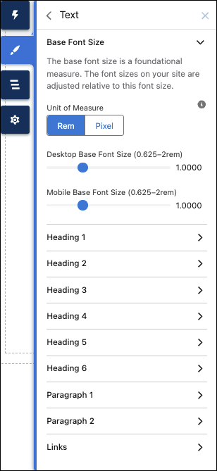
In addition to text for buttons, links, and forms, you can modify the style for several levels of heading and body text, including:
- Heading 1
- Heading 2
- Heading 3
- Heading 4
- Heading 5
- Heading 6
- Paragraph 1
- Paragraph 2
You can configure each of these text styles declaratively in the Theme panel or programmatically via --dxp styling hooks. When you change the values for these properties, it also affects the SLDS and DXP CSS classes that consume them.
To use these text properties in your components, use either SLDS or DXP CSS classes, or use the --dxp styling hook directly in the component’s CSS.
For example, this code sample styles a component’s h1 using the DXP CSS class to use the branding property values defined in the Extra Large Heading.
1<template>
2  <h1 class="dxp-text-heading-xlarge">Heading 1</h1>
3</template>
Alternatively, you can use the --dxp styling hooks directly in the component’s CSS:
1h1 {
2  font-size: var(--dxp-s-text-heading-extra-large-font-size);
3  font-family: var(--dxp-s-text-heading-extra-large-font-family);
4}
To alter the Base Font Size for small form factors, such as Tablet Portrait or Mobile, you can set the value of --dxp-s-html-font-size-mobile programmatically.