Customize Your Storefront

Modify the storefront by adding a custom page and component.

Prerequisites 

Steps 

  1. Create a component that displays a banner. Later, add this component to a new page.

    a. In {project-folder}/src/components, create a folder with the name custom-banner.

    b. In the new custom-banner folder, create the index.tsx file with this code.

    1import { type ReactElement } from 'react';
    2
    3 export interface CustomBannerProps {
    4     /** The title text to display in the banner */
    5     title: string;
    6     /** Optional subtitle text */
    7     subtitle?: string;
    8     /** Optional CSS class name for custom styling */
    9     className?: string;
    10 }
    11
    12 /**
    13 * CustomBanner component that displays a prominent title banner.
    14 *
    15 * @param props - The component props
    16 * @param props.title - The title text to display (required)
    17 * @param props.subtitle - Optional subtitle text
    18 * @param props.className - Optional CSS class name for custom styling
    19 *
    20 * @returns A React element containing the banner
    21 *
    22 * @example
    23 * ```tsx
    24 * <CustomBanner title="Welcome to the Custom Collection!" />
    25 * ```
    26 *
    27 * @example
    28 * ```tsx
    29 * <CustomBanner title="Welcome" subtitle="This is a subtitle" />
    30 * ```
    31 */
    32 export default function CustomBanner({ title, subtitle, className }: CustomBannerProps): ReactElement {
    33     return (
    34         <div className={`w-full bg-primary text-primary-foreground py-12 md:py-16 lg:py-20 ${className || ''}`}>
    35             <div className="container mx-auto px-4 sm:px-6 lg:px-8">
    36                 <div className="max-w-4xl mx-auto text-center">
    37                     <h1 className="text-4xl sm:text-5xl md:text-6xl lg:text-7xl font-bold mb-4 leading-tight">
    38                         {title}
    39                     </h1>
    40                     {subtitle && (
    41                         <p className="text-lg sm:text-xl md:text-2xl text-primary-foreground/90">
    42                             {subtitle}
    43                         </p>
    44                     )}
    45                 </div>
    46             </div>
    47         </div>
    48     );
    49 }

    The CustomBanner component in /custom-banner/index.tsx renders a centered banner with a large title and optional subtitle. It accepts title (required), subtitle (optional), and className (optional) via CustomBannerProps. It uses Tailwind classes for responsive typography, primary theme colors, and spacing, and centers content within a max-width container. The component returns a React element with the title as an <h1> and conditionally renders the subtitle as a paragraph, if provided.

  2. Add a page that includes this new component. The new page is created as a route file. In {project-folder}/src/routes, create a route file with the name _app.custom-page.tsx and add this code.

    1import { type ReactElement } from 'react';
    2 import { createPage, type RouteComponentProps } from '@/components/create-page';
    3 import CustomBanner from '@/components/custom-banner';
    4
    5 /**
    6 * Data structure for the custom-page.
    7 * This page doesn't require any loader data, so we use an empty type.
    8 */
    9 export type CustomPageData = Record<string, never>;
    10
    11 /**
    12 * Custom page view component that displays a banner with the title "Welcome to the Custom Collection!".
    13 * @returns JSX element representing the custom page
    14 */
    15 // eslint-disable-next-line react-refresh/only-export-components
    16 function CustomPageView({}: RouteComponentProps<CustomPageData>): ReactElement {
    17     return (
    18         <div className="pb-16">
    19             <CustomBanner title="Welcome to the Custom Collection!" />
    20         </div>
    21     );
    22 }
    23
    24 /**
    25 * Custom page component with loading fallback.
    26 * This creates a page component that wraps the CustomPageView component with a loading fallback.
    27 * The createPage utility provides consistent loading states and error handling.
    28 * @returns Page component with custom page functionality and loading states
    29 */
    30 // eslint-disable-next-line react-refresh/only-export-components
    31 export default createPage<CustomPageData>({
    32     component: CustomPageView,
    33 });

    The _app.custom-page.tsx file defines a React Router page at /custom-page. The _app. prefix in the file name causes the React Router to nest your custom page route under the _app.tsx layout. That layout renders the header, your page content, and the footer. It exports a default page via createPage, which wraps CustomPageView with Suspense and loading handling. CustomPageView renders the CustomBanner component inside a container with bottom padding. The page uses CustomPageData, an empty record. It doesn’t require loading data so it renders immediately without async data fetching.

  3. In a terminal window, go to the storefront folder.

    1cd {project-folder}
  4. If you haven’t already, install Storefront Next project dependencies that are specified in package.json.

    1pnpm install
  5. Build the storefront and then run the development server.

    1pnpm run build
    2pnpm run dev
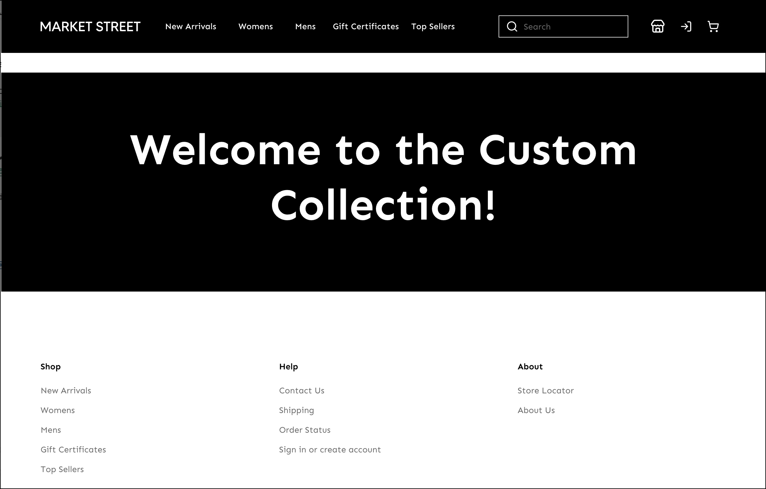
  6. Navigate to the new page that you created by appending /custom-page to the storefront URL. For example, go to this default URL: http://localhost:5173/custom-page. The new page shows the banner with a title.

New page in Storefront Next displays the products by category

Next Steps