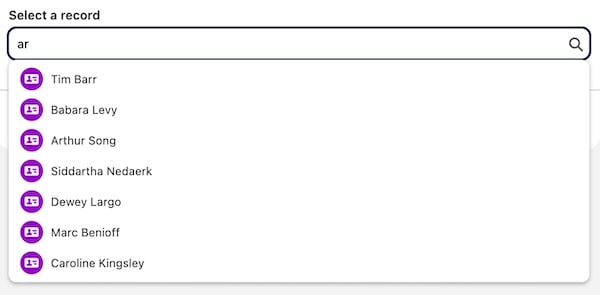
lightning-record-picker implements the autocomplete combobox (lookup) blueprint in the Salesforce Lightning Design System (SLDS). The combobox adapts to SLDS 1 or SLDS 2 styling based on the org’s theme or the container app that you use.
The filter attribute specifies which records the component lists in the record picker. The value for filter is an object with a criteria property and an optional filterLogic property. The value for criteria is an array with a list of filter criteria objects.
This example filters records where the Website field equals “https://www.grenoble.fr” or null, the Name of the related Parent doesn’t start with “Acme”, and Type doesn’t equal “Partner”.
To define logic for the set of filter criteria objects in the criteria array, specify the filterLogic property in the filter object. If filterLogic is undefined, all criteria apply with an AND logical operator by default. Valid operators are AND, OR, and NOT. The AND operator has higher precedence than OR. Parentheses are supported.
The filter object defines the criteria for individual filters. You can combine these filters by using logical operators that you specify with the filterLogic property.
The filter object requires these properties for each element in the criteria array.
Name
Type
Description
fieldPath (required)
string
The name of the field in the API to filter on. Cross-object references such as Account.Phone are supported.
operator (required)
string
The filter operator. Can be any of the supported types and operators listed in the next table.
value (required)
string
The value to filter against. If using a date filter, see the next table for accepted values.
Supported Operator Values for Filters
Type Family
Field Type
eq
ne
lt
gt
lte
gte
in
nin
like
includes
excludes
Boolean
Checkbox
✓
✓
Date and Time
Date
✓
✓
✓
✓
✓
✓
✓
✓
Date and Time
Date/Time
✓
✓
✓
✓
✓
✓
✓
✓
Date and Time
Time
✓
✓
✓
✓
✓
✓
✓
✓
ID
ID
✓
✓
✓
✓
✓
✓
✓
✓
Number
Currency
✓
✓
✓
✓
✓
✓
✓
✓
Number
Geolocation
✓
✓
Number
Latitude
✓
✓
✓
✓
✓
✓
✓
✓
Number
Longitude
✓
✓
✓
✓
✓
✓
✓
✓
Number
Number
✓
✓
✓
✓
✓
✓
✓
✓
Number
Percent
✓
✓
✓
✓
✓
✓
✓
✓
Picklist
Multi-Select Picklist
✓
✓
✓
✓
Picklist
Picklist
✓
✓
✓
✓
✓
✓
✓
✓
✓
Text
Auto Number
✓
✓
✓
✓
✓
✓
✓
✓
✓
Text
Email
✓
✓
✓
✓
✓
✓
✓
✓
✓
Text
Encrypted Text
Text
Long Text
✓
✓
✓
✓
✓
✓
✓
✓
✓
Text
Phone
✓
✓
✓
✓
✓
✓
✓
✓
✓
Text
Rich Text
✓
✓
✓
✓
✓
✓
✓
✓
✓
Text
URL
✓
✓
✓
✓
✓
✓
✓
✓
✓
Calculated Fields
Formula
✓
✓
✓
✓
✓
✓
✓
✓
✓
Calculated Fields
Roll-up Summary
✓
✓
✓
✓
✓
✓
✓
✓
The like operator works similarly to the SOQL like operator, with % and _ wildcards. The % wildcard matches zero or more characters. The _ wildcard matches exactly one character.
Filter on Date Types
For date types (Date, DateTime, and Time), value is passed as an object with either a value or literal property. Use value if referring to an absolute date, time, or datetime. Use literal if referring to a relative date or time.
A value must be passed as a string (not a JavaScript date) that corresponds to the type of field. Use the JavaScript methods in the following table to convert to the correct format. The API throws an error if the date format is incorrect.
Field Type
Format
JS Date Conversion
DateTime
”2023-03-10T14:24:44.567Z”
date.toISOString()
Date
”2023-01-01”
date.toISOString().slice(0, 10)
Time
”14:29:50.659Z”
date.toISOString().slice(11)
This example uses a Date value to filter results to a specific date.
A literal is a date literal that represents a relative range of time, such as last month, this week, or next year. The value for literal must be a value from the GraphQL API list of Literal Values for Relative Dates.
The following example uses the TODAY literal to filter results to today’s date.
To customize the way record suggestions appear in the record picker, use the display-info attribute. The display-info attribute references an object that specifies the main field and an additional field to display. By default, the value of the name field of the target object is displayed.
This example sets the primary field to the name of the related account and adds Title as a display field in the returned record picker results.
The display-info referenced object (displayInfo in the example) has the following properties. One or both properties are required if using display-info. Cross-object fields such as Account.Name are supported for both primaryField and additionalFields.
Name
Type
Description
primaryField
string
The first field displayed in record suggestions. The default value is the name field.
additionalFields
array
An extra field to display in record suggestions. The value for additionalFields is an array with a single string element representing the additional field to display. Only the first element of the array is used.
Customize the Fields to Match in Search
By default, the search is conducted on the name field of the target object. To look for a match to a different field or additional fields, specify the matching-info attribute. The matching-info attribute references an object that defines which fields to query for the search terms in the record picker.
Cross-object fields such as Account.Phone are supported.
The matching-info referenced object (matchingInfo in the example) has the following properties. One or both properties are required if using matching-info.
Name
Type
Description
primaryField
object
The primary field used to query the search terms. Only Text and Formula (Text) fields are supported. Object must be in the format { fieldPath: 'Name' }.
additionalFields
array
The additional fields used to query the search terms. You can only specify one additional field. Only Text and Formula (Text) fields are supported. Array must be in the format [ { fieldPath: 'Phone' } ].
You can specify a matching mode for both the primary field and the additional fields using the mode property as shown in the following example. Specifying a matching mode can be useful in addressing performance concerns when searching through large datasets within an org.
The mode property accepts two values:
startsWith: matches results that start with the search term
contains: (default) matches results that contain the search term
This example shows a matchingInfo config that queries records whose Name field starts with the search term or whose Phone field contains the search term.
The event fired when a record has been selected or cleared.
The change event returns the following parameter.
Parameter
Type
Description
recordId
string
Returns the ID of the selected record or null if none.
The event properties are as follows.
Property
Value
Description
bubbles
false
The event doesn’t bubble.
cancelable
false
This event has no default behavior that can be canceled. You can’t call preventDefault() on this event.
composed
false
The event doesn’t propagate outside the component in which it was dispatched.
error
The event fired when Lightning Data Service returns an error.
The error event returns an object with these parameters.
Parameter
Type
Description
error.message
string
The error message.
error.output
string
The error details.
error.errorCode
string
The error code having the format: ERR_RP00x. See the Error Handling section to explore the possible error code values.
The event properties are as follows.
Property
Value
Description
bubbles
false
The event doesn’t bubble.
cancelable
false
This event has no default behavior that can be canceled. You can’t call preventDefault() on this event.
composed
false
The event doesn’t propagate outside the component in which it was dispatched.
focus
The event fired when the focus is set.
Property
Value
Description
bubbles
false
The event doesn’t bubble.
cancelable
false
This event has no default behavior that can be canceled. You can’t call preventDefault() on this event.
composed
false
The event doesn’t propagate outside the component in which it was dispatched.
blur
The event fired when the focus is removed.
Property
Value
Description
bubbles
false
The event doesn’t bubble.
cancelable
false
This event has no default behavior that can be canceled. You can’t call preventDefault() on this event.
composed
false
The event doesn’t propagate outside the component in which it was dispatched.
ready
The event fired when the component stops loading and is rendered. To call a method on the component, use the ready event. For example,
you can call this.template.querySelector('lightning-record-picker').focus(); by using this event to put focus on the component after
it finishes rendering.
Property
Value
Description
bubbles
false
The event doesn’t bubble.
cancelable
false
This event has no default behavior that can be canceled. You can’t call preventDefault() on this event.
composed
false
The event doesn’t propagate outside the component in which it was dispatched.
Error Handling
lightning-record-picker can return blocking and non-blocking errors. When a blocking error occurs, the input is disabled and a red message appears. To handle these errors, change the component configuration to exit the blocking error state based on what specific error was thrown.
When a non-blocking error occurs, a red message appears but the user can still interact with the component. The user must change their search or reload the page to exit the non-blocking error state.
The following is a list of errors emitted by the lightning-record-picker component.
Error Code
Error Message
Description
Blocking?
ERR_RP001
Missing or invalid required object-api-name attribute
The object-api-name attribute is omitted or formatted incorrectly.
✓
ERR_RP002
lightning-record-picker supports only objects with a name field…
The object-api-name refers to an sObject that doesn’t provide a name field.
Label attribute isn’t provided or is invalid. Valid values are any non-empty strings
✓
Validation Messages
Validation messages display when the component loses focus or when the component uses the reportValidity() method. Validation messages also display when a user types a search term but doesn’t select a record, or the component is required and the user doesn’t select a record.
Set a custom validation message with the setCustomValidity() method. Setting a message puts the component in an invalid state. The custom message isn’t automatically displayed. Call reportValidity() to display the custom message.
Objects and Fields Support
The lightning-record-picker component only supports objects in the User Interface API with at least one name field as part of the nameFields array from the getObjectInfo response.
The fields that are displayed for the records may not be an exact match for the records returned by the API. The displayed record fields are determined by the primaryField and additionalFields properties set for display-info. If the matching-info properties are set to record fields that aren’t used by display-info, the displayed records can confuse users because the matching fields aren’t displayed.
When you search for results with a search term, wildcards characters (’%’ and ’_’) are escaped in the search term.
lightning-record-picker doesn’t support searching on encrypted fields, including encrypted fields configured in the matching-info attribute.
When configuring the primaryField property of the display-info attribute, we recommend that you pick a field that’s marked as required in the sObject definition. Using a required field prevents displaying a blank selection when a record is selected.
When working with a public method on lightning-record-picker, make sure the component is fully rendered before calling the method. Don’t call focus() from renderedCallback() as the component and its child components may not be fully rendered. For example, you can call the public method using the ready event instead.
1<lightning-record-picker2 label="Choose a Record"3 placeholder="Search Contacts"4 object-api-name="Contact"5 onready={handleOnReady}6></lightning-record-picker>
In your JavaScript file, set the focus on the record picker. This example assumes that you have only one lightning-record-picker component on the page.
For a recipe that uses lightning-record-picker, see the c-record-picker-* components in the LWC Recipes repo.
Attributes
Name
Description
Type
Default
Required
disabled
If present, the component is disabled and you can't interact with it.
boolean
false
display-info
The display configuration used to customize the way retrieved records are presented.
field-level-help
Help text detailing the purpose and function of the record picker, displayed on hover for desktop and on click for mobile
string
filter
The filter applied to the retrieved records.
Filter
label
The text label for the component.
string
matching-info
The matching configuration to customize the fields used to match the search results to the search term entered by the user.
MatchingInfo
message-when-bad-input
The error message displayed when the user enters a search term in the input but doesn't select an option.
String
object-api-name
The API name of the object for the retrieved records.
string
placeholder
The text displayed when the input is empty to prompt the user to enter a search term.
string
required
If present, specifies that a user must select a record. If no record is selected, the record picker is in an invalid state.
boolean
false
value
The ID of the record that is selected in the record picker.
string
variant
The variant changes the appearance of the component. The component displays the label above the combobox by default. Specify variant="label-hidden" to hide the label but make it available to assistive technology. The only variant is label-hidden.
string
Methods
Name
Description
Argument Name
Argument Type
Argument Description
blur
Remove the focus of the component.
checkValidity
Check if the component is in a valid state.
clearSelection
Clears the selected record. This method does not clear the search term or refresh the validity message.
focus
Set the focus of the component.
reportValidity
Check if the component is in a valid state and refresh the validity message. If the component is valid, it clears the validity error message. If the component is invalid, it displays the validity error message.
setCustomValidity
Set a custom validity error message.
message
String
A custom validity message. Specify an empty string to reset the custom message.