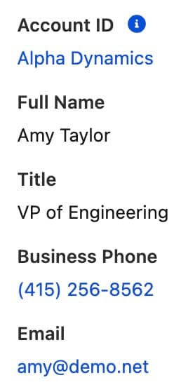
Represents a record view layout that displays one or more fields, provided by lightning-output-field.
For Use In
Lightning Experience, Experience Builder Sites, Salesforce Mobile App
Use the lightning-record-view-form component to create a form that shows Salesforce record data for specified fields associated with that record. The fields are rendered with their labels and current values as read-only.
You can customize the form layout or provide custom rendering of record data.
If you don’t require customizations, use lightning-record-form instead.
To specify read-only fields, use lightning-output-field components inside lightning-record-view-form.
Design
lightning-record-edit-form implements the form element (view mode) blueprint in the Salesforce Lightning Design System (SLDS). The form adapts to SLDS 1 or SLDS 2 styling based on the org’s theme or the container app that you use.
lightning-record-view-form requires
a record ID to display the fields on the record. It doesn’t require additional
Apex controllers or Lightning Data Service to display record data. This
component also takes care of field-level security and sharing for you, so
users see only the data that they have access to.
To access raw record data or create a form that needs more customization than the lightning-record-*-form components allow, use Lightning Data Service wire adapters and functions, such as those from the lightning/ui*Api module.
Object API Name and Record ID
Each Salesforce record is associated with a Salesforce object. For example, a contact record is associated with the Contact object. Record IDs are created with prefixes that indicate the object. The lightning-record-view-form component requires you to specify the object-api-name attribute to establish the relationship between a record and an object. The object API name must be appropriate for the use of the component. For example, if you include lightning-record-view-form on a record page for an account, set object-api-name="Account". If the record ID and object API name don’t agree, the form doesn’t display.
Specify Object API and Field Names
We strongly recommend importing references to objects and fields by using the @salesforce/schema syntax especially when you plan to distribute your component as a managed package.
For example, create a form that enables users to view the name field on a contact record page.
To include a read-only field in the form, use the lightning-output-field component and set the field-name to the API name of the field. Labels for certain fields can differ from those fields on a standard record page. For example, the Name field on the opportunity object displays “Name” instead of “Opportunity Name” while the Name field name on the account object displays “Account Name”.
Although you can set the field name directly with the field-name attribute, we recommend that you import a reference to the name field. In this example, the form uses the object API name and record ID of the record page it’s placed in.
1import{LightningElement, api}from "lwc";23import NAME_FIELD from "@salesforce/schema/Contact.Name";45export default class RecordViewFormStaticContact extends LightningElement{6 // Expose a field to make it available in the template7 nameField = NAME_FIELD;89 // Flexipage provides recordId and objectApiName10 @api recordId;11 @api objectApiName;12}
To use your component in a managed package with your custom object, import the object by using your namespace, for example, @salesforce/schema/namespace__object.
1import MY_CUSTOM_OBJECT from "@salesforce/schema/namespace__Custom_object__c";
When you import the references, Salesforce verifies that the objects and fields exist, prevents objects and fields from being deleted, and cascades any renamed objects and fields into your component’s source code. For more information, see Import References to Salesforce Objects and Fields.
Supported Objects
This component doesn’t support all Salesforce standard objects. This limitation also applies to a record that references a field that belongs to an unsupported object.
This component supports the Task object but Task.IsRecurrence and Task.IsReminderSet fields don’t render even when requested.
This component supports the Event object but Event.IsRecurrence, Event.IsRecurrence2, and Event.IsReminderSet fields don’t render even when requested.
If you’re working with an unsupported object or if you use SOQL to query certain records, create your own UI and use Apex to work with Salesforce data. For more information, see Data Guidelines in the Lightning Web Components Developer Guide.
Display Record Fields
To display the fields on a record, specify the fields by using the
lightning-output-field component with the field-name attribute
set to the API field name.
Use Record Edit Form and Record View Form Together
Here’s an example that displays a record edit form and a record view form
for the same contact record. When you make edits and click the Update Record
button to submit the record edit form, the record view form updates automatically.
The forms are separate from each other. A form can’t be nested in another form.
To create a multi-column layout for your record view, use the Grid utility
classes in Lightning Design System.
This example creates a two-column layout.
1<template>2 <lightning-record-view-form3 record-id="003XXXXXXXXXXXXXXX"4 object-api-name="My_Contact__c"5 >6 <div class="slds-grid">7 <div class="slds-col slds-size_1-of-2">8<!-- Your lightning-output-field components here -->9 </div>10 <div class="slds-col slds-size_1-of-2">11<!-- More lightning-output-field components here -->12 </div>13 </div>14 </lightning-record-view-form>15</template>
Form Display Density
In the Salesforce user interface, the Display Density setting determines how densely you want to show the content. The Comfy density shows labels on top of the fields and more space between page elements. Compact density shows labels next to the fields and less space between page elements.
The record form components, lightning-record-form, lightning-record-edit-form, and lightning-record-view-form,
handle form density in similar ways. The density attribute is set to auto by default for all record form components.
Display density is supported for lightning-input-field and lightning-output-field within the form; display density is not supported for custom components within the form.
With auto density:
Record form components detect the Display Density setting and the width of the form’s container to determine label position. The record form components don’t change the space between elements, however.
If your Salesforce density setting is Comfy, the fields always display with their labels above them.
If your Salesforce density setting is Compact, the fields initially display with their labels next to them. If you resize the form container below a certain width or use the form in a narrow container, the fields display with their labels above them. This behavior is similar to how other elements behave in Lightning Experience when Compact density is enabled. The record form components use the same width settings to determine when to switch the display density.
If a record form component doesn’t detect the Salesforce density setting, the fields display with their labels next to them. If you resize the form container to a narrow width, the fields display with their labels above them.
Detecting the user’s density setting is only supported in Lightning Experience. When a record form component runs outside Lightning Experience, and density is set to auto, the fields display with their labels next to them, and switch to labels above the fields when in a narrow container.
If you specify a variant for lightning-output-field, the variant overrides the display density for that field.
Set the Form Display Density
To display a record form with a particular density, set the density attribute to one of these values.
comfy makes the form always display labels on top of fields and doesn’t detect the user setting.
compact makes the form display labels next to their fields and doesn’t detect the user setting. However, the form switches to the comfy density if the form is narrowed to the width that triggers the automatic change. To reduce the whitespace between the label and field when the form uses compact density, use the slds-form-element_1-col class on lightning-input-field or lightning-output-field.
auto makes the form use the default behavior described in Form Display Density.
Display Fields Conditionally
To display a field conditionally, use the if:true|false directive.
This example displays or hides the Name and Industry account fields when you select or unselect a checkbox.
A person account is a record type on the account object. It combines certain fields from the account and contact object into a single record. To use person accounts in your org, you must enable the Person Accounts setting first. After Person Accounts is enabled, it can’t be disabled. For more information, see Enable Person Accounts.
To access person account fields, use the account object with object-api-name="Account".
Specify the fields using the field names listed in the IsPersonAccountFields section for the Account object in the Object Reference.
The fields that begin with Person are the fields from the contact object.
For standard fields on the contact object, use Person<ContactFieldName>. For example, use field-name="PersonMobilePhone" for the MobilePhone field on the contact object.
For custom fields on the account object, use CustomFieldName__c as usual.
For custom fields on the contact object, use CustomFieldName__pc.
This example creates a form to view a person account record.
1<lightning-record-view-form record-id={recordId} object-api-name="Account">2<!-- Name field on account -->3 <lightning-output-field field-name="Name"> </lightning-output-field>45<!-- Nickname__c field on account -->6 <lightning-output-field field-name="Nickname__c"> </lightning-output-field>78<!-- MobilePhone field on contact -->9 <lightning-output-field field-name="PersonMobilePhone">10 </lightning-output-field>1112<!-- Contact_Nickname__c field on contact -->13 <lightning-output-field field-name="Contact_Nickname__pc">14 </lightning-output-field>15 <lightning-button16 class="slds-m-top_small"17 variant="brand"18 type="submit"19 label="Update"20 >21 </lightning-button>22</lightning-record-view-form>
Nesting lightning-record-view-form in another instance of the component, or nesting it in lightning-record-edit-form or lightning-record-form is not supported.
Consider using the lightning-record-form
component to create record forms more easily.
The event fired when the record view form loads record data.
If you load the fields dynamically, load is fired before the child elements of lightning-record-view-form finish loading. Consider the connectedCallback() lifecycle hook to perform initialization tasks. Alternatively, to load values or set properties dynamically, use a getter and setter instead.
load is fired when the form gets new data from Lightning Data Service, which can be once or multiple times after the component is initialized. For example, the load event is fired when:
The record-id value changes
The fields list changes
The form includes picklist fields
The record type changes
If you require the load event to be called only once, write code to prevent it from running more than once.
Use the event.detail property to return the record UI.
The event properties are as follows.
Property
Value
Description
bubbles
false
This event does not bubble.
cancelable
false
This event has no default behavior that can be canceled. You can’t call preventDefault() on this event.
composed
false
This event does not propagate outside the template in which it was dispatched.
Sets the arrangement style of fields and labels in the form. Accepted values are compact, comfy, and auto (default). Use compact to display fields and their labels on the same line. Use comfy to display fields below their labels. Use auto to let the component dynamically set the density according to the user's Display Density setting and the width of the form.