


Health Cloud Administration
 j
jProvide Dashboards
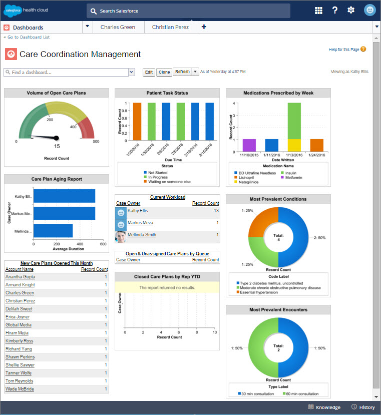
People love the summarized views they get with dashboards, and you can help care
coordinators optimize their workload with dashboards. A dashboard shows data from source reports
as visual components, which can be charts, gauges, tables, metrics, or Visualforce pages. The
components provide a snapshot of key metrics and performance indicators for your organization.
Each dashboard can have up to 20 components.
To save you time, there are many apps available on the AppExchange that you can download and customize. This sample dashboard was created using Salesforce Labs Service & Support Dashboards.
After you create your dashboard, remember to add it to the console so that care coordinators can use the tab switcher to access the dashboard. From Setup, in the Quick Find box, enter App, and then select App Manager. Select the Health Cloud app you want to customize and then add it as a navigation tab item.